Indeed Education School Pages
Project
Indeed Education School PagesMy contribution
As the UX Lead at Indeed Education (School Team), I led the work on UX strategy, UX and UI design, iterative prototype user testing, and data analysis to measure the training provider pages' impact and identified areas for improvement.
Skills/ Expertise
User Research, Competitive AnalysisUX Strategy, Design Thinking, User Experience Design, Prototyping, Data AnalysisTimeline/ Duration
Feb to Jul 2021
Tool
UserTesting, Miro, Figma
At Indeed,
we help people get jobs.
Indeed Education is a platform that helps people look for courses and training providers for professional certifications.Indeed Education school pages are designed to help prospective students in exploring training providers, courses, and user reviews.

However, the current iteration of Education school pages falls short due to lacking detailed information and suboptimal content organisation, which detracts from the overall user experience. Our shared goal is to overhaul these pages into a more informative and user-friendly resource, ensuring potential students can easily access the essential information they require.
In Q2 2021, the Education Schools team wanted to understand the following:  'How can we restructure the content about schools and programs to be more user-centric?'

To begin to answer this question, we recognise the importance of gaining insights into 2 key areas:
We want to understand how users currently seek out info on our existing school pages.
01
02
We need to identify/determine the specific types of content that are most valuable to our audience, primarily those seeking certification.
We had some idea of what students might want to know about training providers from qualitative on-page feedback, but we didn’t know much about how they were using the existing pages or what/ how that information should be displayed.
A full discovery and design phase was not an option as Engineers were already waiting for new features and experiments.So, we decided to take an iterative learning approach to allow the team identify quick fixes while building a better understanding of page behaviours and needs.
Discovery Research
Running research and design side-by-side
Content research to understand what info cert-seekers need on school pagesContent Research
Understand behaviours, needs and pain points on page when looking for short-duration courses (e.g. certs)User Testing 1
Assess similarities and differences in needs, etc. between other qualification types (e.g. licenses)User Testing 2
Assess performance between redesigned and current pages for key areas of the page and new ideasUser Testing 3
Constant feedback
Research

Design

Start provider page redesigns based on previous research, prioritise data
Incorporate feedback, work on quick fixes, iterate future concepts
Finalise designs for prioritised changes and future concepts
Content Research
I see content as foundational part of UX — in recognition of this, I partnered closely with a Content Designer and User Researcher to run a range of both quick and foundational content research. Some content research examples we ran:
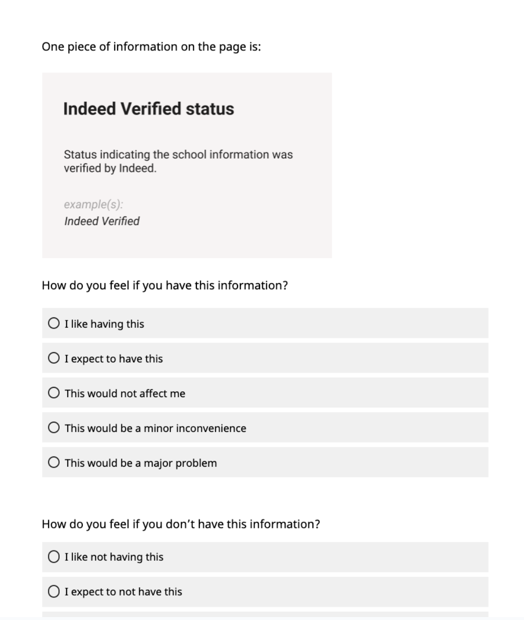
Cloze tests to learn what labels to useComprehension questions & tasks in user testingKano survey to prioritise data collection and data display
We ran a kano survey to understand what information about training providers and courses should be collected and displayed on Indeed Education
Research Objectives & Questions
Categorise and prioritise content about schools according to what users want
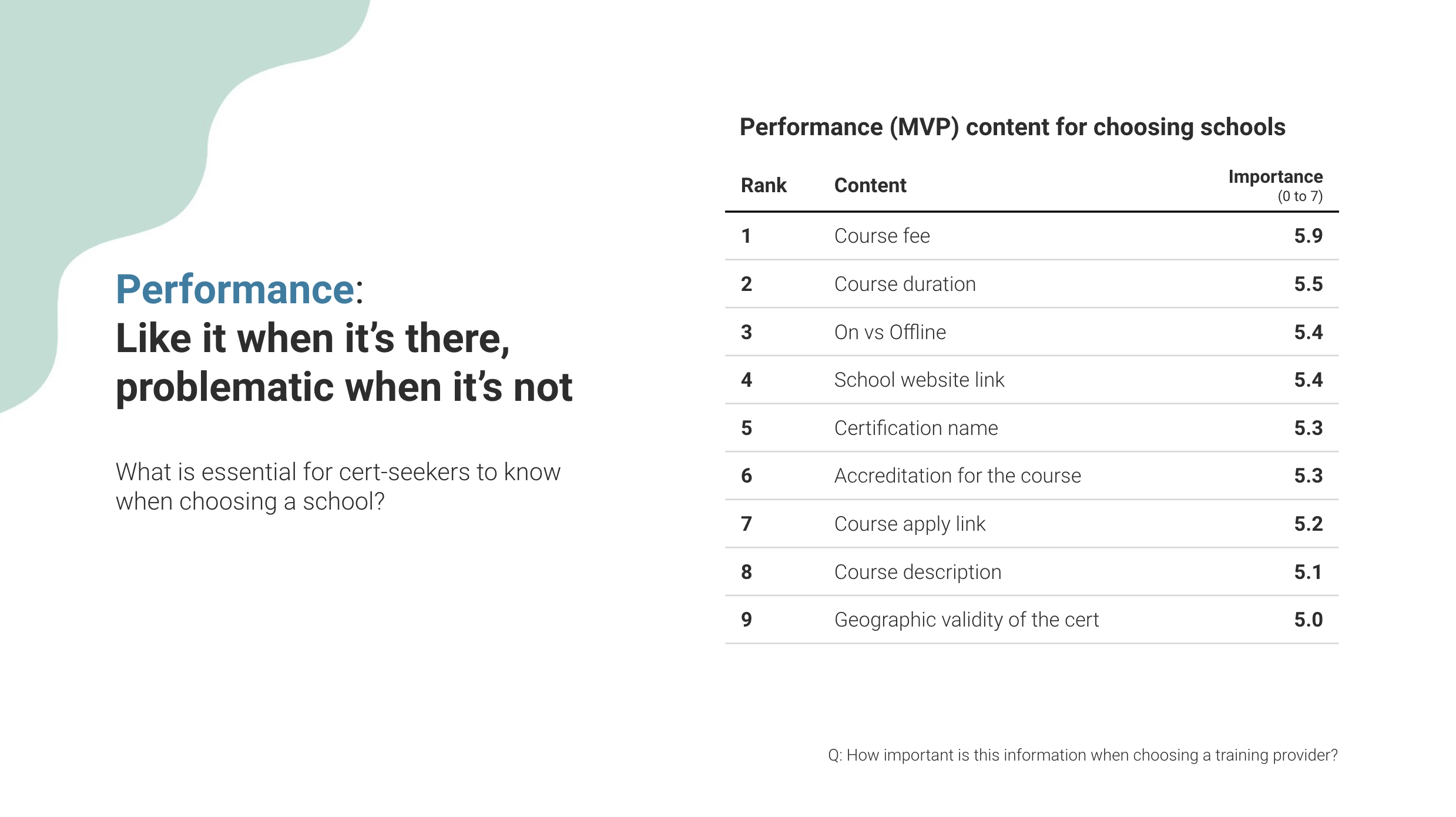
MVP: What's essential for cert-seekers to know when choose a school? What isn't?
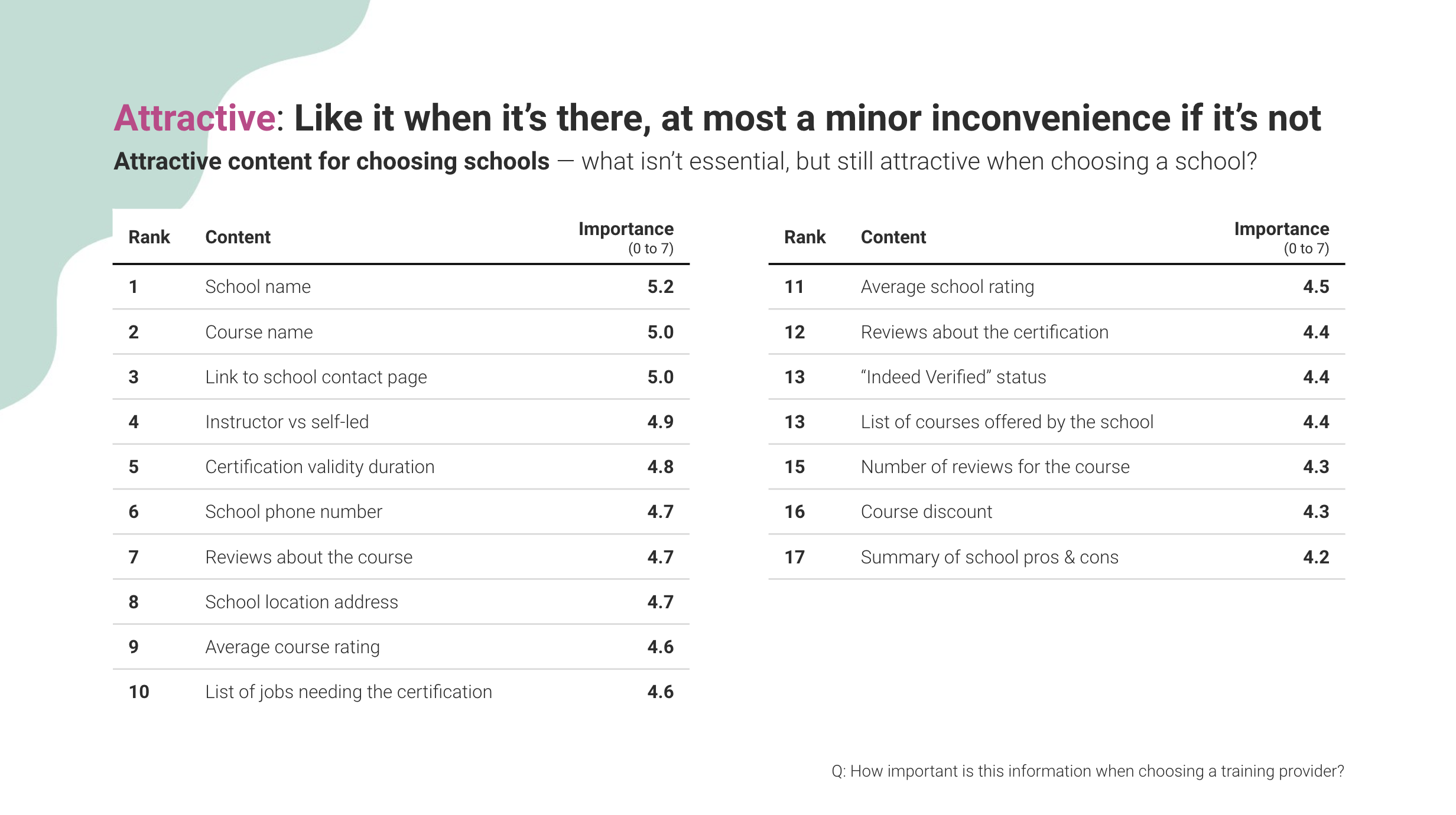
Competitive: What's less essential, but still attractive?

This will inform the ongoing redesign of Indeed Education’s school pages, SERP cards, and the collection of school data. Comprehensive overview of the Kano model
Method:
The team chose 27 pieces of school content (a mix of functional information and ideas for future content creation) for a quantitative Kano survey.
We collected 203* responses between 22 Jan - 2 Feb 2021.
8 of these responses were done on UserTesting.com, with users voicing out why they picked their choices as they completed it.
Who we recruited
Active, US-based jobseekers on Indeed
Completed or renewed a certification/license in the last 6 months
Completed training for it
Did it for a work-related reason
Chose their own school
Content Research: Kano Question Set
Respondents are shown a piece of school content and asked 3 questions about it
How do you feel if you have this information?How do you feel if you don’t have this information?How important is this information when choosing a training provider?
Functional question

i.e. How they feel when it is there.
Scored from -2 to 4
2. Dysfunctional question

i.e. How they feel when it isn’t there.
Scored from -2 to 4
3. Importance question

i.e. How important it is for choosing a school
Scored from 0 to 7
Kano Scoring & Categorisation
Based on the averaged scores of the functional & dysfunctional questions, each piece of content is assigned to a category…
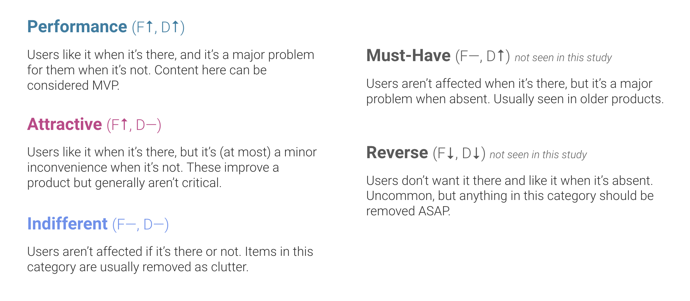
Legend
F: Functional score
D: Dysfunctional score
How users reacted to a piece of content being present.
Scored from -2 to 4.
Functional
How users reacted to a piece of content being absent.
Scored from -2 to 4.
Dysfunctional
Importance
How important the content is when choosing a training provider. Scored from 0-7.(seen the most in this report)
Functional and Dysfunctional scores are used to assign the content to categories.
Importance is used to rank and differentiate content within categories.
What We Learned
Key results by category
Performance: 9 items
Attractive: 17 items
Indifferent: 1 item


Kano survey findings
-
![Finding 1]()
Right now, course cards link to the home page regardless of where they click form.
-
![Finding 3]()
This is currently the only piece of information in the Performance list not being collected by the team. However, we may be able to solve this through better/templated presentation of pre-existing structured data.
-
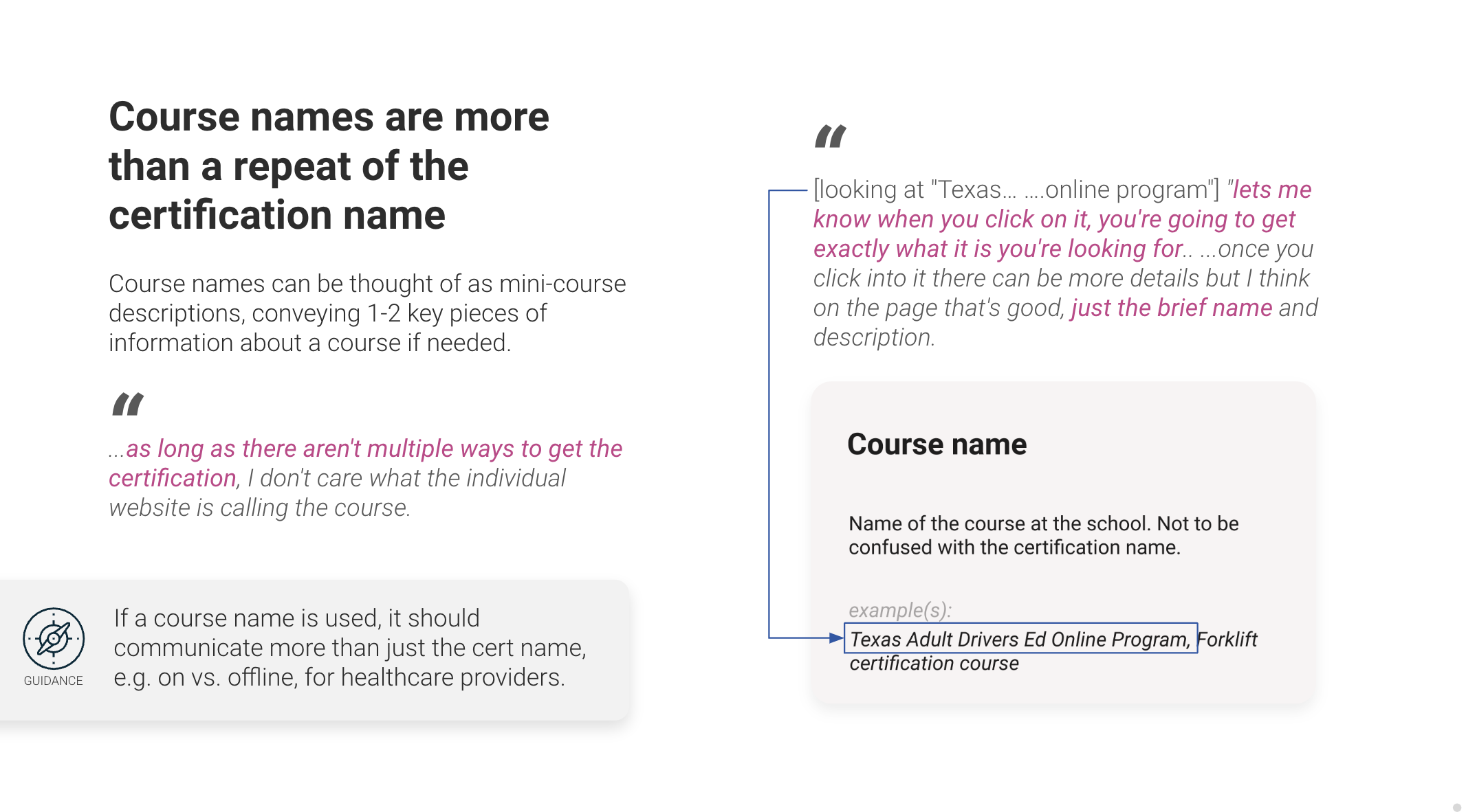
![Finding 3]()
Course names can be thought of as mini-course descriptions, conveying 1-2 key pieces of information about a course if needed.
-
![Finding 4]()
Reconsider the existing hierarchy of course/ program vs. certifications on the school pages.
-
![Finding 5]()
Not all cert-seekers need to contact schools, but for those who do, it can be an essential final step before signing up.
-
![Finding 6]()
“I really like that, being able to read reviews, that's really helpful.”
-
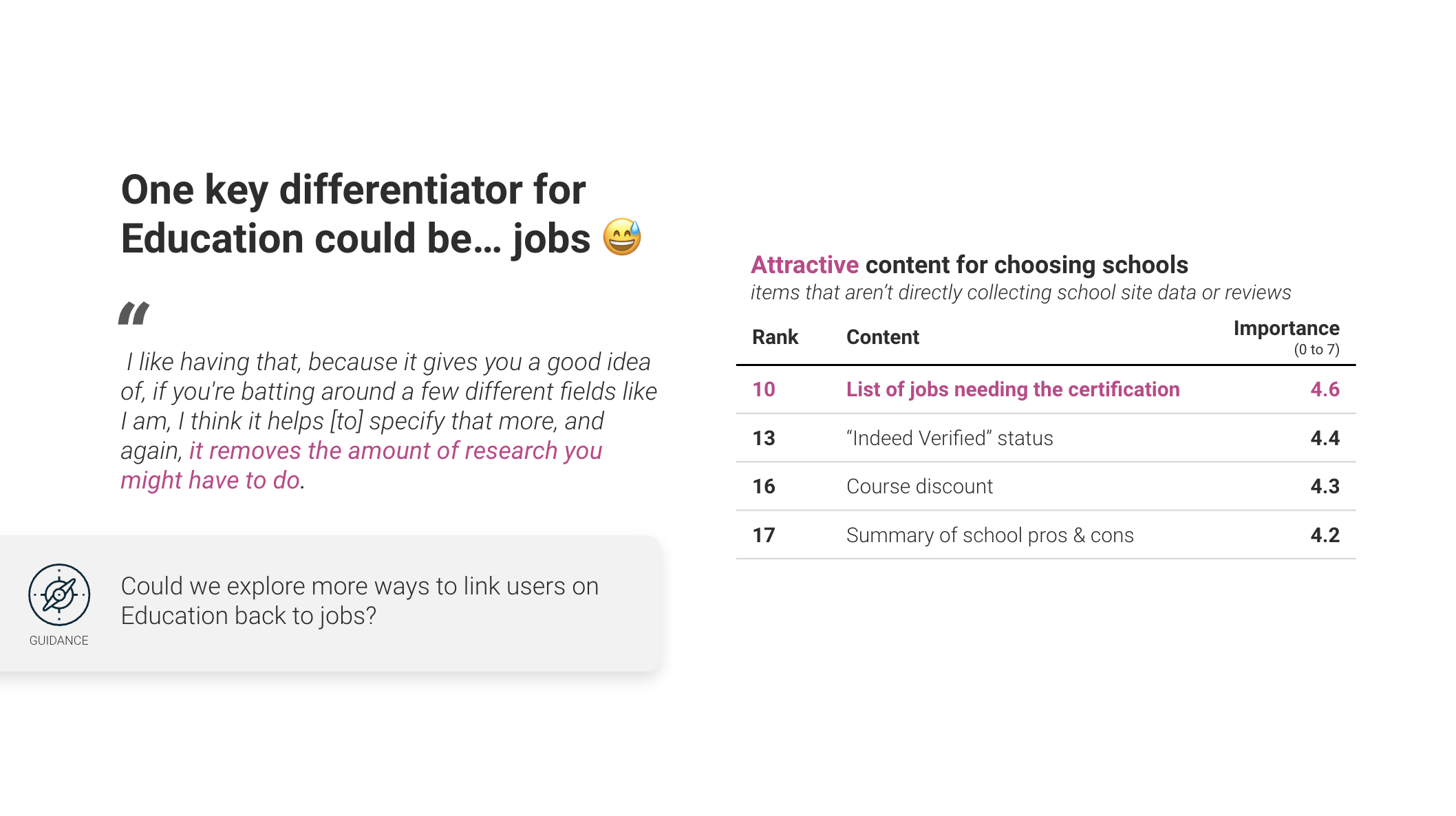
![Finding 6]()
“I like having that, because it gives you a good idea of, if you're batting around a few different fields like I am, I think it helps [to] specify that more, and again, it removes the amount of research you might have to do.”
-
![Finding 8]()
“I'm probably myself going to Google [to] find out before I take this class, are there any applicable discounts. So if it's right there on the page, that's very convenient, it's very helpful.”
-
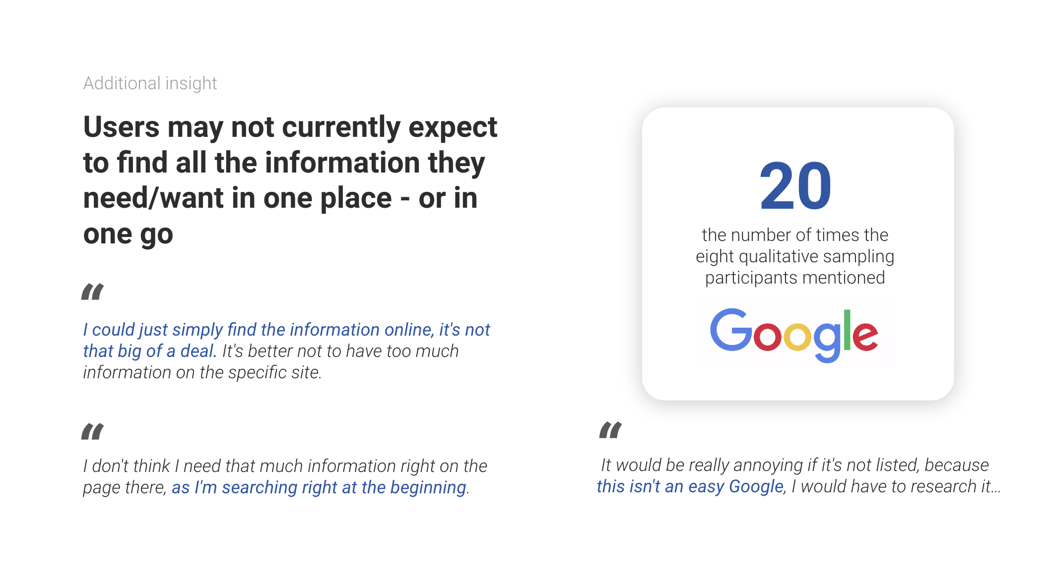
![Finding 9]()
“I could just simply find the information online, it's not that big of a deal. It's better not to have too much information on the specific site.”


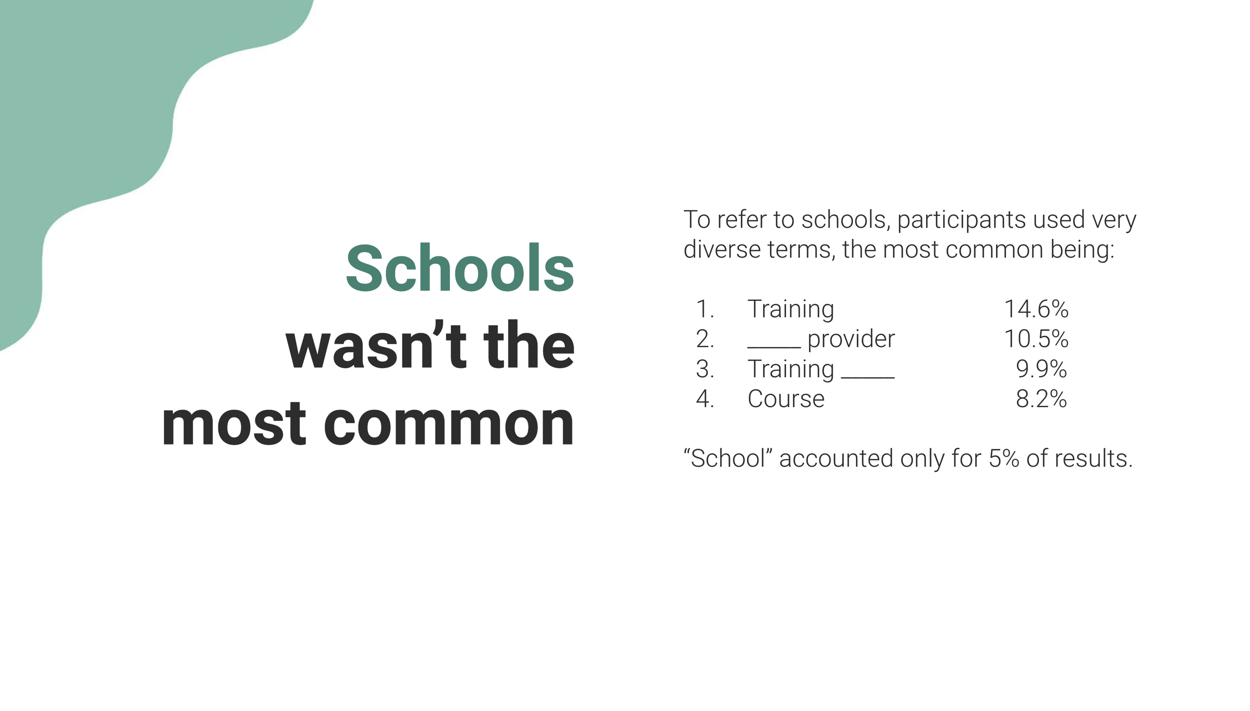
Content Research: Cloze Test
In the Kano analysis, we included a cloze test — a test to better understand what words our users use
We asked participants to tell us what words they’d use in the yellow and red rectangles

Discovery Research — User Testing 1&2
Then, we also conducted two unmoderated user tests, each focusing on a different type of professional qualification (cert vs. license)
Unmoderated User Testing 1
For CPR certification training providers, our test objectives is to:
Identify UX improvements to help users more easily find information on school pagesInform the school team’s understanding of how to make the schools/program content structures more user-centric

Method:
We conducted unmoderated user testing sessions on mobile. We asked participants to first tell us what they would like to know about getting a CPR certification, then to show us how they look for courses on the Indeed school page. Then, we asked them to look for specific information about the school and course
Who we recruited
9 US-based job seekers
Used Indeed in the last 3 months
Uses a smartphone to look for jobs
Got a CPR certification for a work-related reason within the last 6 months
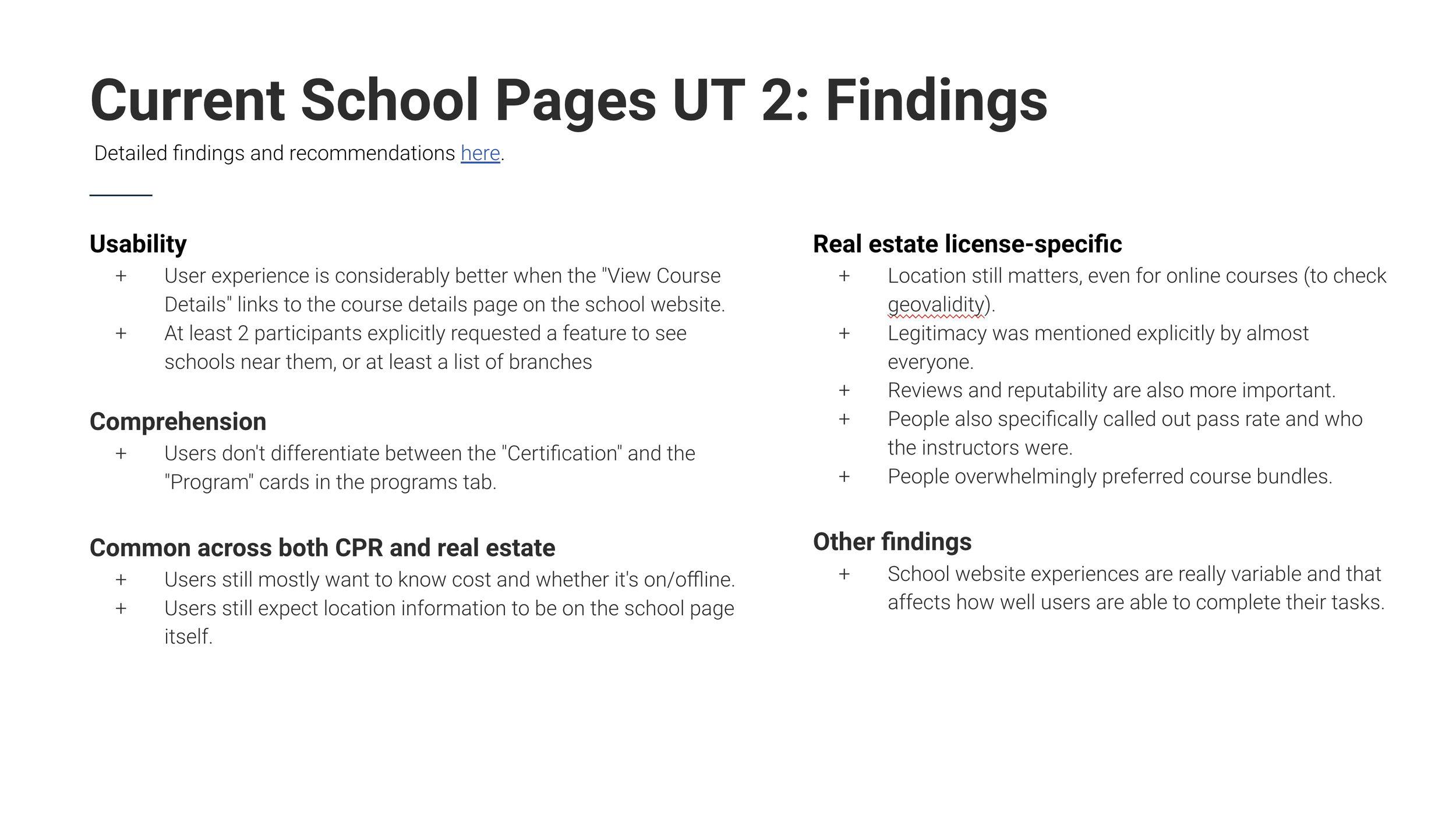
Unmoderated User Testing 2
For Real Estate license training providers, our test objectives is to:
Identify UX improvements to help users more easily find information on school pagesIdentify any real-estate specific learnings and content requirementsInform the school team’s understanding of how to make the schools/program content structures more user-centric

Method:
We conducted unmoderated user testing sessions on a mix of mobile and desktop. Similarly to the first UT, we asked participants to first tell us what they would like to know about getting a real estate license, then to show us how they look for courses on the Indeed school page. Then, we asked them to look for specific information about the school and course
Who we recruited
9 US (Connecticut)-based job seekers
Criteria was the same as the first study, except they had to have completed a Real Estate license within the last 6 months instead of a CPR certification.
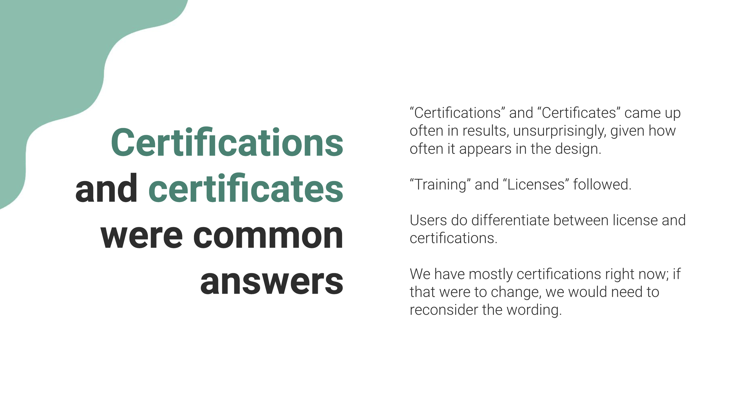
Research Findings
🎮
Unpacking key insights from two user tests
Our research identified usability and comprehension issues on school pages for CPR certification and Real Estate licensing. Users across both areas shared common concerns:Cost information
Users want clear information on how much courses will cost. They find it frustrating when this information is not easily accessible.Online vs Offline courses
Users need to know if courses are available online, offline, or in a hybrid format. This helps them plan according to their schedules and preferences.Location details
Despite the option for online learning, users still expect to find location information for schools. They want to know where courses are held, especially for offline or hybrid options.
Current State
The School team’s focus is on enhancing the GET Education experience
These phases were pinpointed through interviews and surveys conducted with individuals across various industries.
There are 4 phases of getting professional training
The role of the School team in this context is to facilitate these users' journeys by providing a streamlined and efficient pathway to achieving their goals.
User Story
The primary archetype user, the Point-and-Go Seekers, are characterised by their clarity and decisiveness regarding their educational and career goals. They come to Education School pages with a clear idea of what they want to achieve or the specific qualifications they aim to obtain. I promptly began mapping out the user journey for Point-and-Go Seekers. Understanding their goals and needs enables us to craft personalised interactions and optimise touch points to meet their expectations efficiently. This user-centric approach ensures a seamless experience for Point & Go Seekers.
“As a Point-and-Go seeker (P&G), I know what I need, just show me where to get it”
Search and enrol for a specific certification/license (Unknown provider)

I want to delve deeper into my shortlisted programs to gather more information
I want to assess the training providers thoroughly
My objective is to enrol in the program that best suits my needs and requirements
Search and enrol for a specific certification/license (Known provider)

I want to delve deeper into my shortlisted programs to gather more information
I want to assess the training providers thoroughly
I want to determine whether to proceed with the chosen training provider:
- I want to explore alternate training provider options
- I want to enrol for the program that aligns with my needs and requirements
Jobs To Be Done
As a cert-seeker, I want to gather comprehensive information about a school to determine if it aligns with my needs and preferences
"I want to explore the school's program offerings to understand their specialisation and identify potential opportunities for my education."
"I want to discover the school's location to confirm its accessibility for attending classes.""I want to locate the school's local branches to determine their availability in my area and find the closest option to me.""I want to have the means to contact the school to address any concerns or inquire about specific aspects relevant to my needs.""I want to read about others' experiences with the school or its programs to assess if it is a suitable fit for individuals with similar needs as mine."
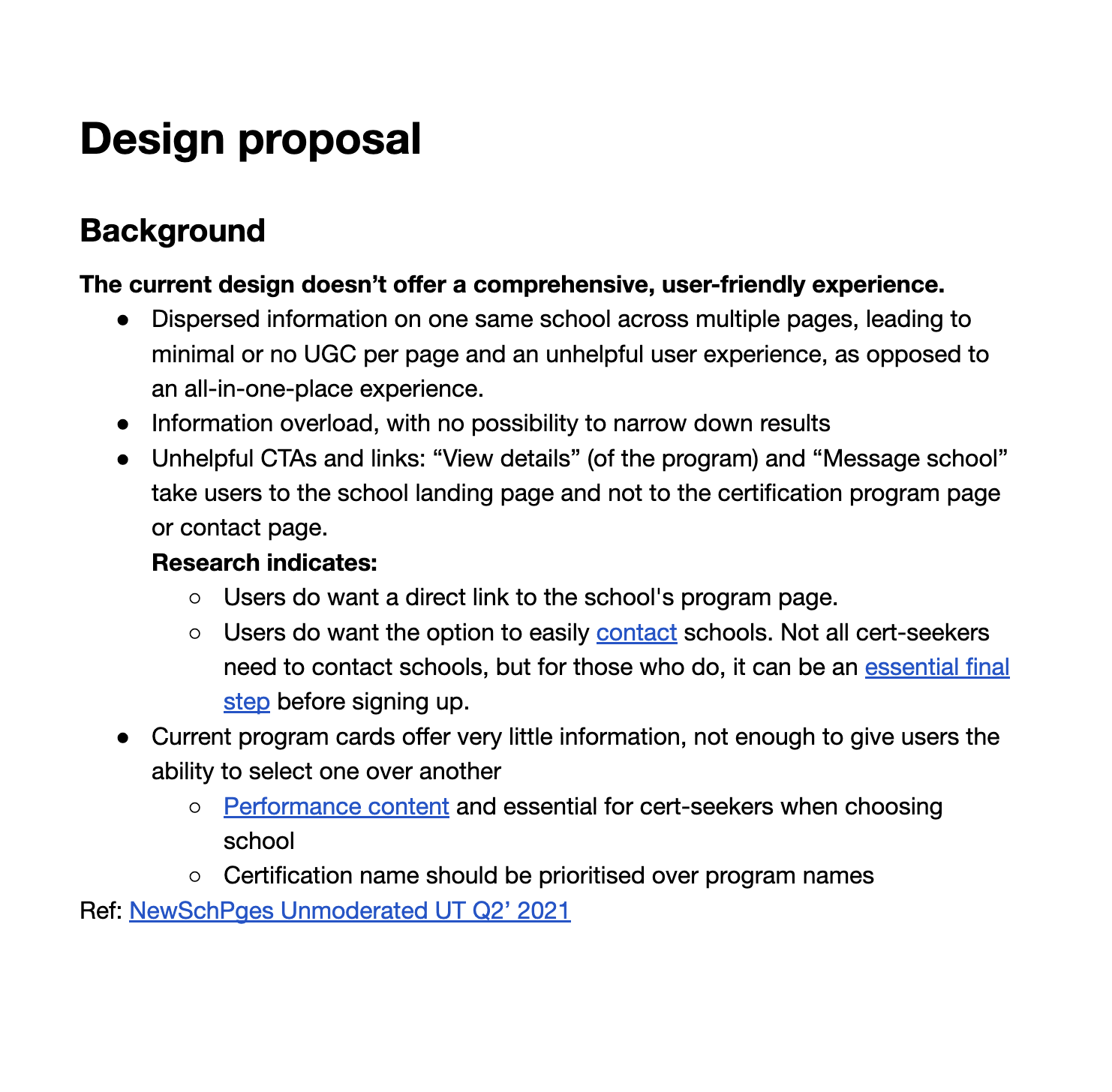
Initiating Design ImprovementsI initiated the design process by analysing user feedback and interaction patterns to identify areas of concern and improvement on the page. Additionally, I synthesised research findings (from Kano and User Tests) to pinpoint specific areas for enhancement on the new school page (see right →)
How Might We (HMW)I started formulating
"How Might We" statements to address my design goals
HMW make the page navigation simple and legible
HMW make the content and data architecture legible and intuitive
How we can best structure or present the canonical school data, location, and their school branches or entitiesHMW help P&G get to what they need to do, in terms of searching for specific training provider, and looking for programs offering a specific certification
HMW structure school page URL, ensure page is searchable and SEO friendly
ProcessBefore commencing the design process, I used "How Might We" statements to establish product design principles to guide me.
These guiding principles have been aligned with the insights and expectations of key product stakeholders, ensuring a harmonious and unified approach to our product development strategy.Throughout every stage of the UX design process, these principles will be closely adhered to, ensuring that my design decisions consistently reflect and uphold our core design ethos.-
Design an intuitive, user-friendly interface that guides user smoothly through their decision-making process.
-
Cultivate user confidence by consistently presenting accurate, current, and reliable information.
-
Enable users to make well-informed decisions by prioritising straightforward and transparent communication, especially regarding costs, program specifics, and certification validity. Additionally, it includes providing detailed, comparative data in an accessible format.
-
Offer continous support and clear instructions throughout the user jorney, from discovery to decision and enrolment.
Adopting a Content-First Strategy
Prioritising content-first design for new school pages
Starting with a content-first design approach enables me to prioritise the organisation and structure of content blocks before addressing visual elements on the new School page. This approach ensures a deep understanding of user needs, derived from our Kano survey, where users expressed a preference for certain content elements. Addressing these needs ensures that the content is considered minimum viable product (MVP) and supports user requirements effectively.By prioritising good content structure and navigability on school pages, users can make well-informed decisions about training providers, offered programs, costs, and certification validity. This ensures transparency and helps users navigate their choices confidently, thereby enhancing the overall user journey.
Ideation Workshop
User-centric design and development strategies
I started with an ideation workshop that brought together key people from Product, SEO, Content, and Research. We focused on understanding specific (cert, license) challenges users faced and agreed on how to streamline their experience. This approach helped us brainstorm potential solutions and aligned our strategies to address user challenges effectively, setting a solid foundation for my design and the next phases of development and optimisation.

Enhancing user experience through iterative design explorations
Aligning with the project timeline, I fast-tracked the development of high-fidelity concept designs. I established a feedback system to quickly share visual concepts and gather input from stakeholders for better alignment. Utilising insights from user testing and initial ideas from our ideation phase, I engaged in a continuous cycle of iteration on the design of the new school pages.

This iterative method led to multiple iterations of the new school page, each aimed at enhancing the user experience.


While developing design concepts, I not only adhered to Indeed’s design style guide and system but also actively contributed to innovation within our framework.
A notable contribution was the development of program cards for providers on Indeed education. I worked closely with Design System advocates to create functional cards components that align with our user experience goals. This involved careful consideration of layout, typography, and interactive elements to ensure that the program cards effectively communicate key information while maintaining a consistent look and feel with the broader Indeed design system.This approach guarantees consistency and harmony across our offerings, facilitating a seamless and intuitive user experience on Indeed Education. My involvement in this project not only enhanced the usability of Indeed Education but also contributed to the continuous improvement and expansion of the Indeed design system.


Final Design
Through stakeholder input and iterative refinement, we achieved a school page design we're confident in, while navigating data availability challenges
Leveraging feedback from key stakeholders, I consistently refined and enhanced the design of the new School page through an iterative process. This approach culminated in a final design that has garnered collective confidence, particularly with the content currently accessible, as the School data team is actively gathering additional data for display. However, we had to make the tough decision to deprioritise data that was unavailable or challenging to obtain at this juncture.Progressing from the initial stages, I moved on to develop a Figma prototype, culminating in the delivery of a final high-fidelity prototype.
This prototype is now ready for user testing, allowing us to collect immediate feedback (see below ↓)You may press 'F' on your keyboard or click the maximise icon at the top right of the frame below to switch to full-screen mode for an enhanced view. If you need to reset the user flow at any point, simply press 'R'. Feel free to explore and interact with the prototype.User Testing
Assessing overall usability and comprehension of proposed new school pages design
After completing the interactive prototype, I spearheaded the user testing phase, essential for gathering firsthand feedback. This part of the process was instrumental in honing the design, as it allowed me to adapt based on user feedback and insights. This ensured that the final product is tailored to meet our users' needs, equipping them with the information necessary to make informed decisions and navigate their options with confidence.

Furthermore, insights from this research will guide the continuous redesign of not just the school pages, but also the Education Marketplace (SERP) and data collection methods.The goal of the study was to:
Assess overall usability and comprehension of the new school pages, in the context of arriving from SEO (or generally coming across the page).
Understand how users look for and want to see school information
Compare usability and findability of information between the new MVP and the current school pages
Identify other potential usability issues or improvements
Who we recruited
We recruited 9 US, Connecticut-based job seekers on Indeed that has either i) gotten a CPR certification for work-related reason within the last 6 months (Group A) or ii) does not have a CPR certification (Group B).
Both groups primarily use a smartphone to look for jobs and are currently in the workforce (any type of employment).
All findings in this report are common across at least of the two criteria groups.
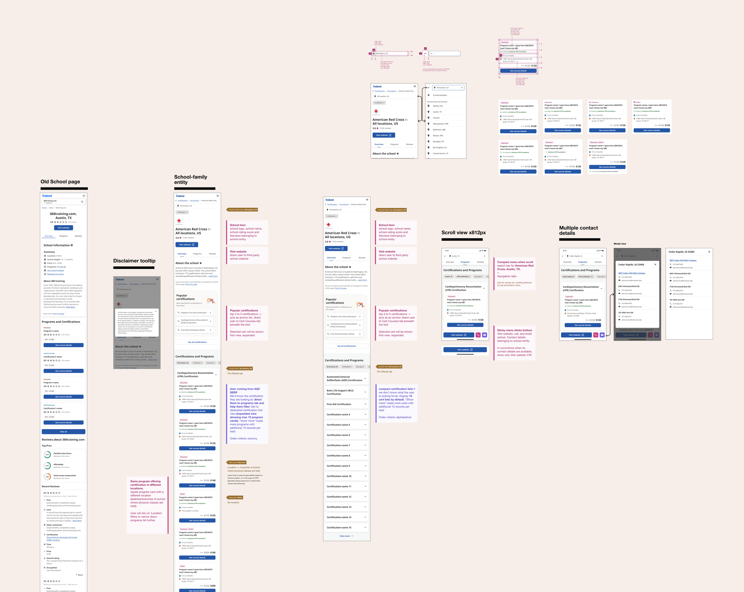
Final Design
Translating insights into further design opportunities for new school pages
Following an exhaustive analysis of feedback from user testing and additional insights, we have developed a series of strategic proposals for the redesign of the new school pages. These proposals aim to enhance user experience and address identified needs. They include:New tab structure & information architecture
3 tabs in the structure of Programs, Reviews and About (with Programs as the default/ primary navigation) Programs tab as the default or primary tab, providing a comprehensive overview of available educational programs.
Reviews tab offering insights and feedback from current and former students about their experiences.
About tab will feature "About the School" content, including an overview of the institution, its history, mission, and values. Additionally, it will provide detailed contact information and a list of local branches, ensuring users have access to comprehensive and relevant information about the school.
Filtering on Programs tab
Enable users to filter programs by certification/license and location (online or specific city/state). There's also the potential to incorporate additional filtering options in the future, such as price, duration, and class type, to further tailor the search experience to individual needs.Contact details in one place
Users will benefit from a more engaging and accessible way to connect with schools through a sticky banner, making contact information more visible and easy to access. For calls and emails, the expected behaviour is a direct dial or an automatic opening of the user's email client, respectively, with a confirmation dialog for added user convenience and confirmation.
In cases where a school has multiple local branches with various contact details, a "Contact" call-to-action (CTA) will be available. Clicking this CTA will open a modal displaying the detailed contact information for each branch, including phone numbers, email addresses, and physical locations.
CTAs will be displayed only when the relevant contact information is available, ensuring a streamlined user experience by providing accurate and actionable contact options.
Comprehensive program cards that link to program detail page
Program cards will be designed to provide a more detailed overview of the programs when information is available, including:Program name: The specific name of the program offered.
Class type: Indicating whether the program is On-site, Online, or Hybrid to suit different learning preferences.
Accreditation: Information on whether the program is accredited, ensuring quality and recognition.
Duration: How long the program will take to complete, providing clarity on time commitment.
Address: When applicable, the physical location of the program for on-site or hybrid options.
Price: The cost of the program, making financial planning easier for prospective students.
Impact
We successfully launched and enhanced the design of the new school pages, incorporating richer SEO content.
This upgrade led to a 14% increase in EnrollStarts* per provider page view, driven by the introduction of new data and improved display.
*EnrollStarts refers to users navigating to the provider's website for more information about a program.
