99 Brand &
Design System
Project
99.co — One Brand, One ExperienceMy contribution
As the Design Manager/Lead at 99.co, I led the development of a comprehensive brand and centralised design system, a significant milestone for the company.

This system, which includes brand identity and design guidelines, establishes consistency and quality standards across all touch points, from product to marketing. By focusing on user needs over pixel-level details, the design system has improved efficiency for designers and engineers. It has also fostered a unified design language, reducing user confusion and promoting collaboration and productivity among teams and departments.
Skills/ Expertise
Brand Strategy, Brand Creation (Visual Identity System, Communications Strategy), Design Systems, UX/UI Guidelines, UX Strategy, Design Thinking, User Experience Design, User ResearchTimeline/ Duration
Jan 2016 to Mar 2017
Tool
Photoshop, Illustrator, After Effects, Sketch, Invision, Zeplin, Miro
99.co Singapore faced significant challenges in user engagement and brand identity
When the market is crowded with similar offerings, it can be difficult to grab attention. 99.co, a property listing website, was confident in the strength of their product — but nobody seemed to be listening.Despite being operational, we struggled to maintain consistent user interest and lacked a unified visual identity in a highly competitive market. The absence of a cohesive brand identity led to fragmented design efforts, with each product team operating independently and without a standardised design system. This lack of consistency across the platform hindered user experience and posed obstacles to effective marketing efforts.As part of 99.co’s ramp-up toward a full-scale launch, I spearheaded a comprehensive rebranding exercise.
As the Design Manager/ Lead, I recognised the urgent need to address these issues and devised a comprehensive strategy to align the Marketing and Product Design teams under a unified vision. By translating a technical list of features into a relatable suite of benefits, we changed the conversation.Overview
Expressions of our brand
system
Logo
Colour
Graphic
Motion
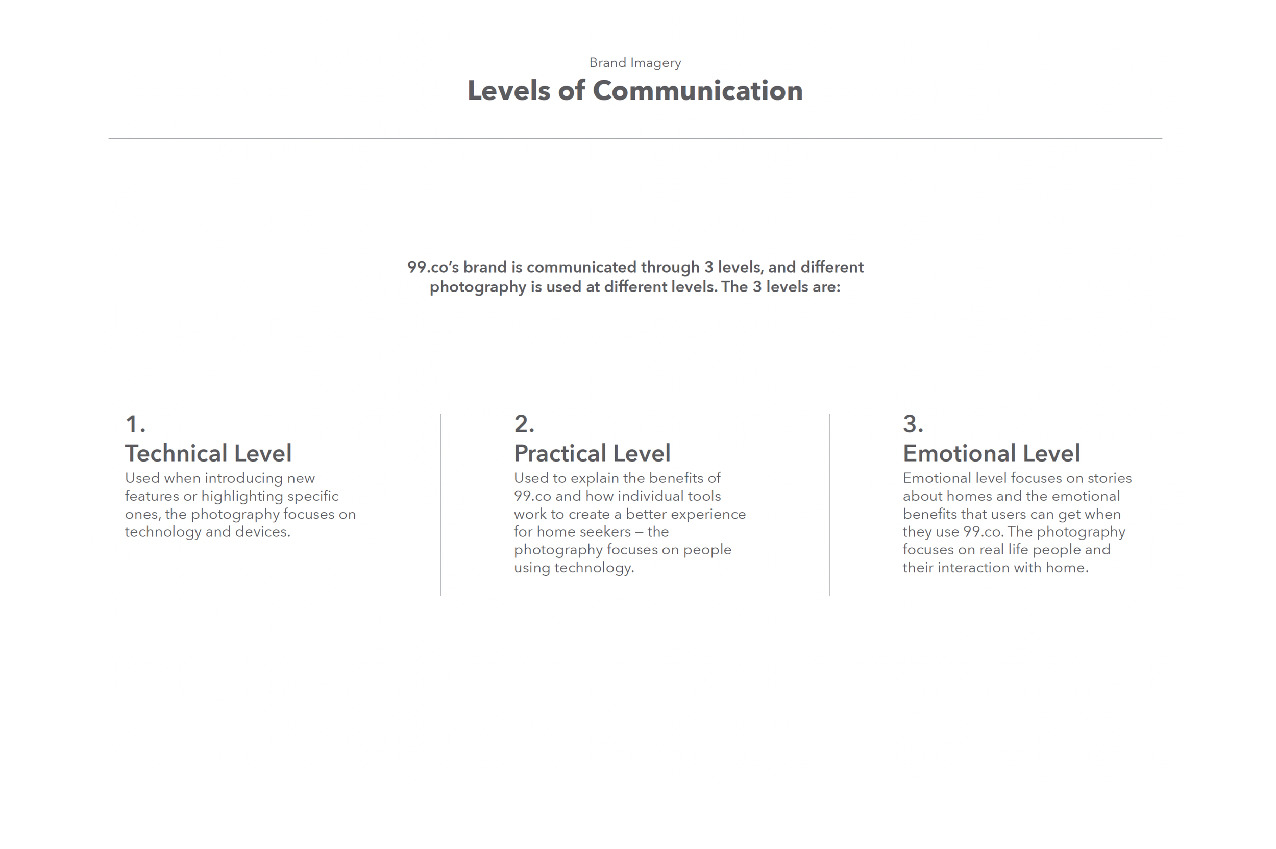
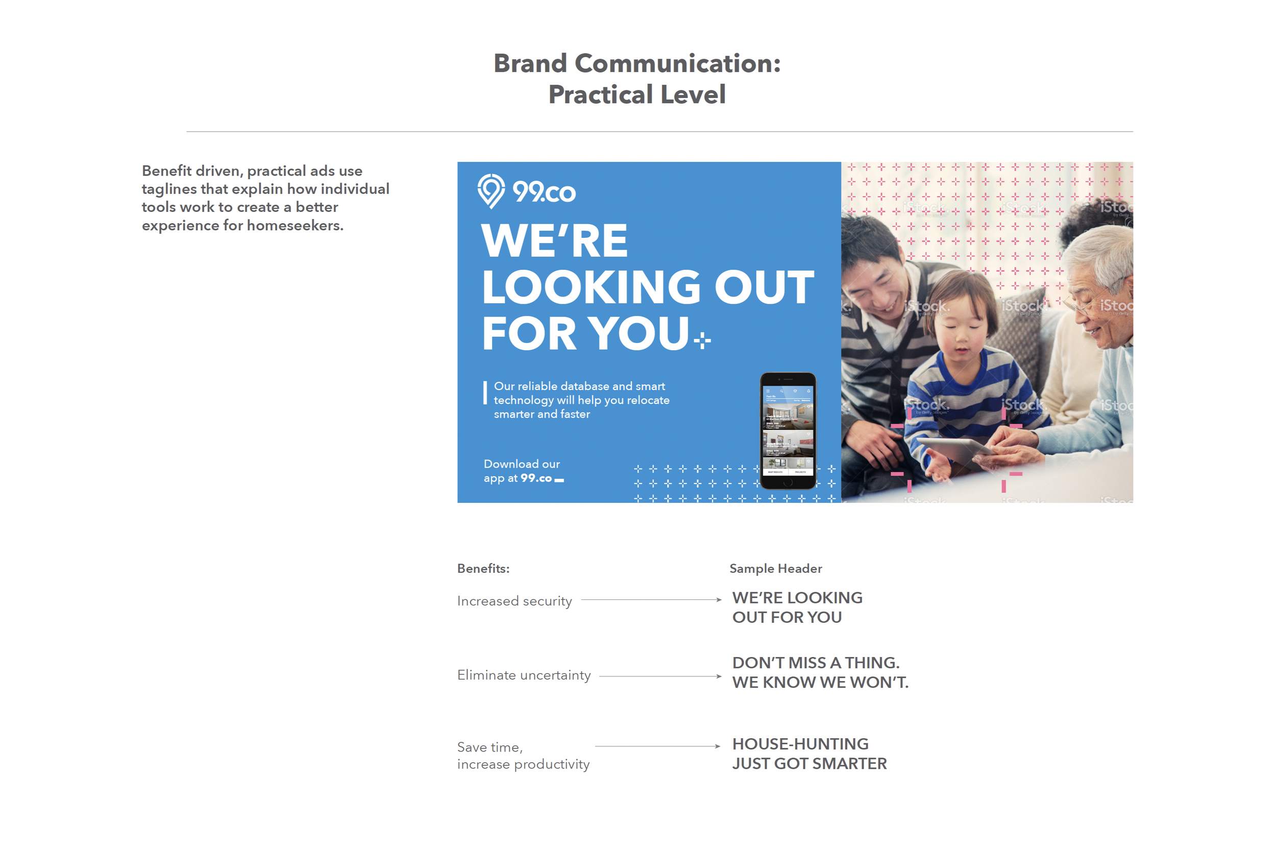
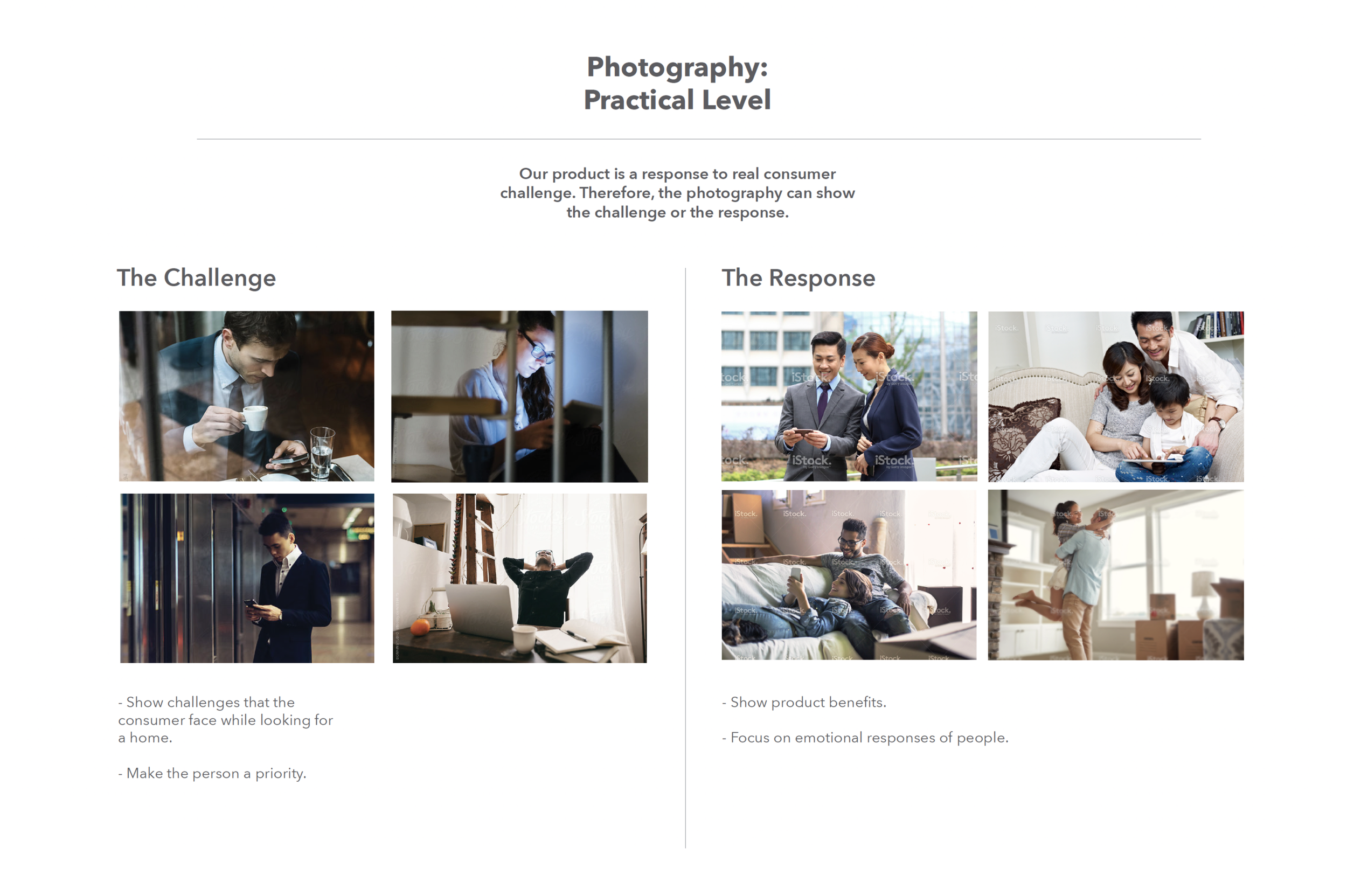
Photography
Typography
Writing
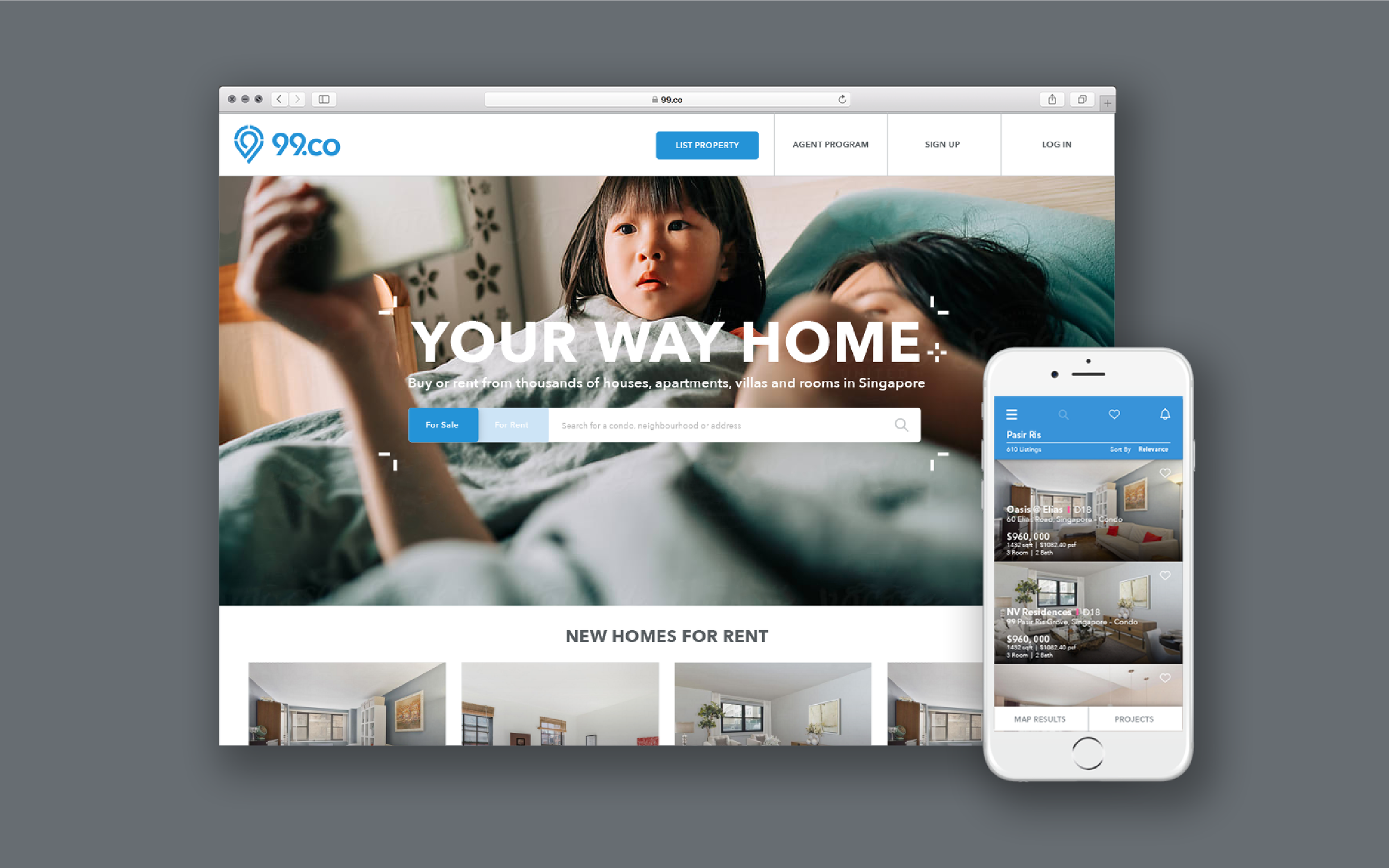
Through our first brand identity initiative, Project 99, our aim is to modernise the visual design across all aspects of 99.co's products and marketing efforts. This includes refining our logo, colour palette, and typography to ensure a consistent and distinctive impression at every touchpoint. By elevating our identity, we aim to enhance consistency, quality, and accessibility across the platform, fostering trust and creating a memorable brand experience for our users.One Brand, One Experience
99.co’s first ever brand identity initiative
In 2016, I spearheaded an internal workshop with key stakeholders, including our CEO, COO, Marketing and Product partners, to launch 99.co's first brand identity initiative. This strategic endeavour is pivotal in reshaping 99.co's visual identity to align with our brand story and company mission.

Through collaborative efforts with UX, Product, Marketing, and Engineering teams, we've successfully tested various elements of our brand expressions and obtained approval to implement them across the 99.co platform.

Brand Audit
We lack visual consistency
Product

Marketing

Design: Visual/Content
In my capacity as a creative leader and designer, I led the brand system team charged with defining our core identity and ensuring a cohesive brand presence across our product experience
This effort necessitated close collaboration across departments to guarantee a unified and cohesive brand presence across our entire platform. Our long-term strategic focus is on enhancing the quality and craftsmanship of our design across both visual and content experiences.Key initiatives include:Logo DevelopmentIdentity System (UX/Marketing)Brand Expression GuidelinesContent Guidelines
A one-year journey
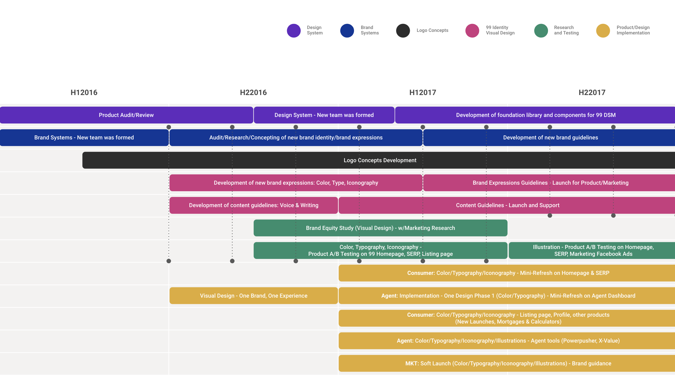
Three types of brand
Brand systems (Foundation)
Establishing an identity framework that guides both visual and written design. By enforcing consistency and quality standards across all touchpoints, from product to marketing, these elements collectively form the essence of our brand DNA.Branding (Expression)
The act of expressing this brand identity through our products and services. Each 99-er contributes to building this experience, whether it’s guiding users through the interactions within a product to capturing the intimate stories of our users through advertising. Brand (Identity)
These moments culminate to form our brand story, shaping the perception of our company identity as a unified entity. Each interaction is an opportunity to convey the essence of 99.co and its significance to our users.Workshop Recap
I spearheaded the process through workshops, closely collaborating with our senior leadership, marketing, and product partners.
My initial focus was on gaining insights into how our key stakeholders perceive our brand and determining what 99.co should represent to our consumers. Examples of activities included:

Brand perception exercise
Stakeholders were engaged in activities to understand their current perceptions of 99.co's brand, strengths, weaknesses, and areas for improvement.Vision and values alignment
Facilitating discussions to align on the core values and vision that should guide 99.co's brand identity.Brand positioning exercise
Defining 99.co's unique value proposition and positioning in the market relative to competitors.Brand archetype exploration
Participants identify and discuss various brand archetypes (e.g., hero, advisor, trend-setter) that align with the brand's personality and values, helping to define its character.Visual mood board creation
Participants curate images, colors, and visual elements that evoke the desired brand aesthetic and personality, providing inspiration for future design and marketing efforts.Customer journey mapping
Collaborating to map out the customer journey and identify touchpoints where brand expression is crucial.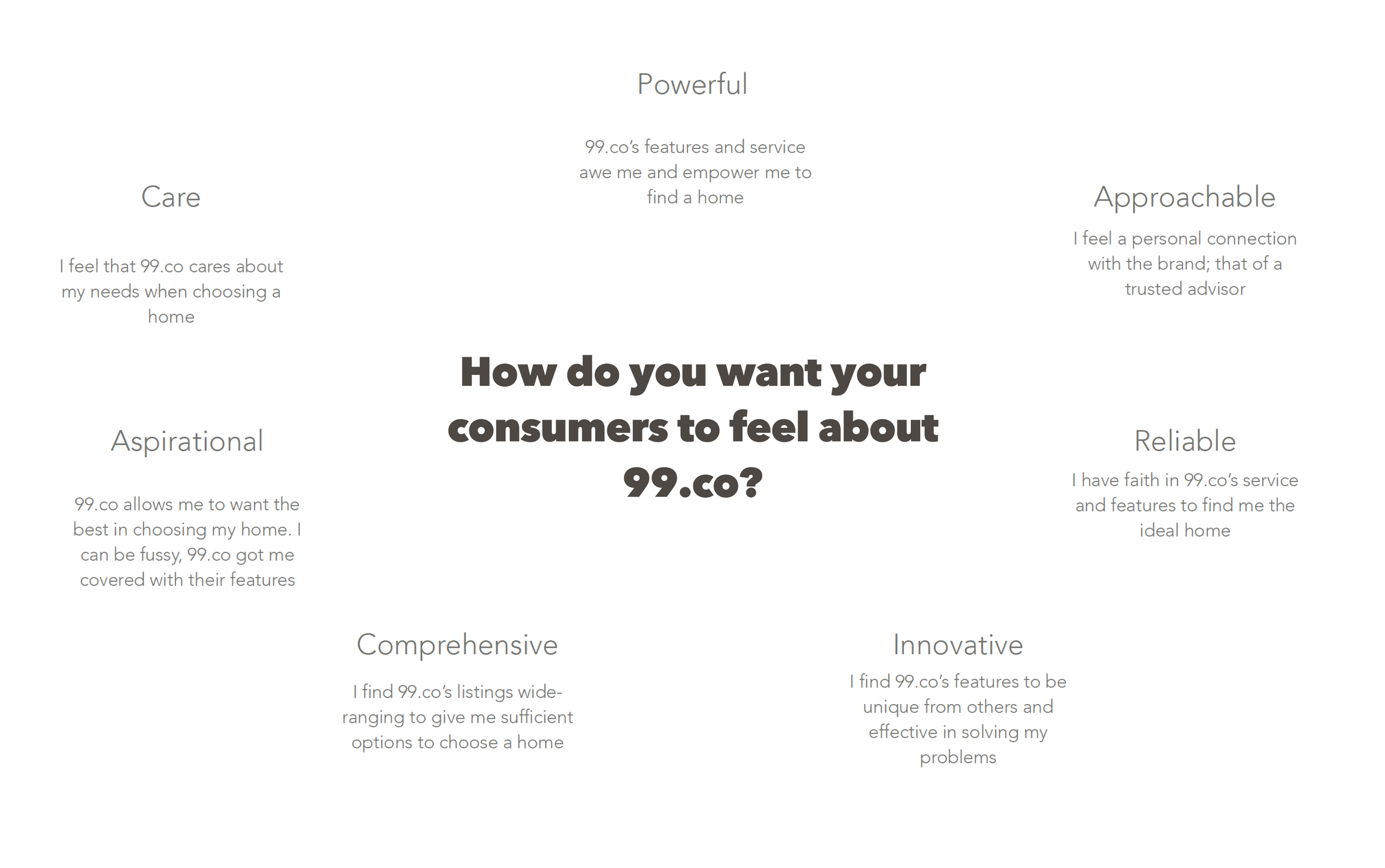


Through these workshops,
We were able to gain valuable insights, align our vision and values, and lay the foundation for a strong and consistent brand identity for 99.co
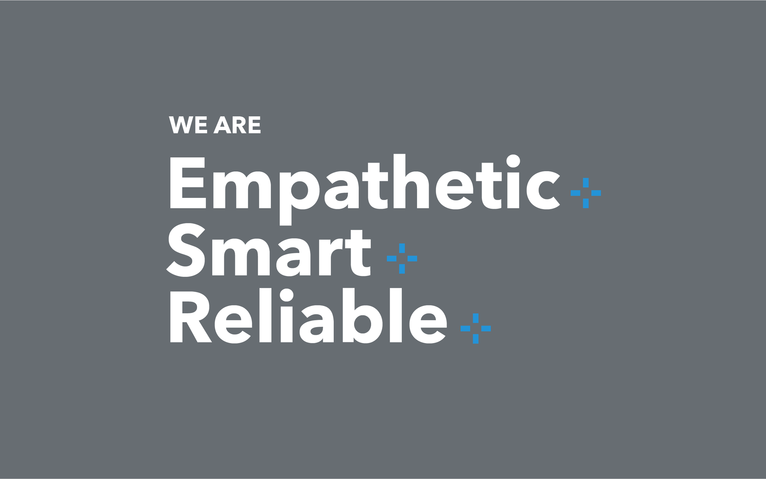
After completing workshops and exercises, and aligning on vision and values with key stakeholders, the brand system team at 99.co embarked on developing the brand identity. This involved translating the agreed-upon vision and values into tangible visual and messaging elements that would resonate with the target audience.
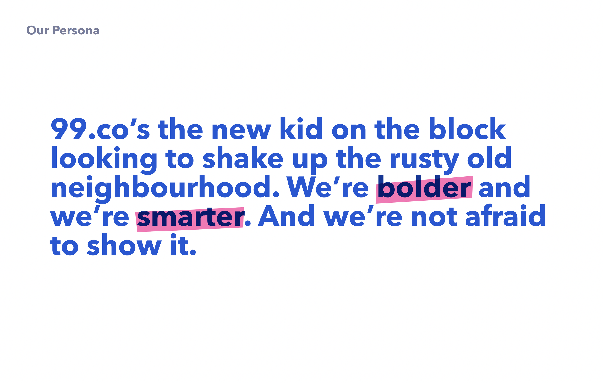
As the leader of the team, I guided our efforts in defining the brand's visual identity, including its logo, color palette, typography, and other visual elements. We also focused on developing a messaging strategy that would effectively communicate the brand's values and positioning. Throughout this process, our priority was to ensure that the brand identity was cohesive, flexible, and aligned with 99.co's overall brand strategy.99.co cares about connecting people with their home
We use the latest technology to create a smart home search experience. Equipped with easy to use functionality and data at your fingertips, we save you valuable time. Creating a system that rewards the most trustworthy agents and ensuring that no agent can pay their way to the top of our rankings, you can be sure that you’re making the best home decision for you.

Recognising that agents are an integral part of the system, we provide them with tools to be more efficient and effective in their service of the consumer. We value and reward rich listings and real information, delivering agents more qualified leads, and provide powerful tools to help them close those deals faster.
Brand Tagline
Brand Values

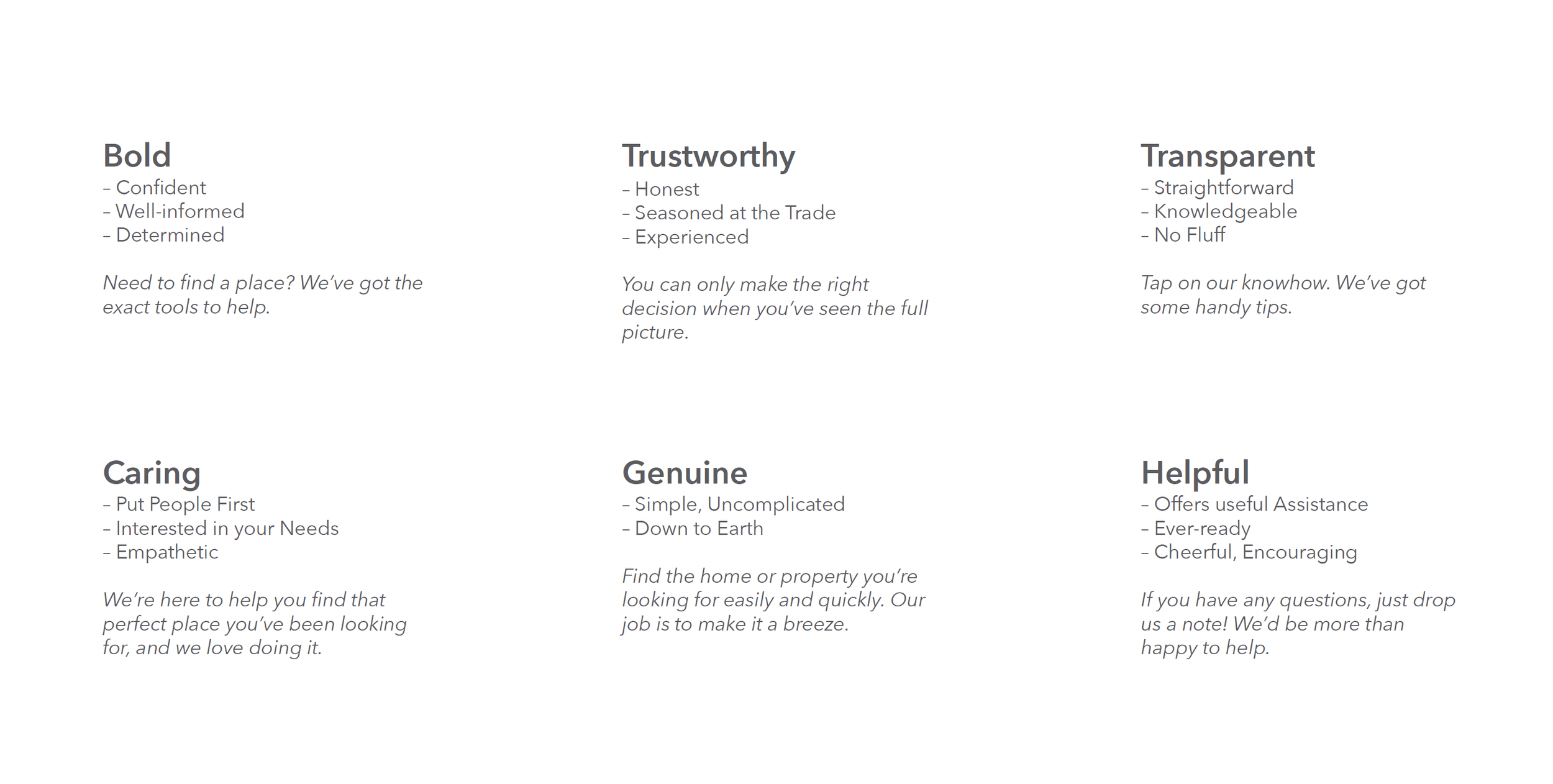
Tone of Voice
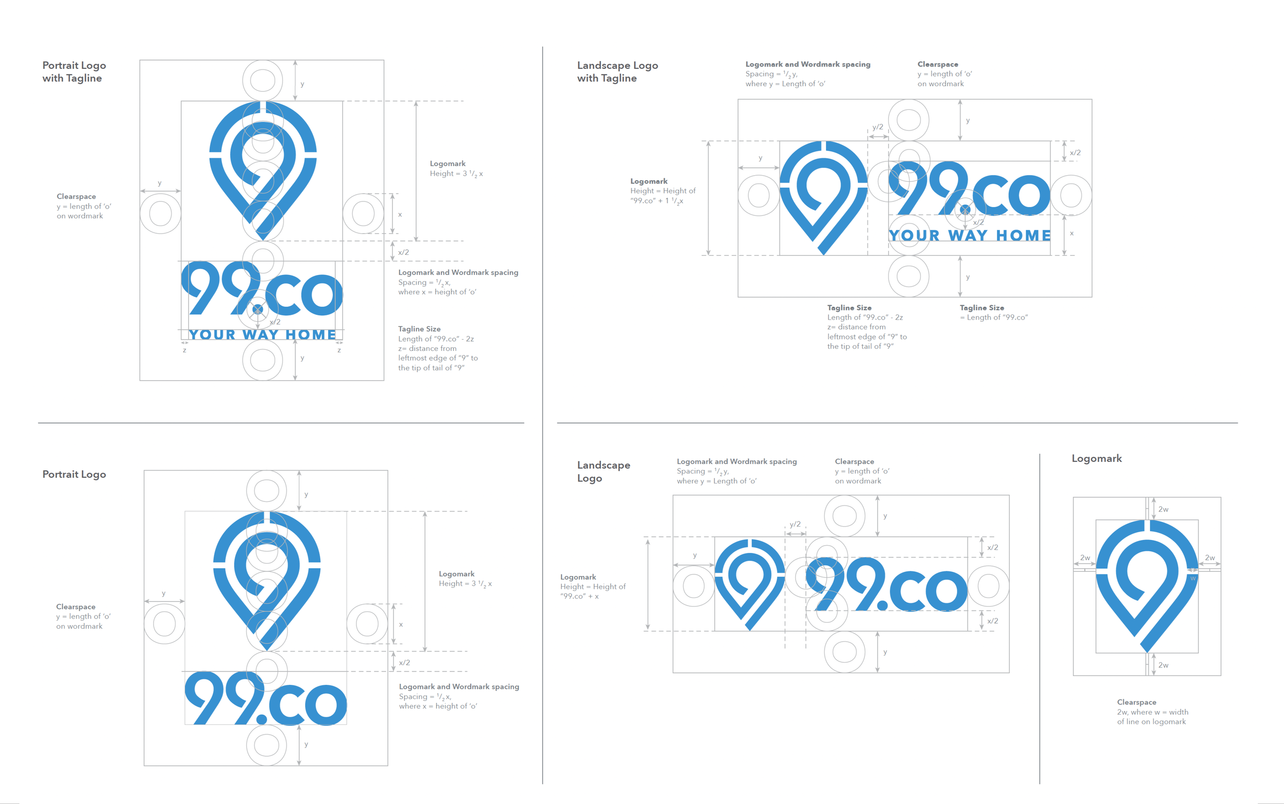
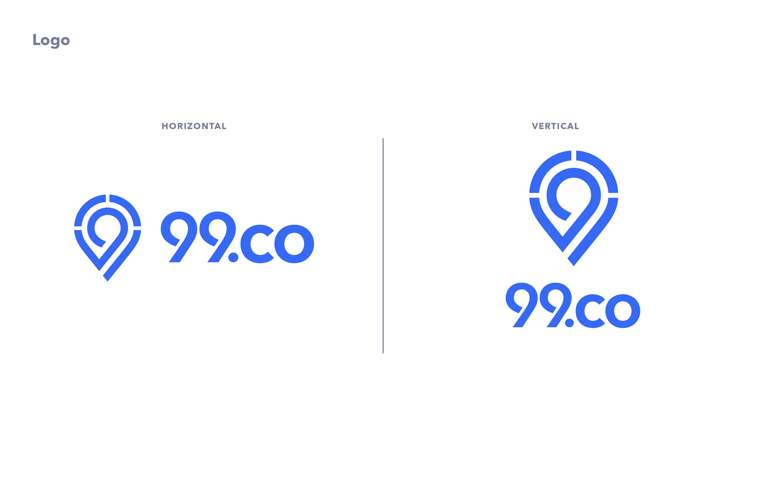
Logo

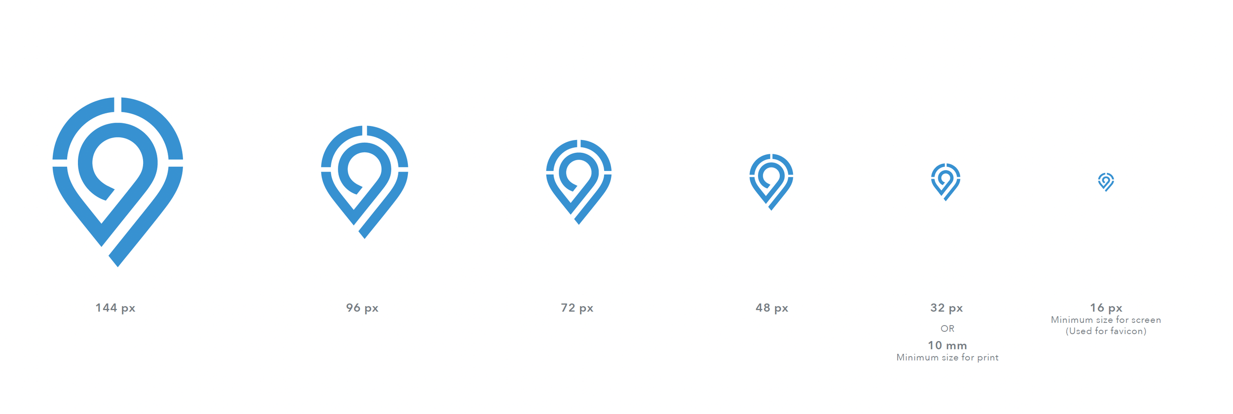
Sizes & Configuration
Logomark


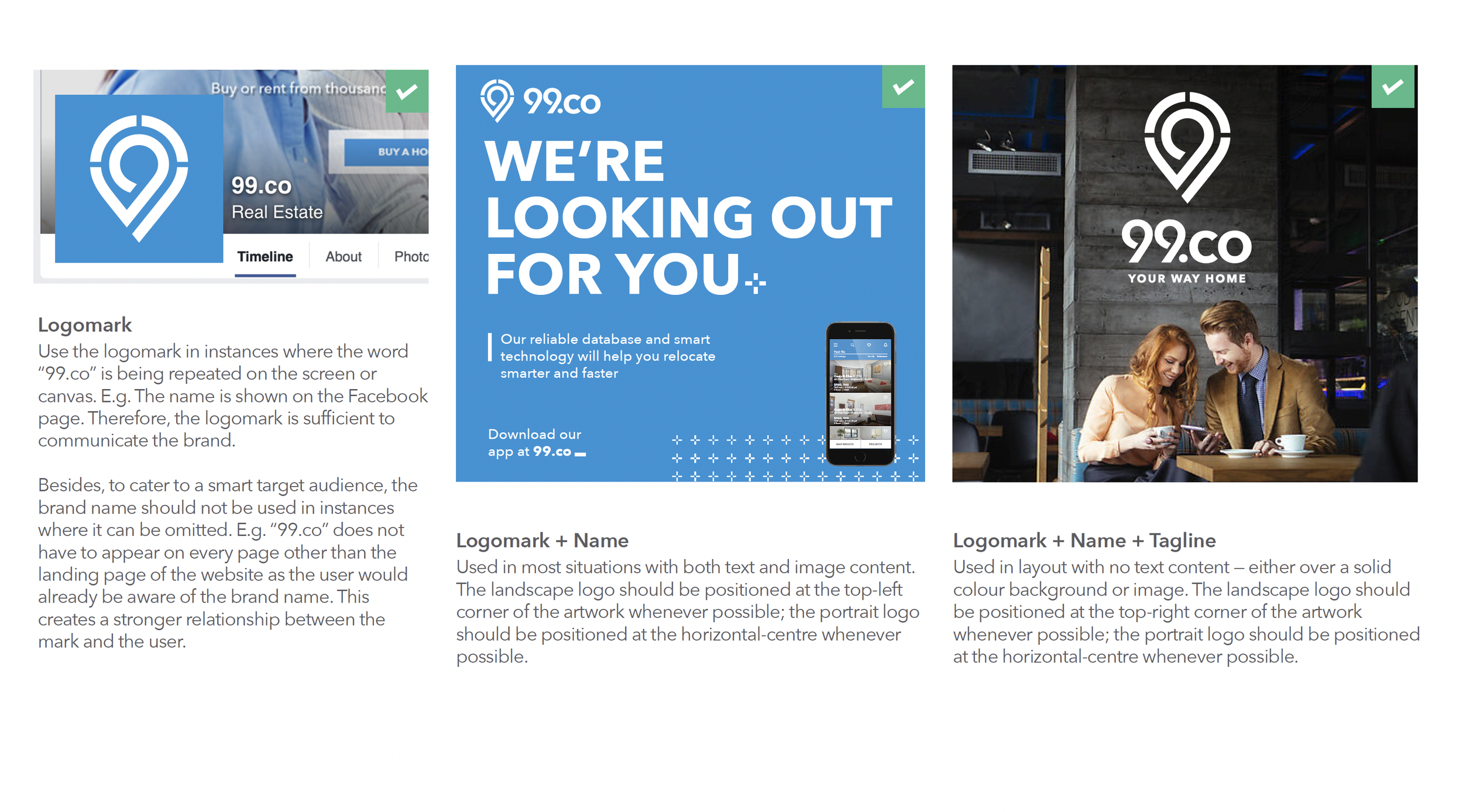
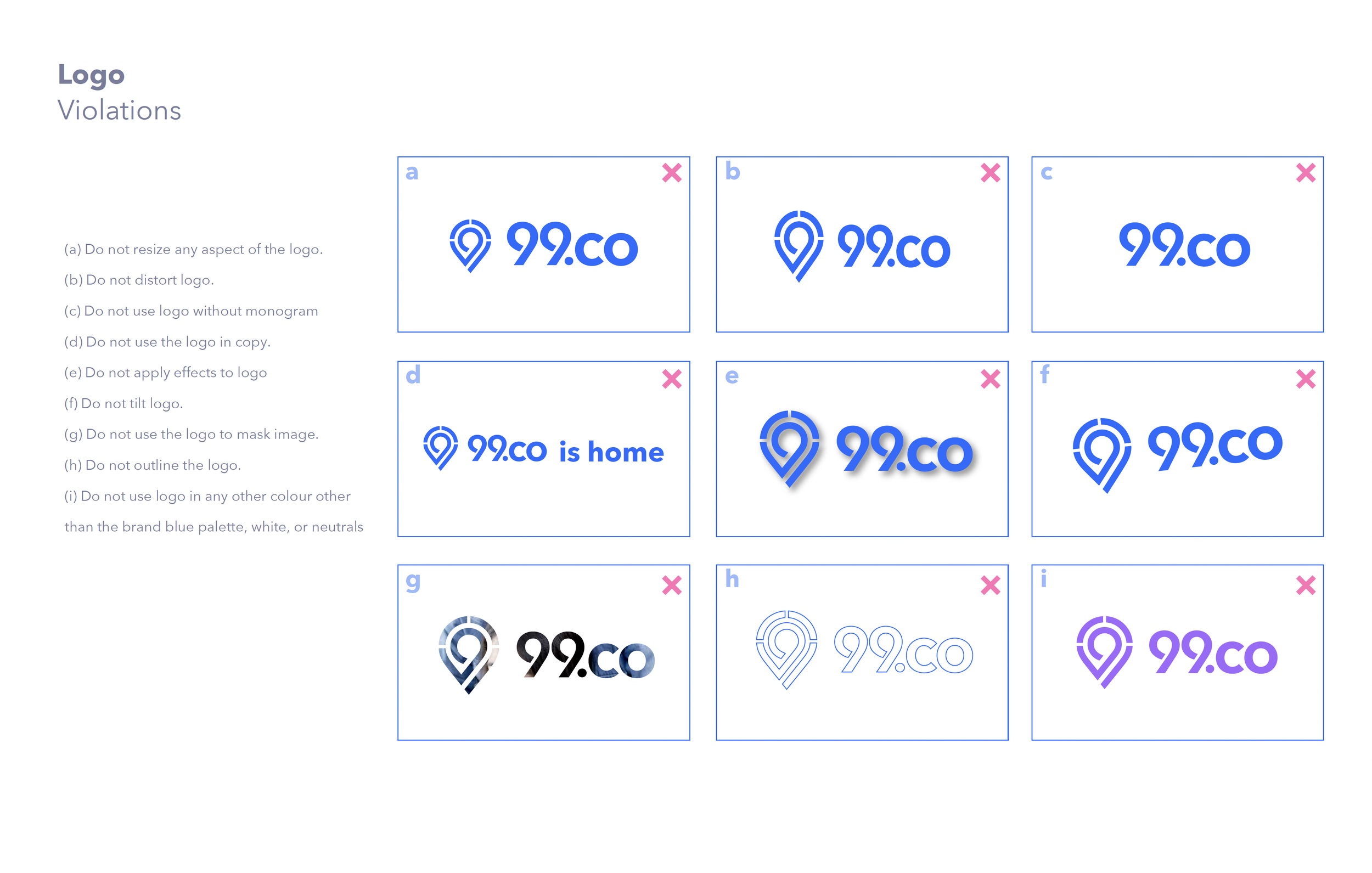
Logo Usage (Do’s & Don’ts)


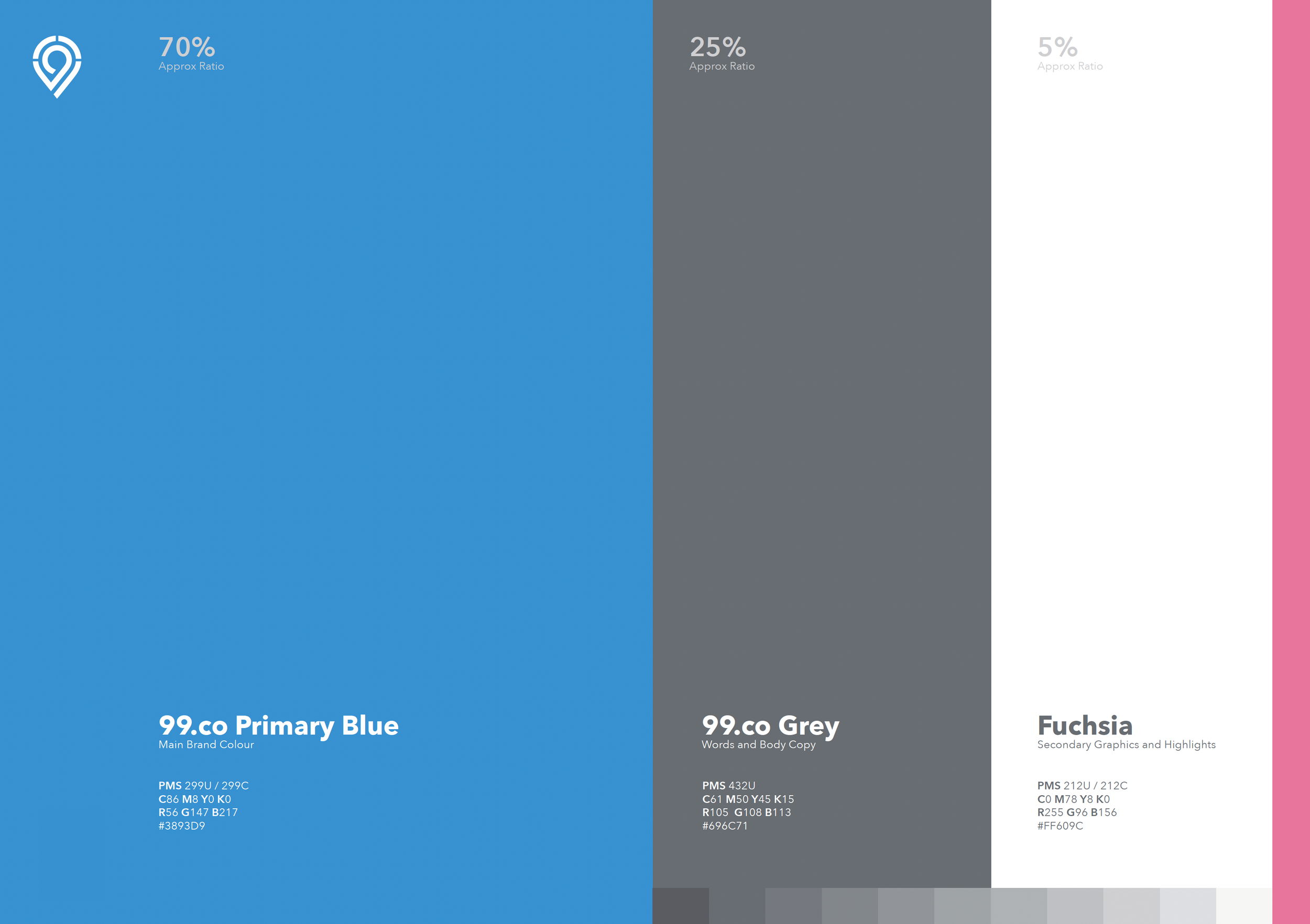
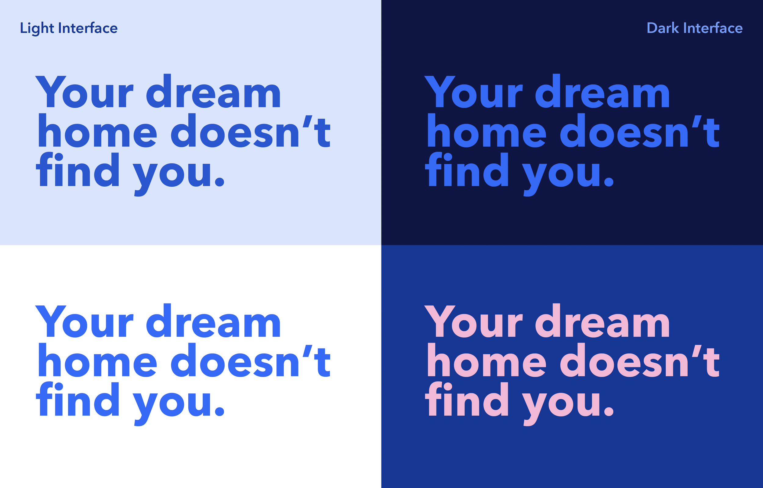
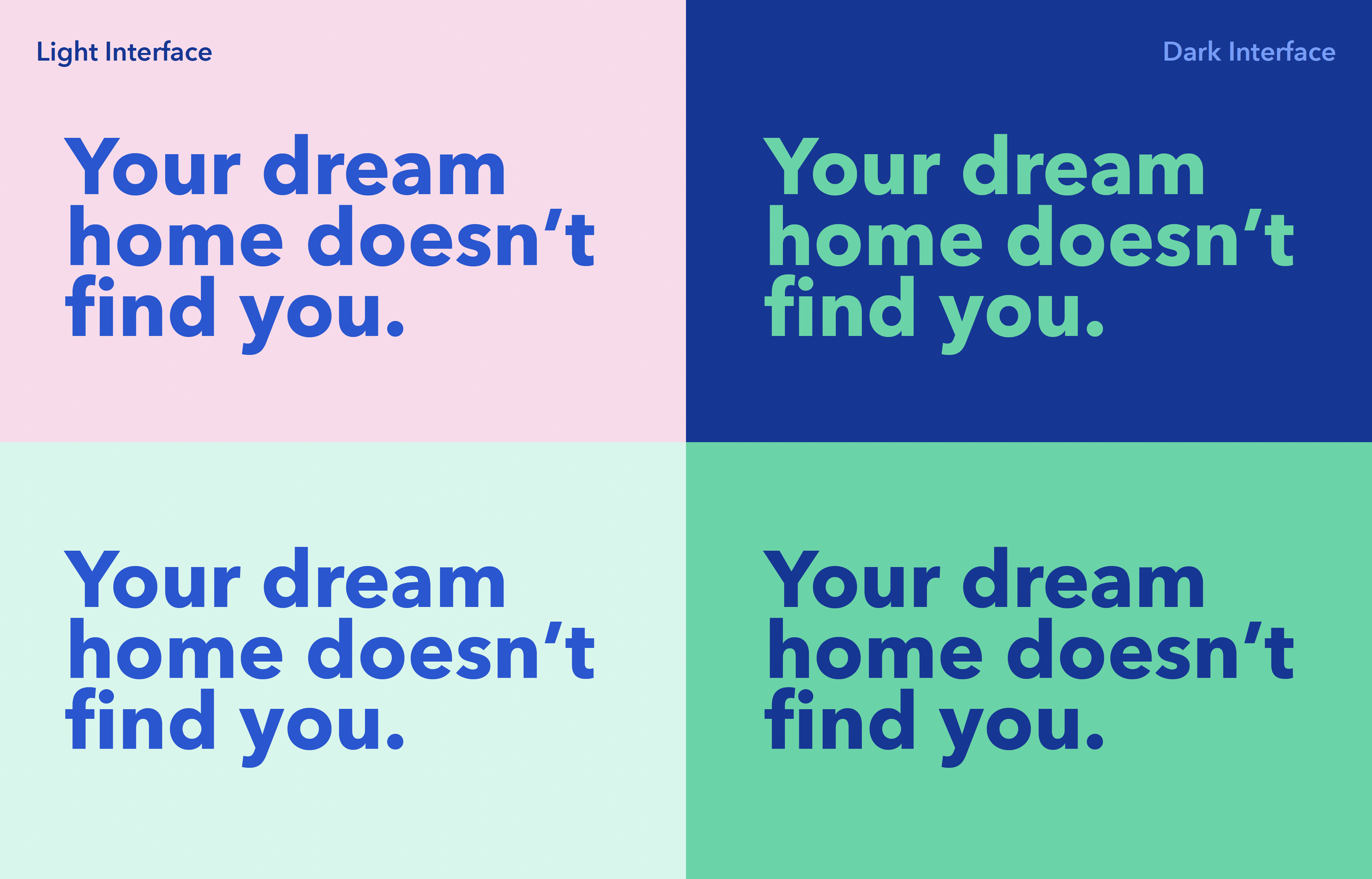
Colour
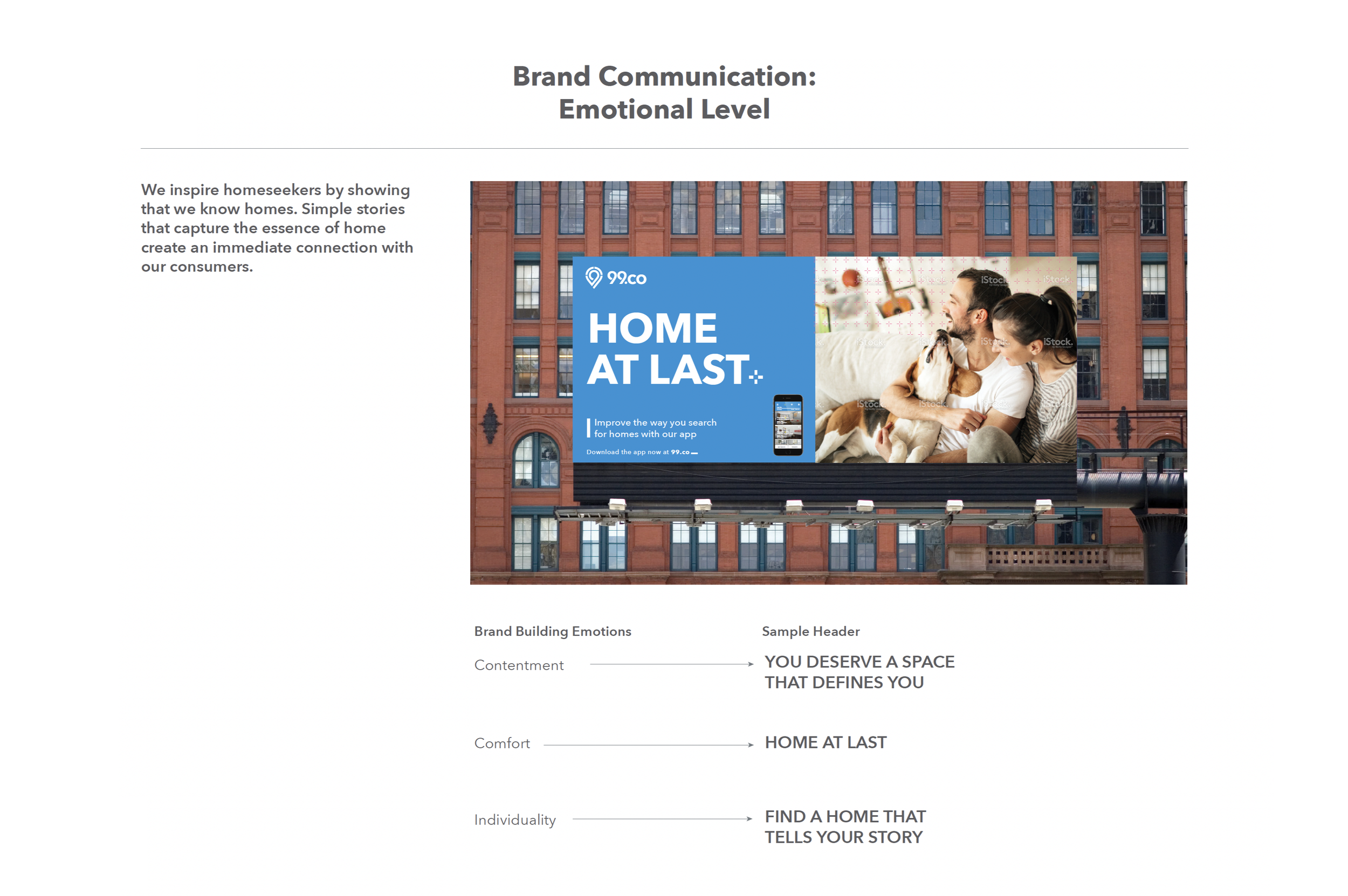
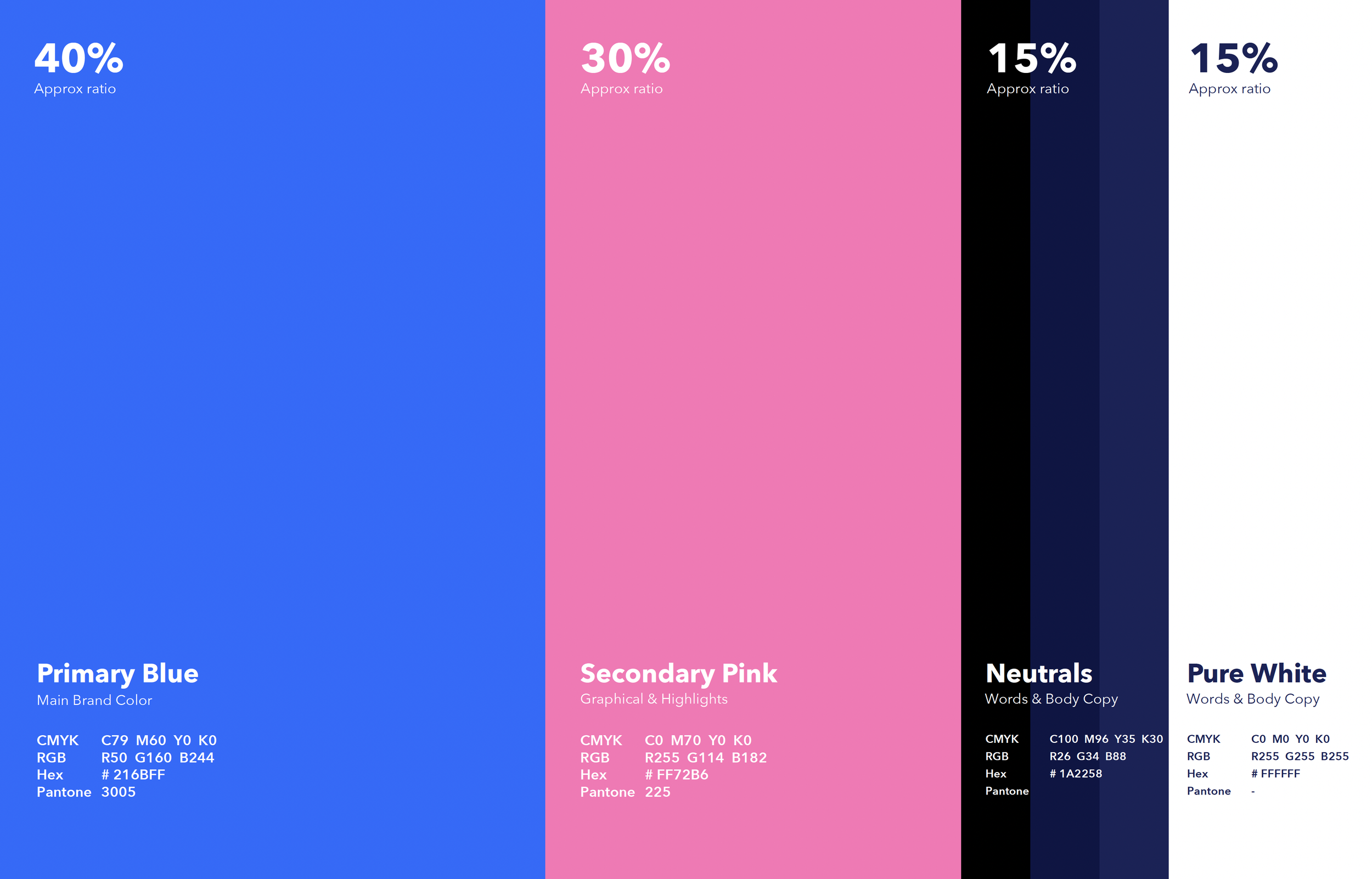
Brand values visualised in an alluring and harmonious palette.


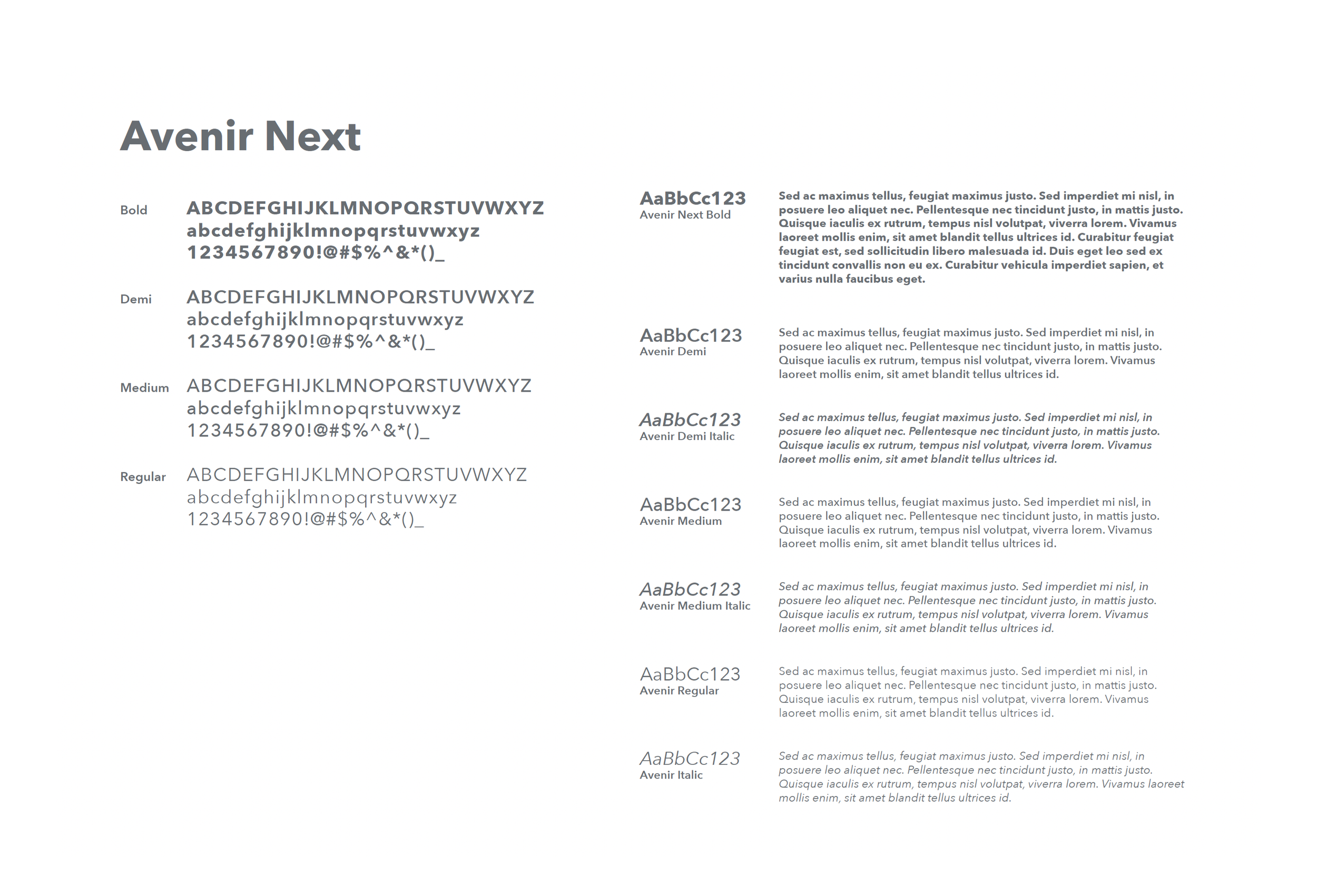
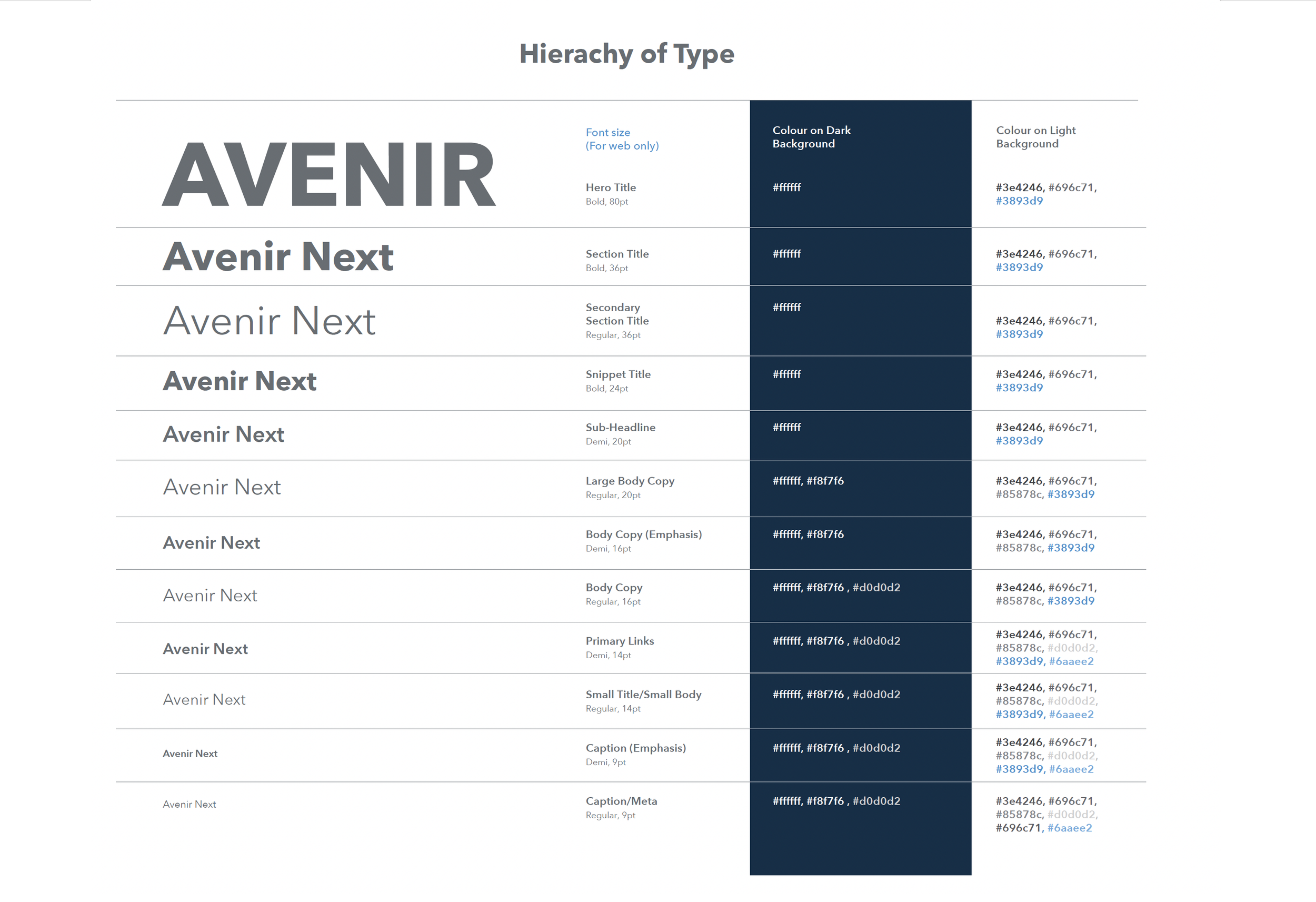
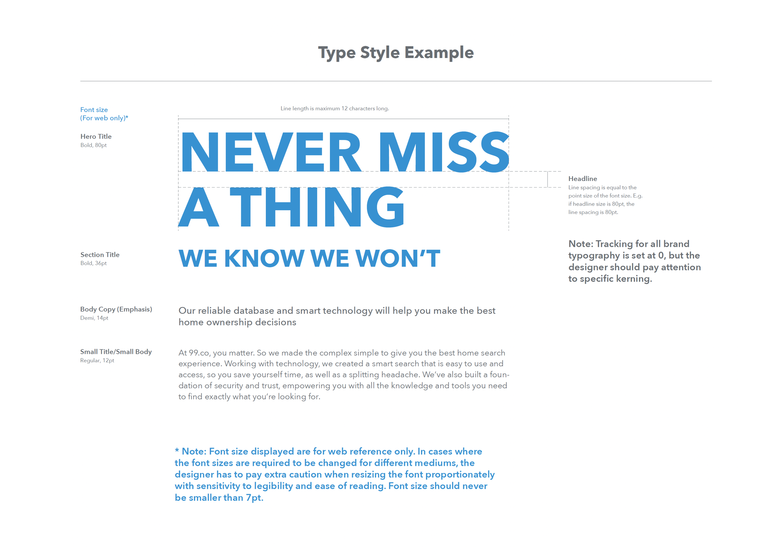
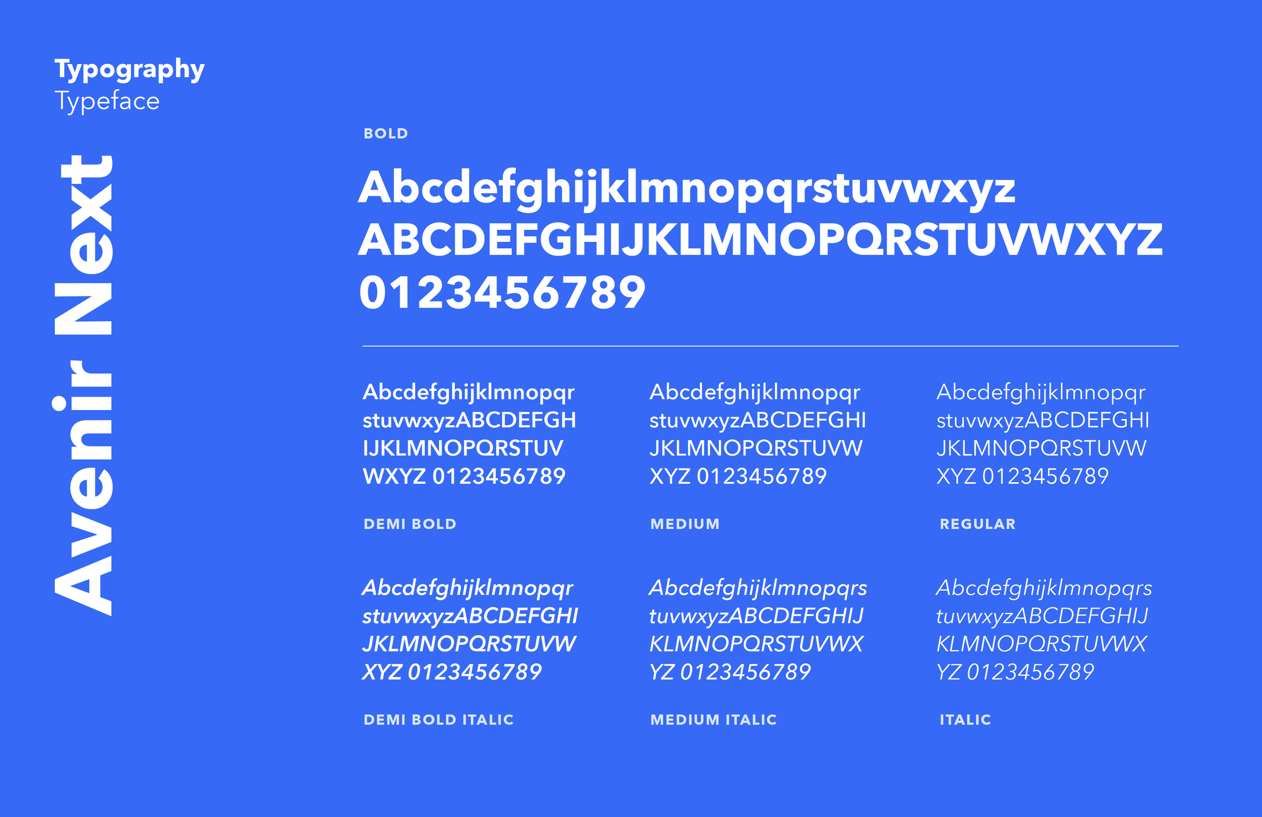
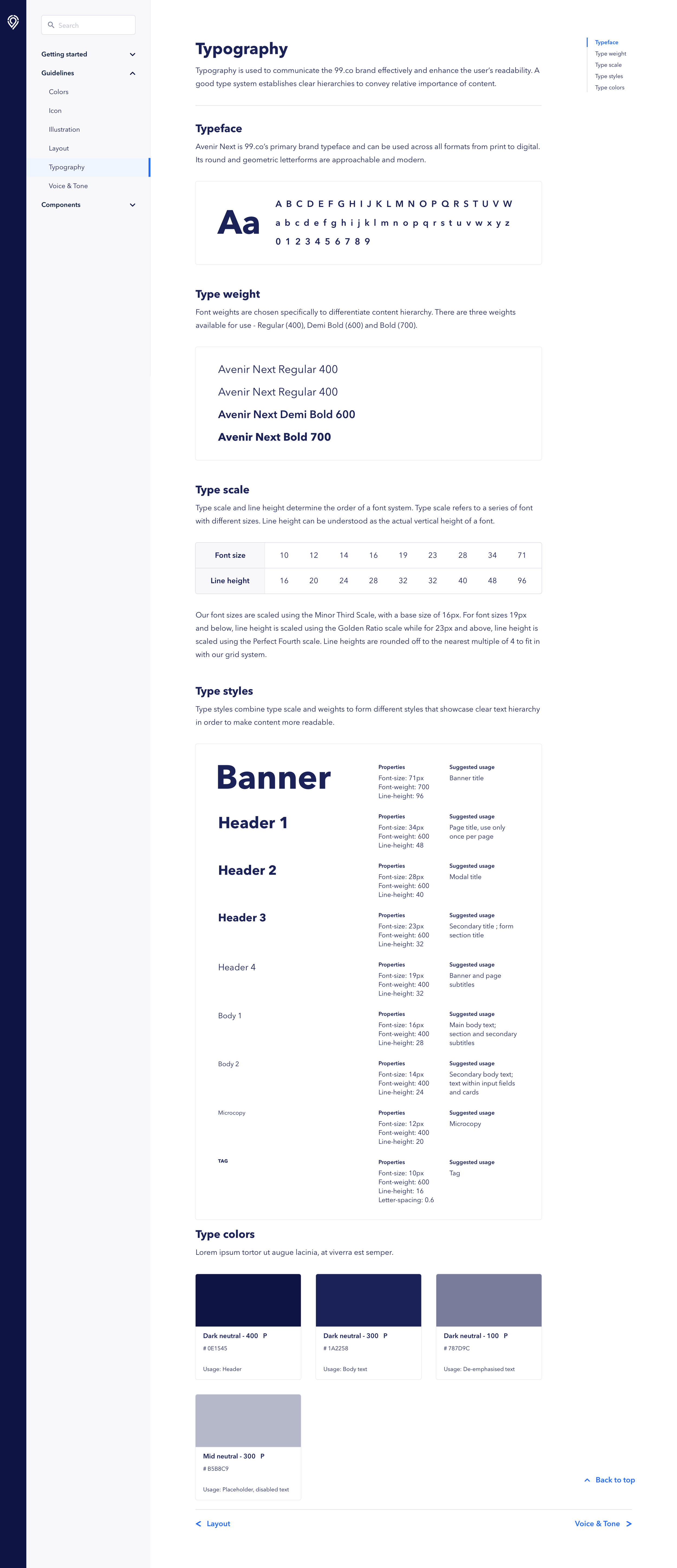
Typography
Communicate the brand values clearly and beautifully through words.
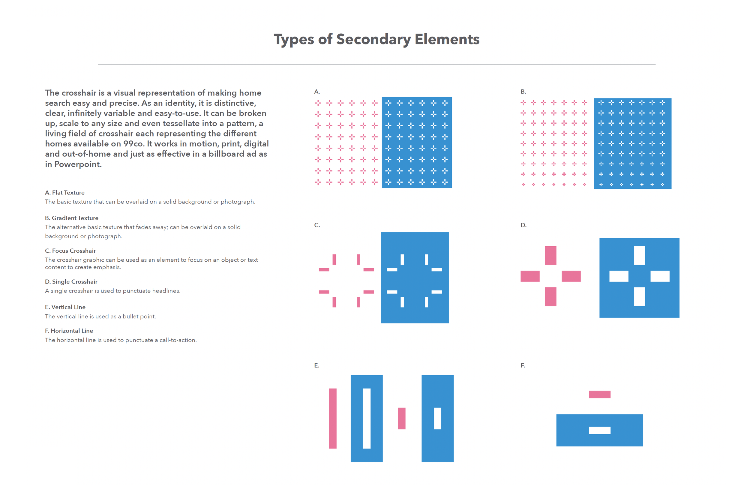
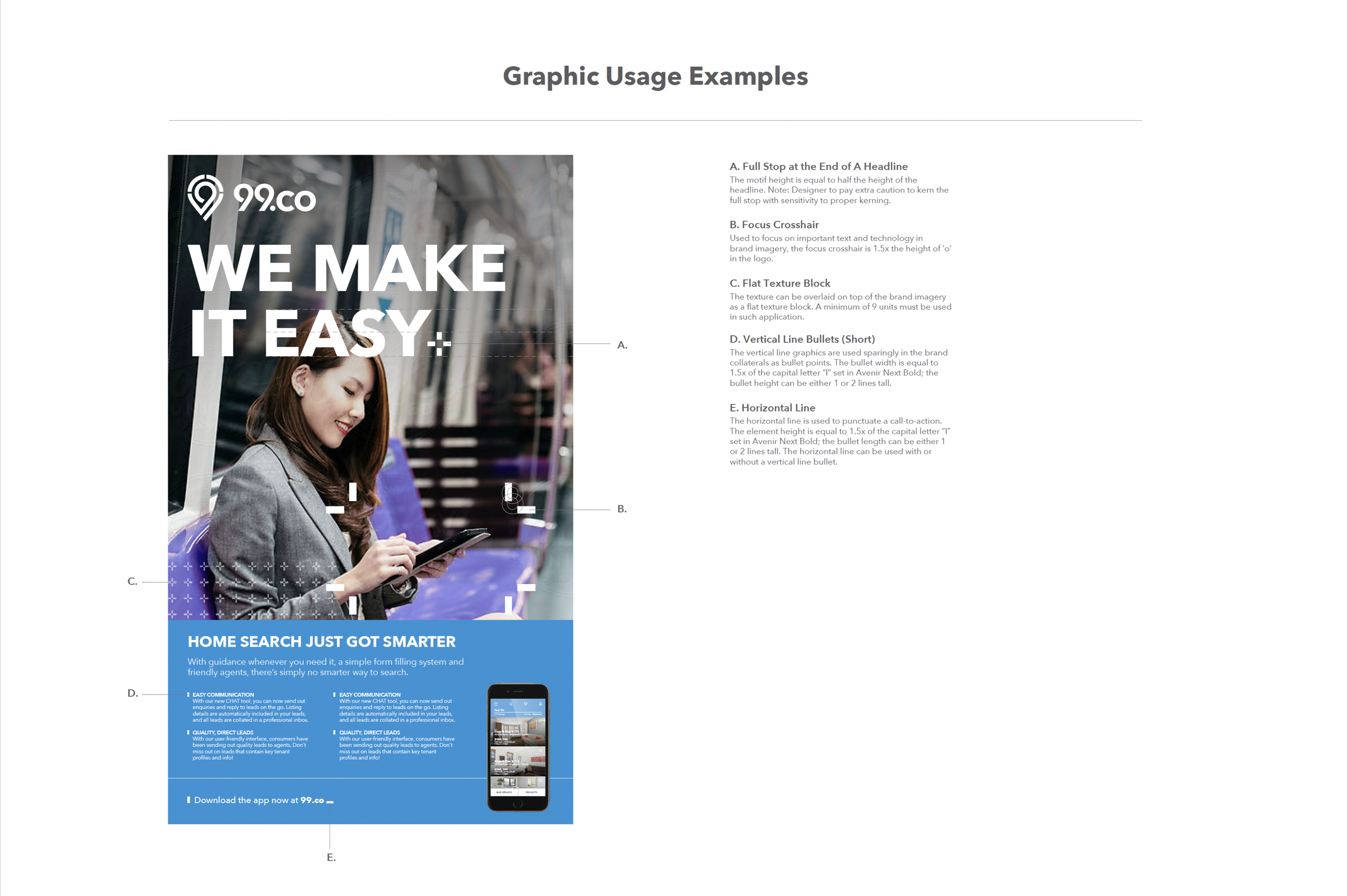
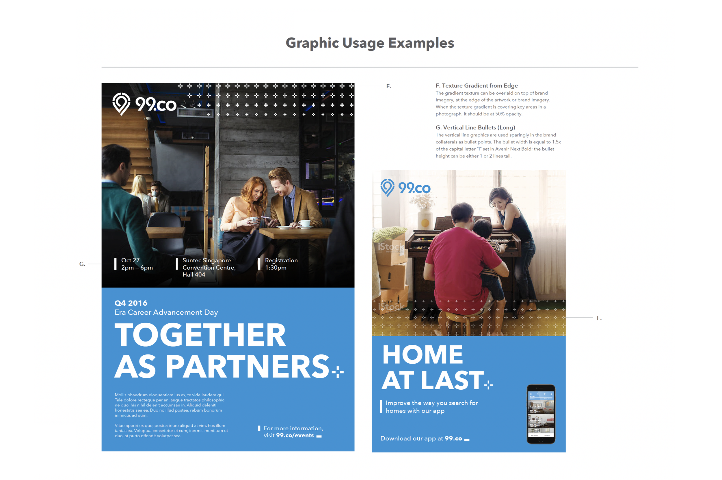
Secondary graphics
More than just decorations, the secondary graphics help to visually express brand values.

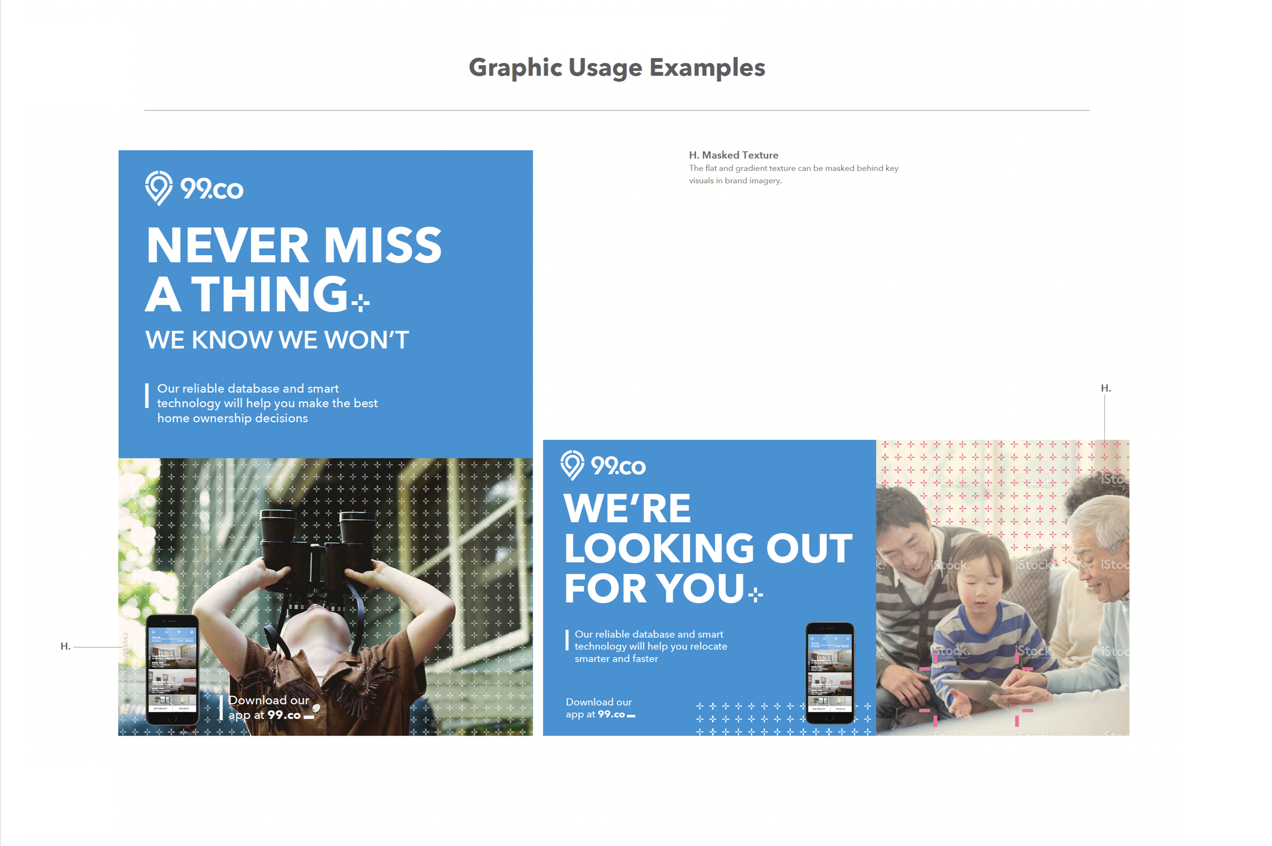
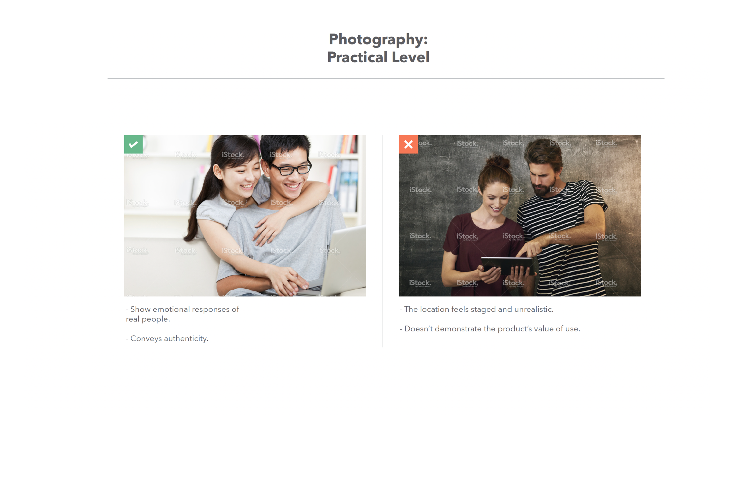
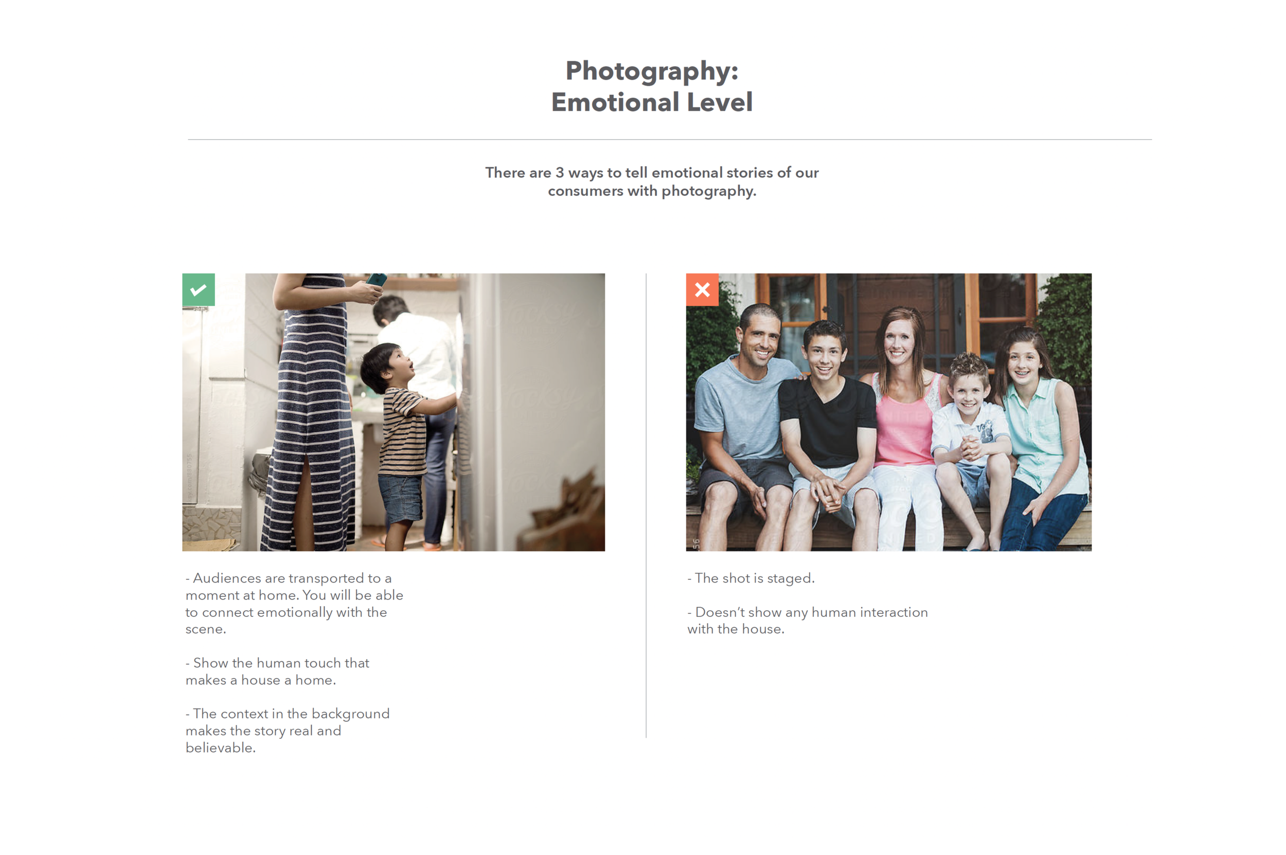
Photography
Truthful imagery that captures the cosy moments of people, home and technology.


Validating our concepts
We embarked on refining our colours and tagline to ensure they resonated with our audience and encapsulated our brand essence
As part of our branding initiative for 99.co, I assembled a diverse group of stakeholders, including designers, marketers, and product managers, to select initial concepts that the team had developed after six months of rigorous work.

To test these concepts, we conducted focus group sessions with representative users (agents and consumers), presenting them with different colour schemes and taglines to gauge their reactions and gather feedback on what resonated most with them.
Through this iterative process, we discovered that certain colours elicited stronger emotional responses and associations with our brand values. Similarly, specific taglines stood out for their clarity and ability to communicate our value proposition effectively.
Taking their feedback into account, we refined our colour palette to include shades that evoke feelings of trustworthiness and professionalism, while also reflecting the vibrancy of our platform. We also iterated on our tagline, crafting a succinct phrase that encapsulated our commitment to empowering users in their property search journey.
After several rounds of testing and refinement, we arrived at a cohesive branding strategy that not only resonates with our audience but also captures the essence of 99.co.

Our colours and tagline now serve as powerful symbols of our brand identity, reinforcing our commitment to revolutionising the real estate experience for everyone.


Overview
Design System
A design system is a collection of reusable components, guided by clear standards that can be assembled together to build any number of applications.We recognised the importance of a design system to eliminate existing design inconsistencies and improve future workflows for both designers and engineers as the company scales up. However, implementing it required us to work around various challenges and get deeply involved to push it forward.
Challenges face today
“Components are inflexible”
The components are too opinionatedThe system is too restrictiveThe use cases for the components are either too specific or too broadDifficult to extend and contribute
“System is difficult to use”
Upgrades are riskyOutdated technologyArchitecture of the system is too complexThe system is complicated to learn and useIncomplete system
“Lack of documentation and processes”
Lack of guidance and support
Incomplete / insufficient documentationsUnclear who’s the audience for the documentations
What we want
Ready to use off-the-shelf componentsUI consistency out of the boxEasy to extend and build custom patterns to fit our use-casesCustomisations without having to leave the systemNo more CSS overrideBuilt-in theming capabilitiesBuilt with accessibility, localisation, and responsive design in mind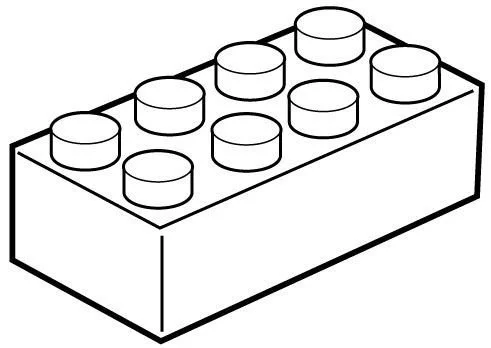
Composable Design System — Like Legos
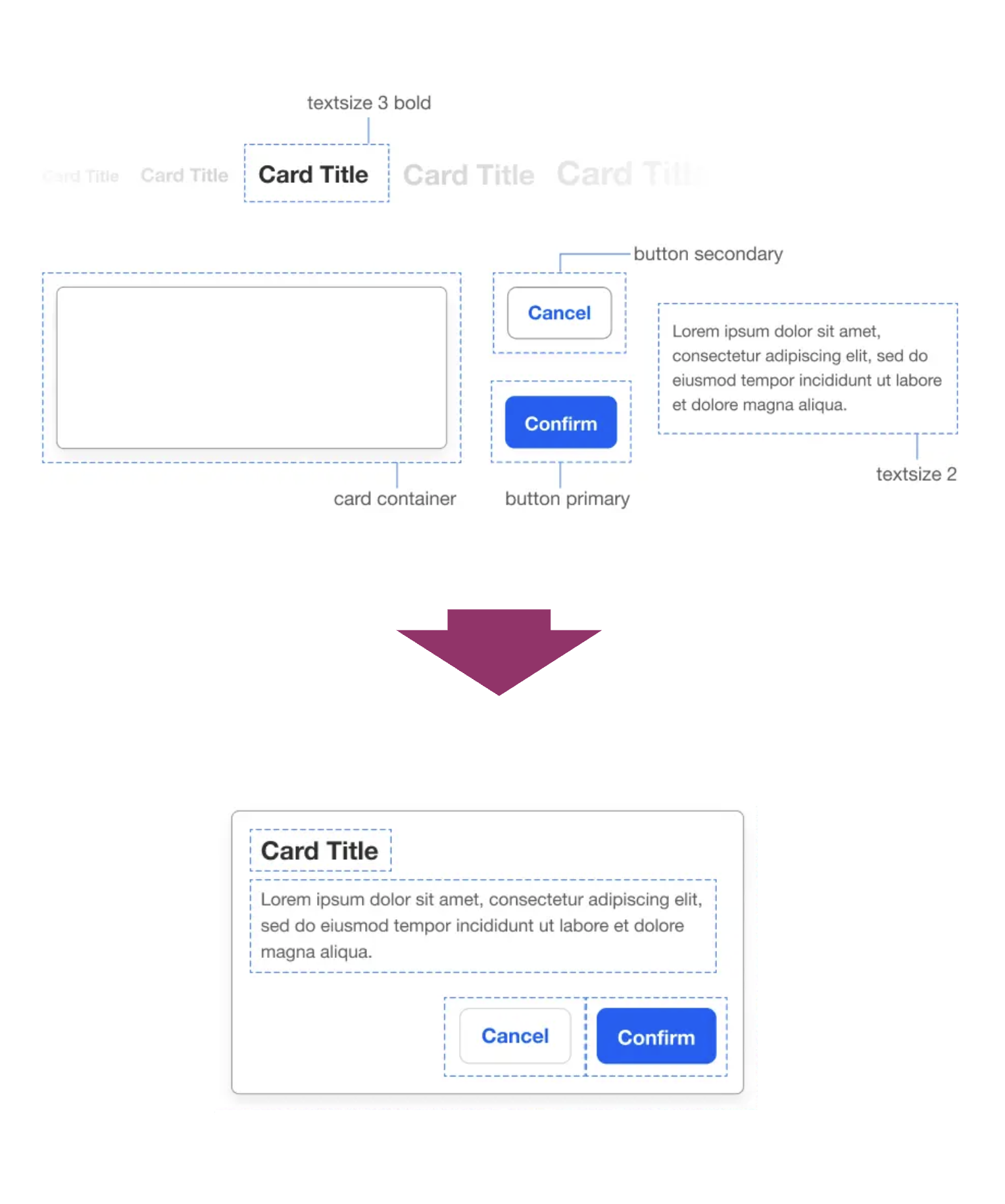
How Brand Systems and Designs System work together
Brand Systems
defines the core identity (company logo) and brand expressions (color, typography, graphic, iconography, photography, motion, voice/tone) of 99.co through the brand expressions within our product experience. With our senior leadership, we are aligning the company around a shared holistic vision around our brand story.
Design System
builds off the brand expression and creates the foundational tools, elements (i.e. states & interactions for components) and guidelines (i.e. accessibility, density, spacing, hierarchy, localisation and page layout) that all teams can use to build products at scale. The team’s work is informed by Product, Design and Engineering.
I led both teams in tandem, working closely together to design and inform one another on next steps as we got closer to building the foundation for our next design evolution.
Kickstarting The Design System Process
Steps taken
Auditing Existing Components
Research on Other Design Systems
Planning Foundational Components
Timeline Development
Components Building
Design Symbols Creation
Develop a 99 Design System (99 DSM)
Handoff for Design System Implementation
In order to gain a comprehensive understanding of all the use cases we need to address, it's essential to conduct an audit of existing components in our product.
Audit existing components
This entails assessing each component on every page. Although this process may be laborious, it is a vital step in comprehensively understanding the current state of our product and pinpointing opportunities for enhancement.
We employed a systematic approach to auditing every component in our product by taking screenshots and organising them using Trello.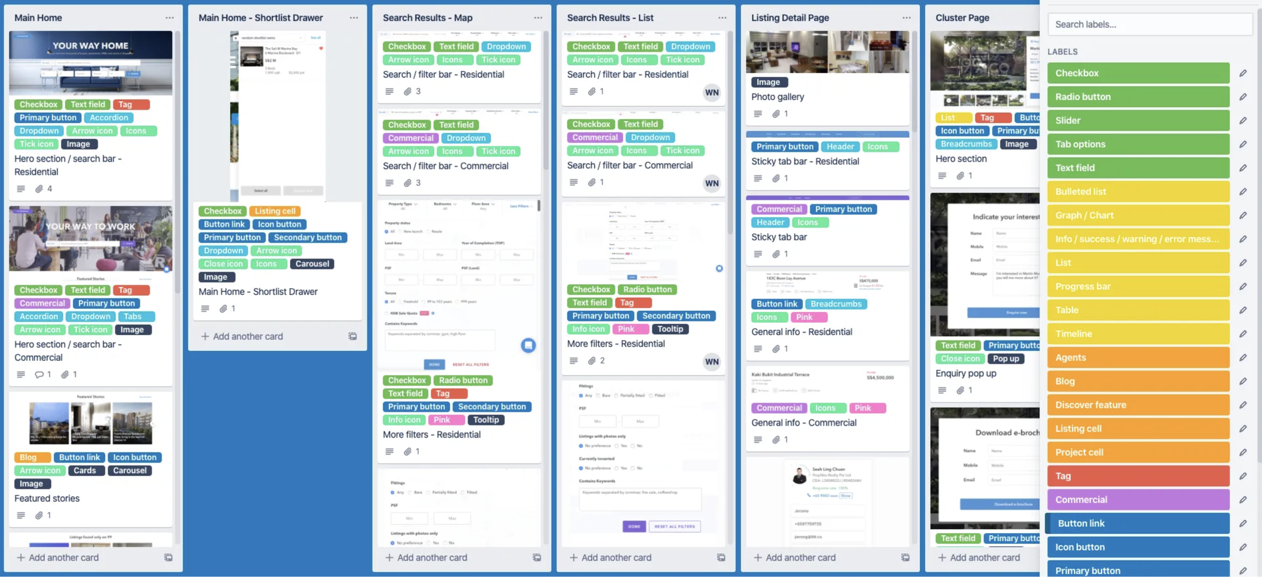
^Each column on Trello represents a webpage on the 99.co platform. Within each column, sections of a page are captured as screenshots and organised into cards. Each card is tagged with labels representing components, color-coded based on type (e.g, green for data input). This system visually organises components for an efficient audit process.

^This organisation method allows us to easily search for specific pages or filter by components, streamlining the process of identifying design inconsistencies by showcasing all current use cases across all pages.
Research on other design systems
We conducted thorough research on existing design systems and best practices to inform the development of our own design system, ensuring it meets our specific needs and standards.
We aimed to extract best practices from renowned design systems, focusing on their content organization and presentation.

Some of our favourites were — Atlassian, Ant Design, IBM & Zendesk. 
^Atlassian segments its design system into Brand, Marketing, and Product, acknowledging that different design facets necessitate distinct guidelines. This strategy guarantees uniformity in the design language throughout the entire organization. E.g. Marketing might require a broader colour palette for creating collaterals, whereas Product generally needs a fixed set of colours to represent various component states. Atlassian also offers comprehensive guidelines for each component, outlining its styles, variations, use cases, and best practices, ensuring clarity and consistency in design implementation.

^Ant Design effectively categorizes its components into distinct sections such as Data Display, Data Input, Navigation, etc., enhancing organization and accessibility. Anchors displayed in the top right corner provide users with a clear preview of what each page contains, eliminating the need for excessive scrolling. Each component's style and variation are prominently showcased and made interactive, with code snippets readily available for developers. Quick actions enable developers to effortlessly copy code or open it in various environments, contributing significantly to an excellent user experience.
Planning foundational components
We began by listing the patterns and components required based on our research and the filtering labels we utilized on Trello.
This process provided us with a comprehensive overview of the components that needed to be reviewed, allowing us to effectively track progress and allocate time accordingly.We categorised components into sections based on their functions, such as Buttons, Data Input, Data Display, Feedback, Navigation, and others. This list is continuously updated and regularly revised, with components being marked off as they are discussed and finalised.
Timeline development
Next, I coordinated with the Design System team to establish a weekly timeline, outlining the tasks that needed to be completed and assigning responsibilities, including my own. This approach ensured that everyone remained aligned, engaged, and accountable, while also facilitating the efficient allocation of the team's resources
We prioritised foundational components, focusing first on those most commonly used in our product, as identified through our use cases on Trello. Key patterns such as Typography, Colors, and Layout were essential to discuss initially, as they established the foundation upon which subsequent components would be built.In addition to our weekly discussions, we planned to create components as symbols in Sketch and begin designing our design system pages with accompanying guidelines. These would eventually be handed off to our UX developers for implementation. Our aim was to continuously update the timeline on a weekly basis to reflect our progress and ensure that we stayed on track.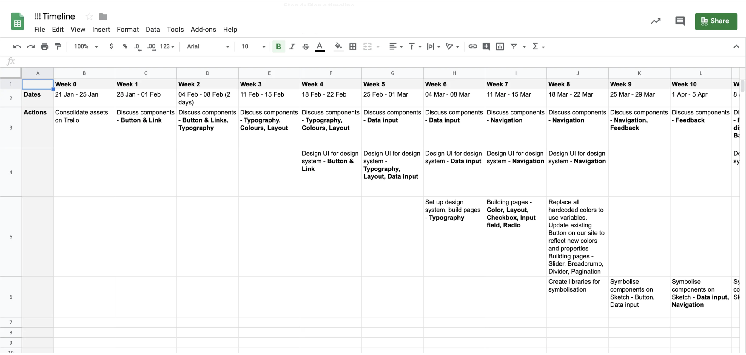
Component development
The objective of our discussions was to meticulously design each component, defining its properties and states, and to establish clear usage guidelines to ensure consistent application across our product.
For each component, we conducted a thorough review of its use cases on Trello and engaged in research on best practices by analysing how other companies utilise that component.To ensure alignment and maintain a record of our decisions and rationale, we extensively documented our discussions on Google Docs. This documentation proved invaluable for revisiting previously discussed components, as it provided the team with a clear record of thought processes and decision-making, thereby enhancing the efficiency of subsequent discussions.
Design symbols creation
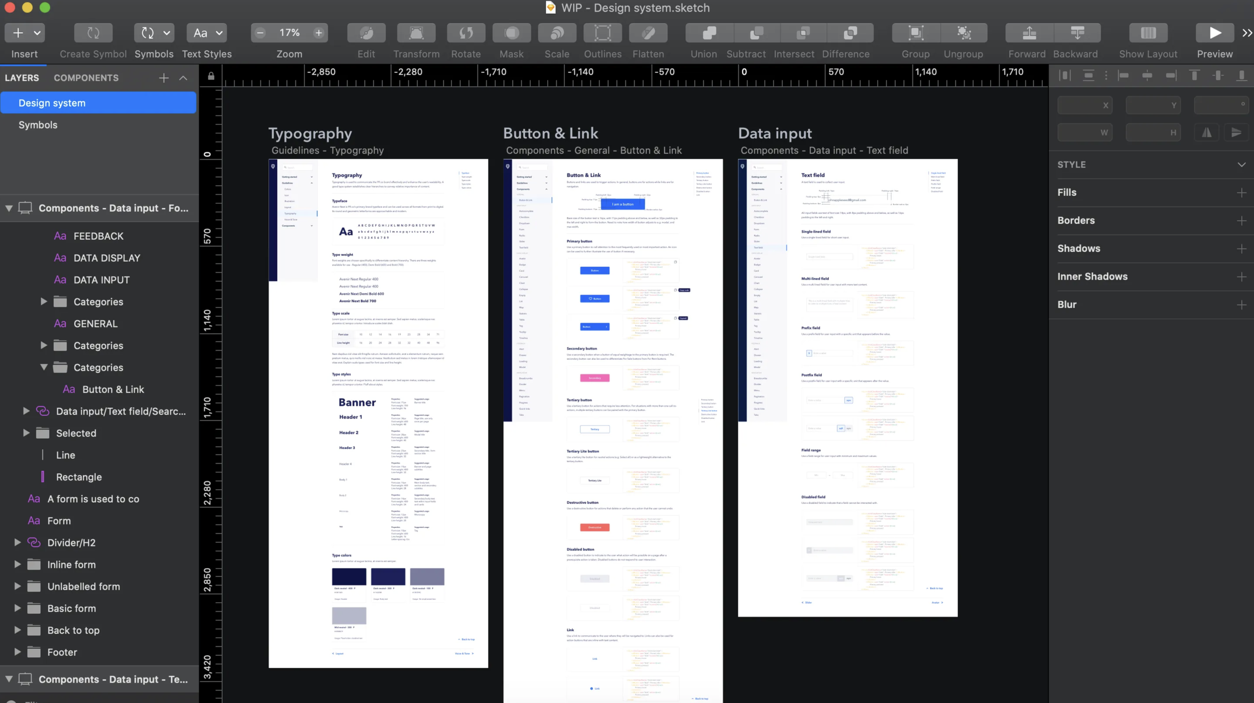
As our discussions evolved, we commenced the development of our 99 library and style guide in Sketch. We established text and layer style libraries and symbolised each component, meticulously accounting for its various states and variations. This approach laid the foundation for a cohesive and scalable design system.

Text and layer style libraries on Sketch
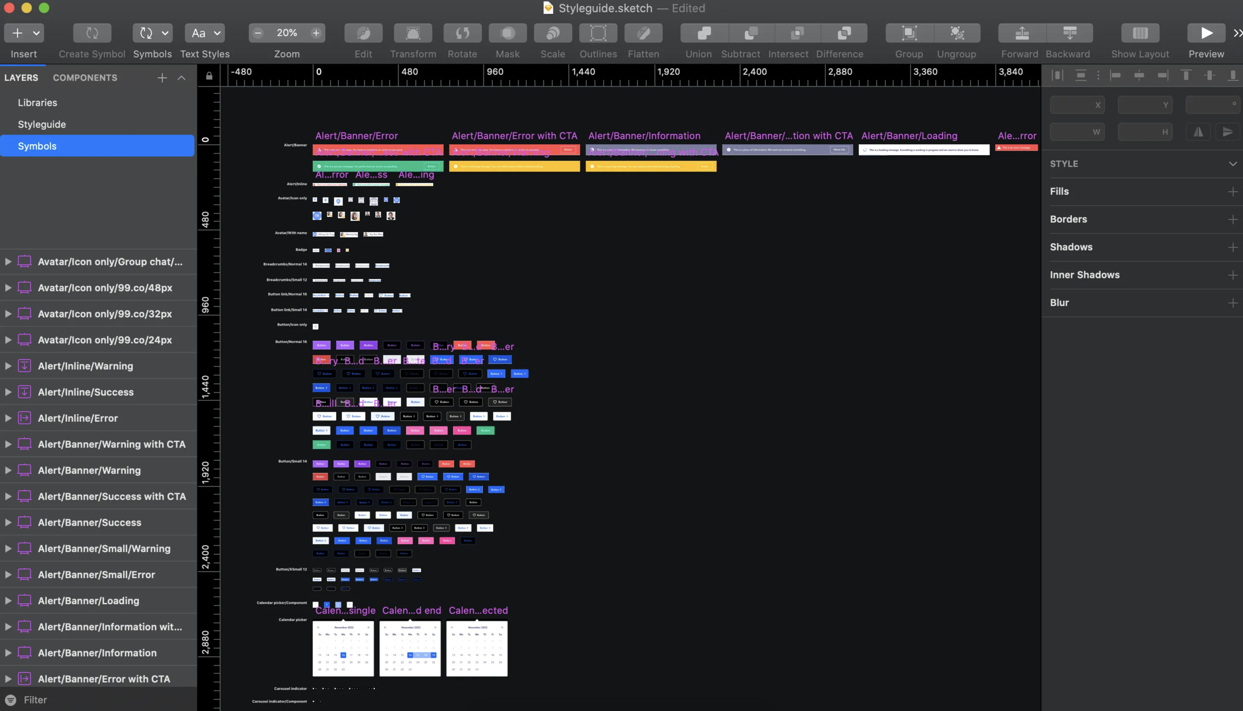
Component library on Sketch
Developing a 99 Design System
However, we realised that our initial workflow was not optimal, as customising pages demanded a significant portion of our limited design resources. To address this, I sought out tools that could streamline our team's workload, enabling us to more effectively allocate resources towards building and implementing components across our product.

Finding a tool that seamlessly integrated into our existing workflow was crucial, with features such as version control and branding customisation being key considerations. To make an informed decision, I consulted a comprehensive comparison table of different design system tools' capabilities, created by uxtools.co. Additionally, I trialed various tools, including Invision DSM, Lingo, and Zeroheight. While each tool had its advantages, I ultimately chose Invision DSM for its alignment with our needs and workflow.
We aimed to incorporate best practices from other design systems into our own. We designed mockups for each page after symbolising its components, before handing them off to our UX developers for implementation.

^I organised pages and sections within Invision DSM for various components and their variations, providing clear usage guidelines for each use case. Sketch symbols from our 99 style guide were seamlessly imported into Invision DSM using a plugin. This integration allows us to display live component examples to viewers through interactive HTML snippets and Storybook components. Moreover, developers can effortlessly stay in sync with the designs by utilising the design token API, ensuring consistency and efficiency in the development process. Unfortunately, the link cannot be accessed without 99.co's VPN, and Invision has also been deprecated.
Handoff for design system implementation
Effective communication with engineers, product managers, and other stakeholders is essential throughout the entire process, particularly during this phase.
To implement a comprehensive design system, we are developing new components and uploading them to Invision. Additionally, we are updating and refreshing existing components in our product and integrating them into new product designs. This approach ensures consistency and coherence across our entire product ecosystem.
To improve collaboration between designers and engineers during the implementation of the design system, we utilised Zeplin's global style guides and connected components feature.

By uploading all component symbols directly into 99 style guide, developers could then link their codebase and documentation sources, such as Storybook or GitHub, to these components. Consequently, when a developer inspects a design on Zeplin, they can view an overview of the component linked to the 99 style guide and easily reuse these components.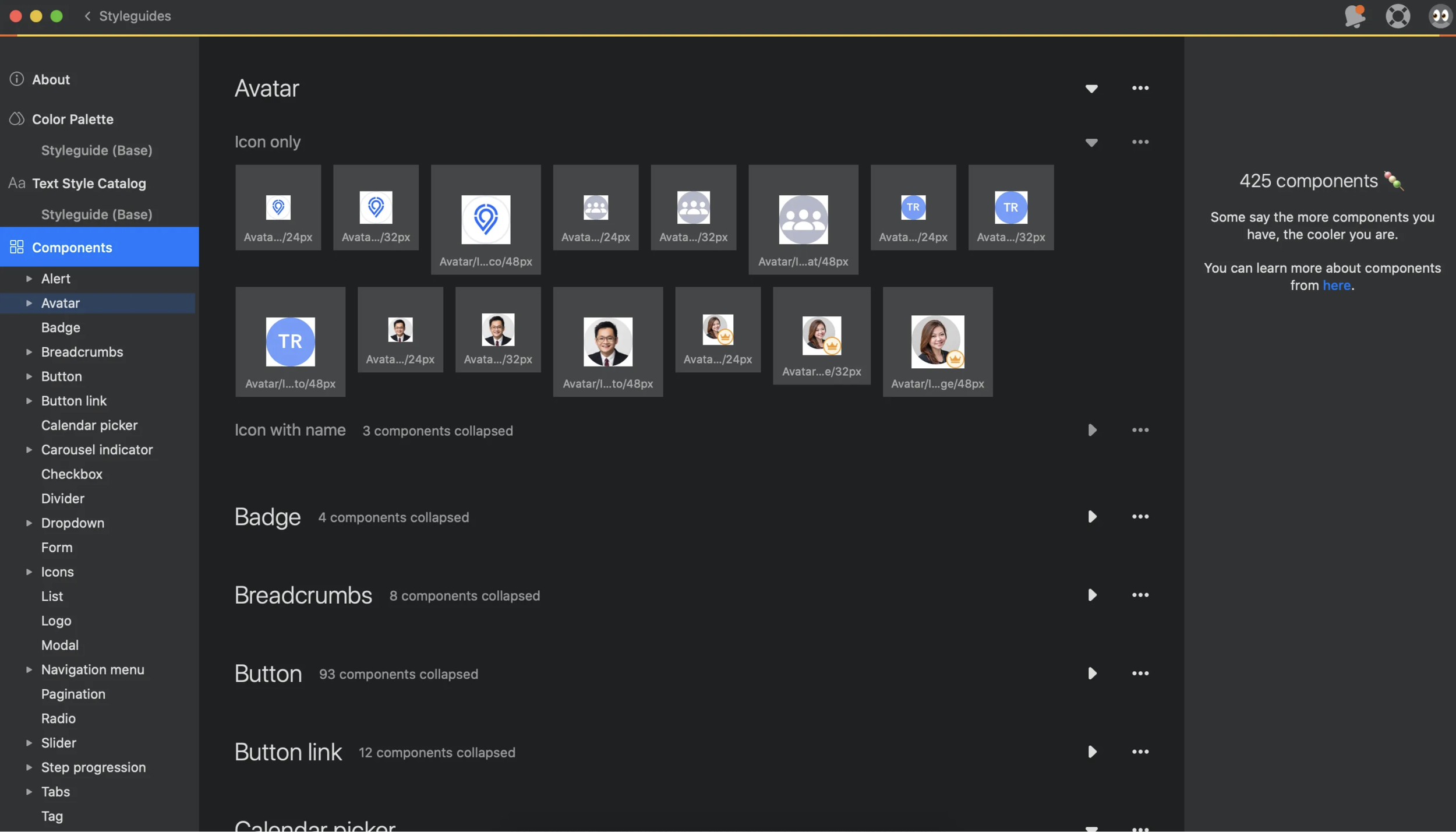
^Global style guides on Zeplin

^Linked components on Zeplin
Successful In-Product Testing
Over the past year, we've conducted numerous in-product tests to achieve a "no-harm" metric, and in some cases, we've not only met but exceeded our goals.
This success led to the approved rollout of the new brand expressions across all 99 consumer and agent products.
We began with uncertain results, but testing enabled us to iterate swiftly and stabilise our outcomes to meet expectations. EyeOfSauron is 99’s internal tooling of prototyping in production, facilitating rapid data collection, testing, and iteration. It allows us to make visual changes swiftly without the need for code rewriting.Beginning of Q3, 2016

End of Q3, 2017

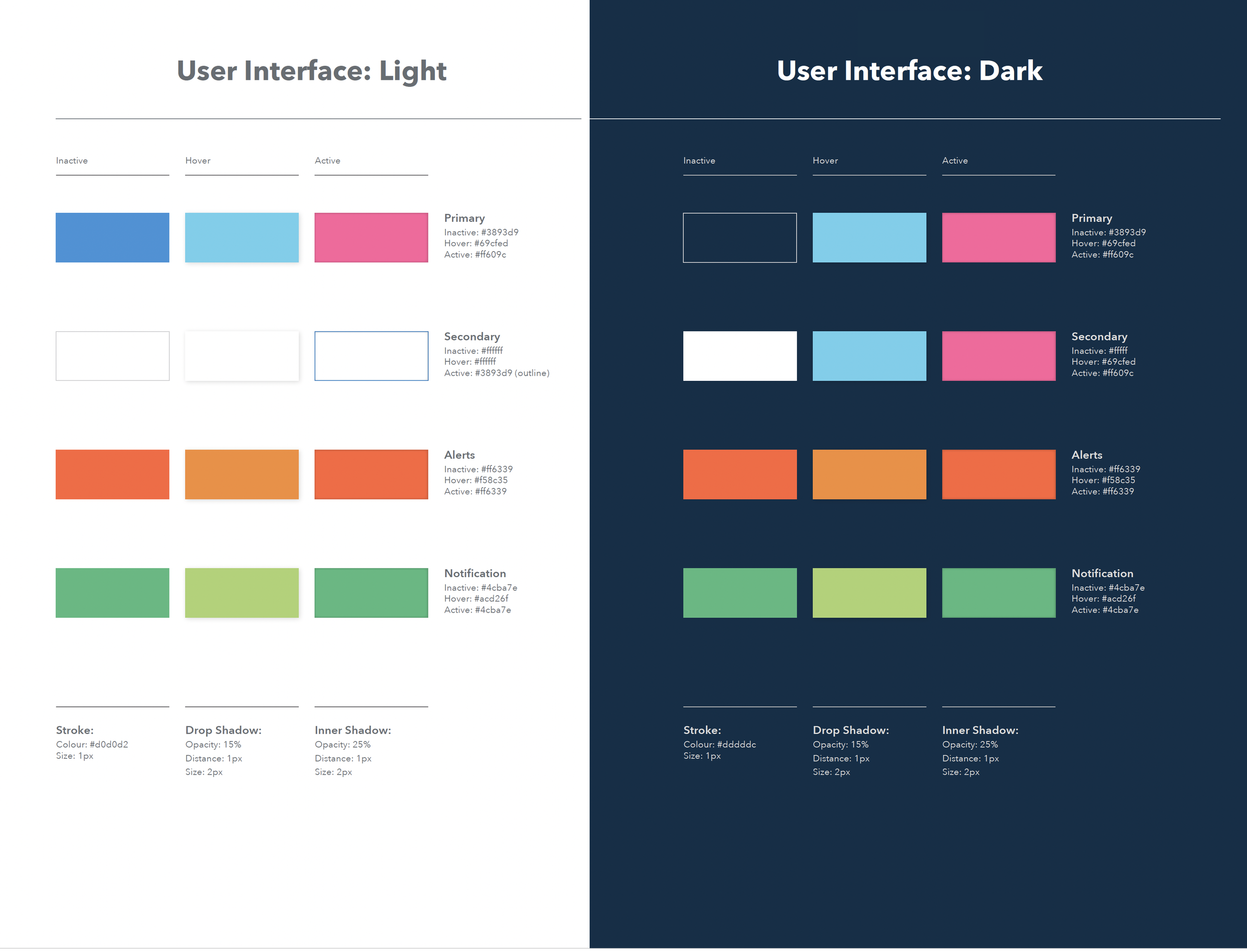
With the accessibility compliance goal, we’ve also designed every aspect of the new identity to meet (and exceed) those standards. Specifically with colour, we’ve moved our colour palette from a A to AAA rating, the highest rating for color/contrast.
In addition, we meticulously documented all component states on 99 style guide, linking them to their corresponding Storybook entries to enhance developer accessibility.

Impact
All consumer and agent-facing products successfully adopted the new design system by March 2017, resulting in greater consistency in user experience.
More importantly, to people searching for a new home, the brand has come to mean more than just another property listing portal.99.co quickly closed the gap with market incumbents, securing multiple rounds of funding and thousands of unique listings from trusted agents, and is currently the fastest-growing in the region.
Accessibility (WCAG 2.1) was seamlessly integrated into the design components from the outset, ensuring a more inclusive user experience.
Putting it together


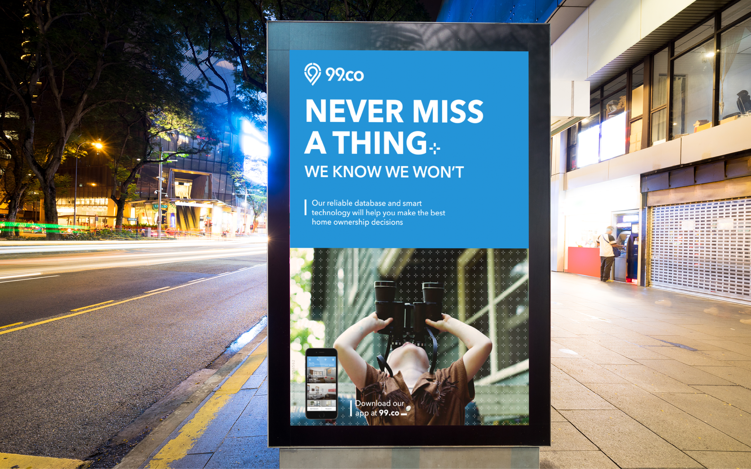
In addition to my other responsibilities, I've conceptualised and led over 20 events and campaigns at 99.co.
As the Design Manager/Lead at 99.co, my responsibilities extended beyond overseeing art direction and maintaining brand consistency across diverse advertising mediums. I consistently delivered high-quality design assets tailored for various platforms, often functioning as a solo contributor and executing tasks and projects independently (see right→).

Additionally, I cultivated relationships with external vendors and worked closely with the Marketing team to effectively manage budgets for campaigns and events. 
20+
Events & Campaigns
Agent summit
Feature launches
Seedly x 99.co

Nas Daily x 99.co
Mediacorp Digital Network
... more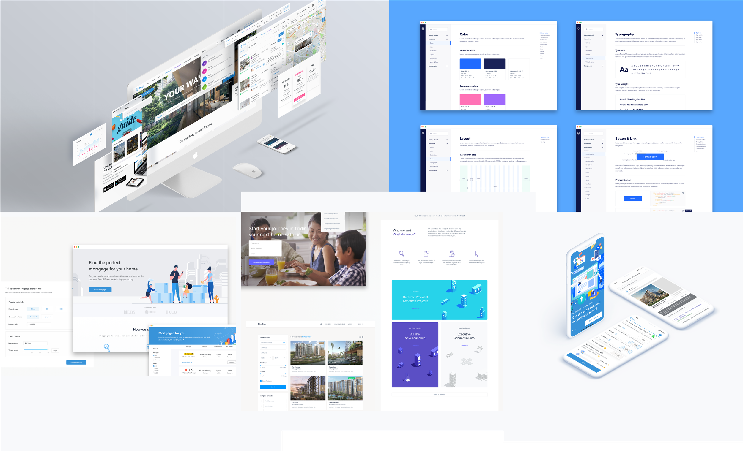
I led UX efforts across product groups, utilising research and data insights to shape our product goals and inform decision-making. Also, I delivered wireframes, user flows, prototypes, and high-fidelity designs, conducted user research, wrote UX copy, facilitated developer handoff, and conducted design QA.

Key product features: Property Marketplace, Ads Maximiser, E-wallet, Realtor tools, Travel time search, search by MRT feature, Mortgage, and Calculators