Introducing Project Aurora, Indeed’s New Brand Identity
Project
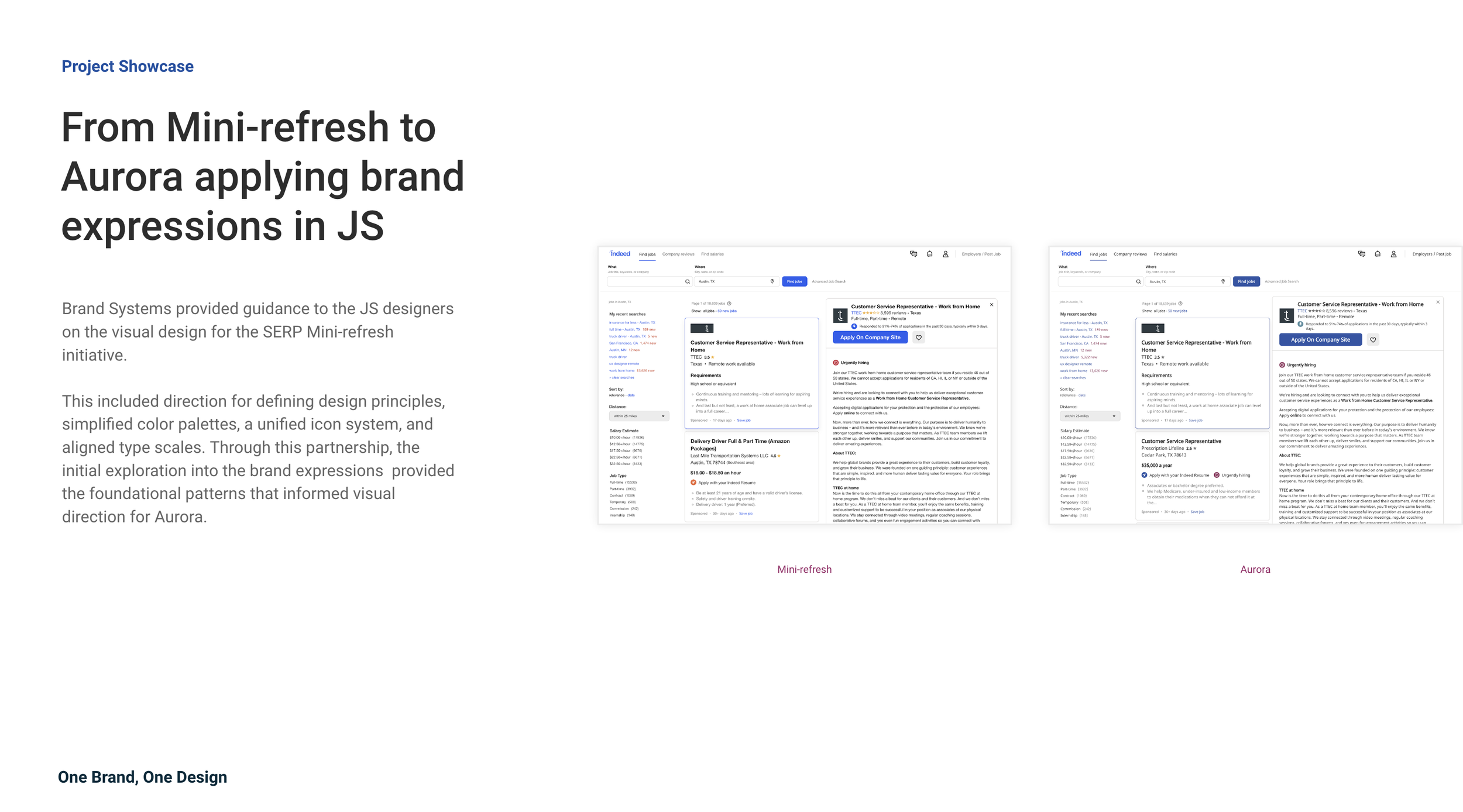
Project Aurora — One Brand, One DesignMy contribution
With the support of leadership, the Brand Systems team at Indeed is collaborating with both UX and Product teams to successfully integrate the Aurora brand expressions.
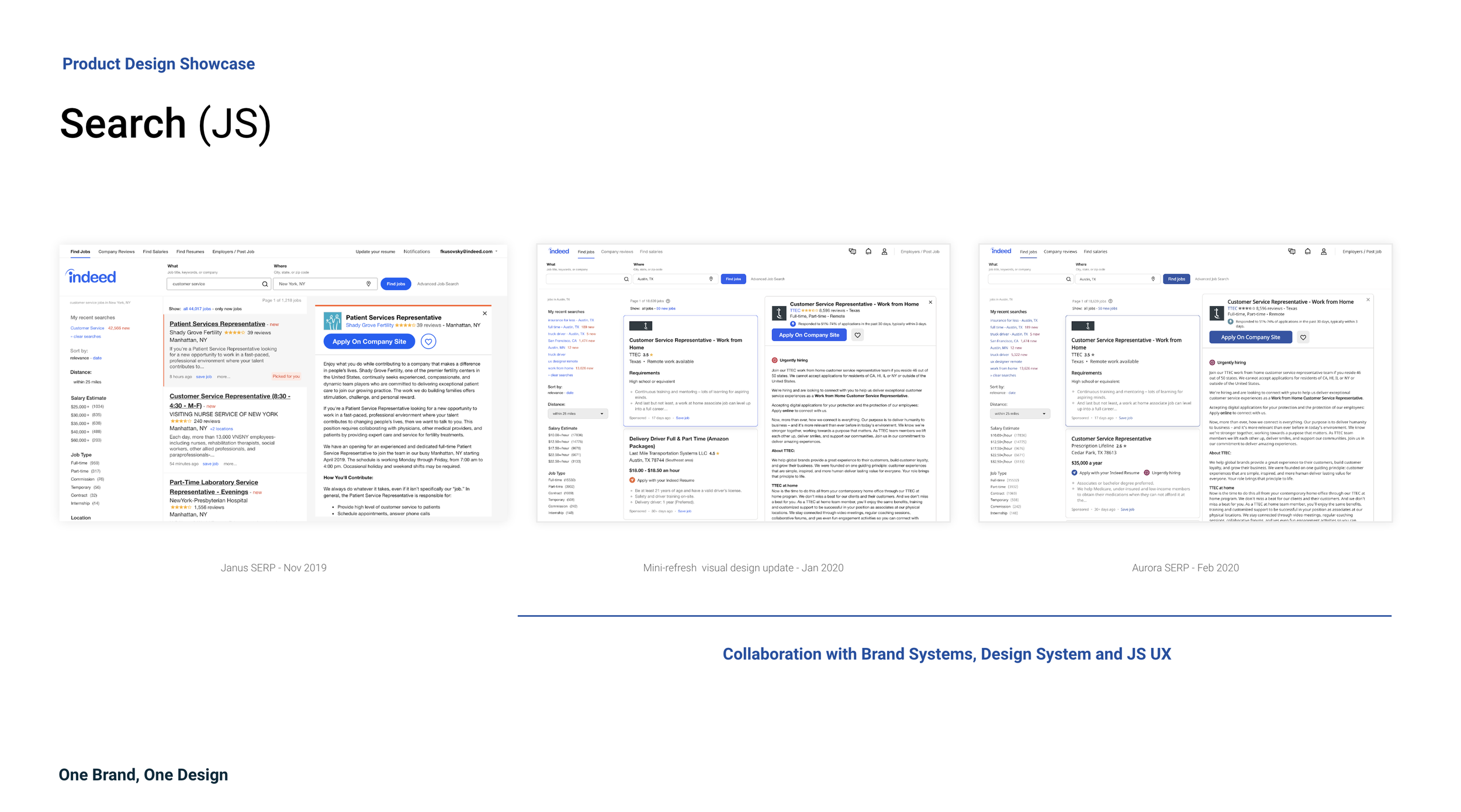
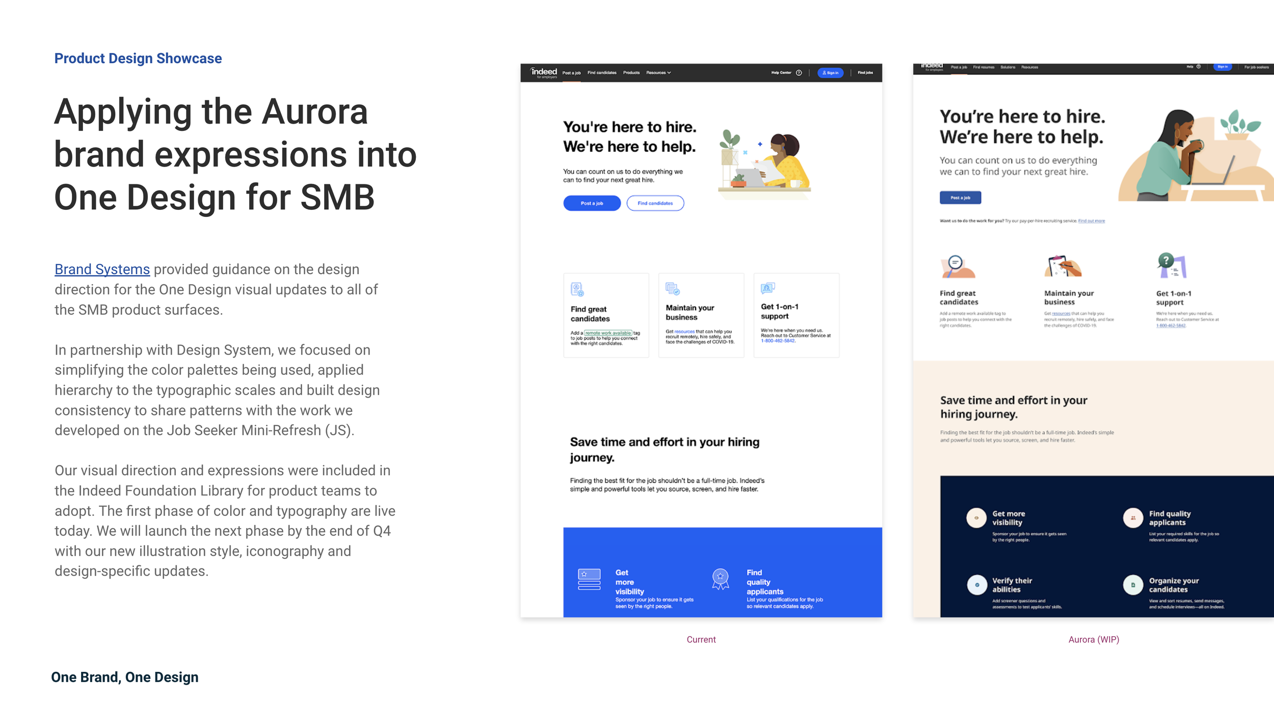
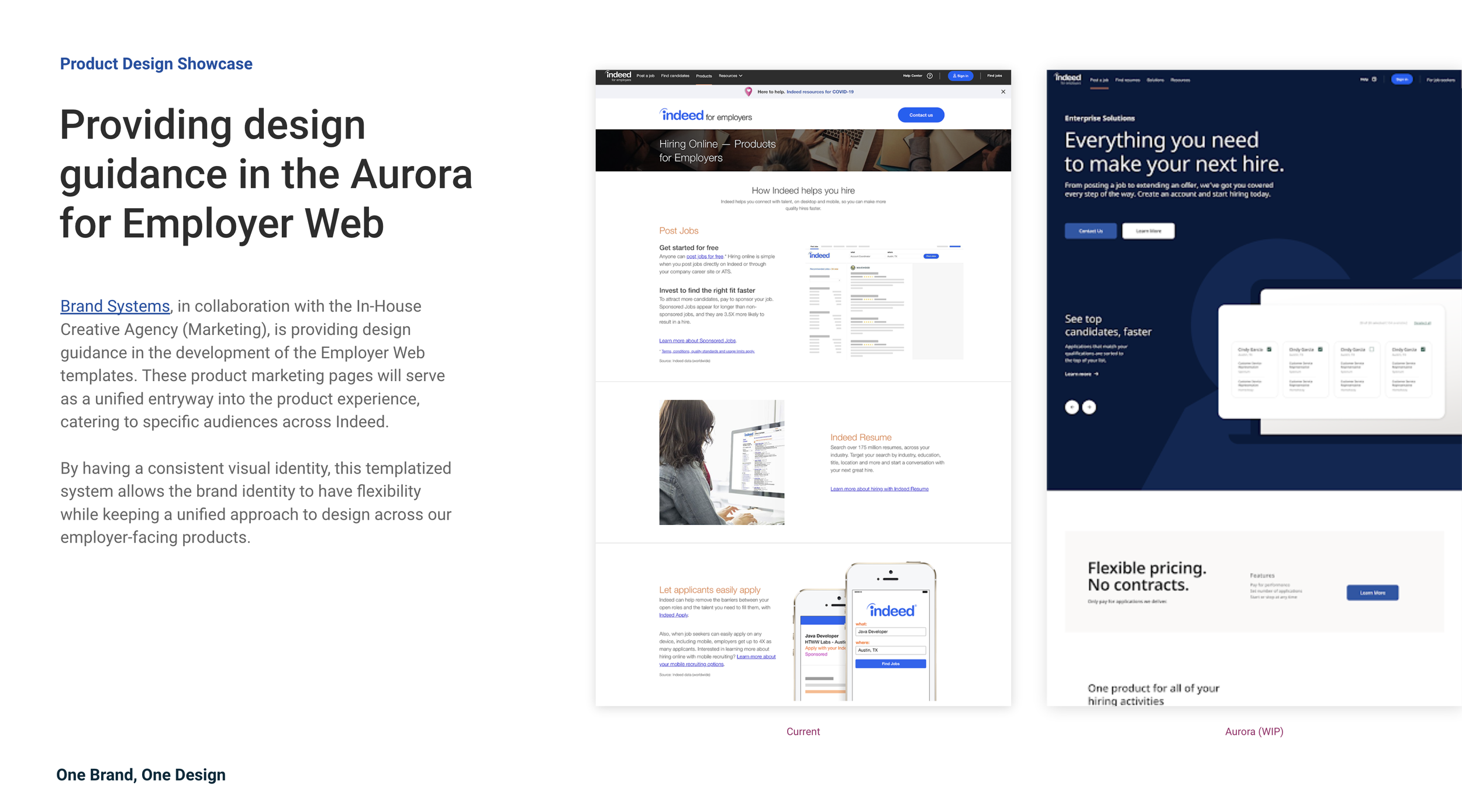
As a key member of the Job Seeker (JS) refresh team, I played a pivotal role in this initiative. My collaboration with the Brand Systems team and fellow designers was instrumental in weaving a new, unified brand identity across key product pages, including the Job Search Results Page (SERP), ACME, Career Pages, and SMB.
My involvement in brainstorming, mood boarding, and testing played a vital role in achieving a seamless integration of the Aurora brand identity. This not only enhanced the overall user experience but also strengthened the consistency of Indeed's brand.Skills/ Expertise
Branding (Expressions & Identity), Design Systems, User Research, UX/UI Guidelines, Design Thinking, User Experience DesignTool

Figma, MiroSince 2004, Indeed has become the world’s leading job site, a destination where job seekers and employers from 60 countries use our products and services in 28 different languages. From the company’s beginning, Indeed’s focus has always been on creating a brand that people trust. We expanded our designs piece by piece whenever we saw a way to make it easier for people to find work or hire, but never the entire system. Until now.By the Feb of 2021, Indeed announced in the company’s history, the biggest update to their brand identity. Designed to integrate the look and feel of our products and solutions, the new system reflects the pace of Indeed’s evolution and helps us deliver on our belief that we are here to help everyone get jobs. All people. All skills. All levels.
With the first brand identity initiative, Project Aurora,
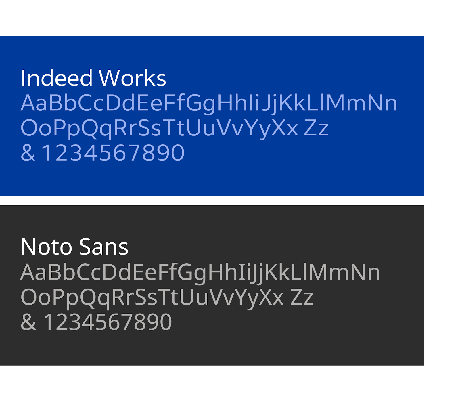
Our goal is to modernise the visual design across Indeed’s product and marketing so that every impression (from our logo, colour palette to typography) is recognisable and distinctive

How Brand Systems and Design System work together
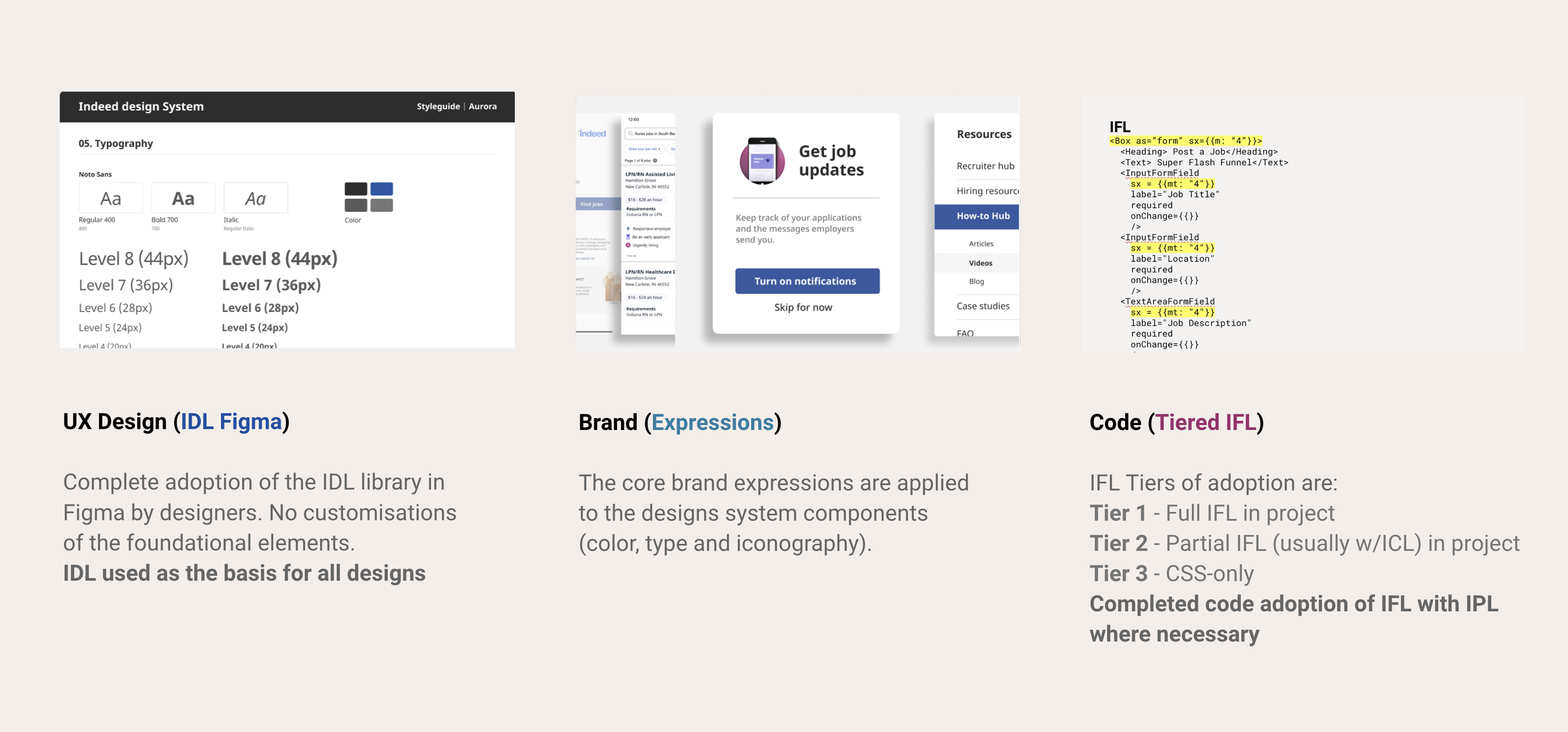
Brand Systems defines Indeed’s identity and voice through the brand expressions in our product experience. The team partners across Marketing and Product to create a shared vision in collaboration with executive leadership.Design System creates the foundational tools, elements, processes, and guidelines that all teams can use to build products at scale. The team’s work is informed by Product, Design, and Engineering.Adopting the new design system for Aurora, gives product teams access to the most up-to-date brand expressions and ensures consistency and velocity.

ACME Refresh initiative
In collaboration with Brand Systems, we embarked on defining a new visual identity, which included introducing new colours and typeface and rebuilding components from scratch
As the Design System and Brand teams explore Indeed's new Aurora brand expression, we have a prime opportunity for collaboration. This partnership is key to shaping and showcasing the direction of our robust products. Given past challenges, such as the Janus* complexities with ACME, close collaboration is essential for the successful integration of the Aurora brand expression on ACME surfaces.
*Janus is the deprecated/outdated design system which Indeed used to run on
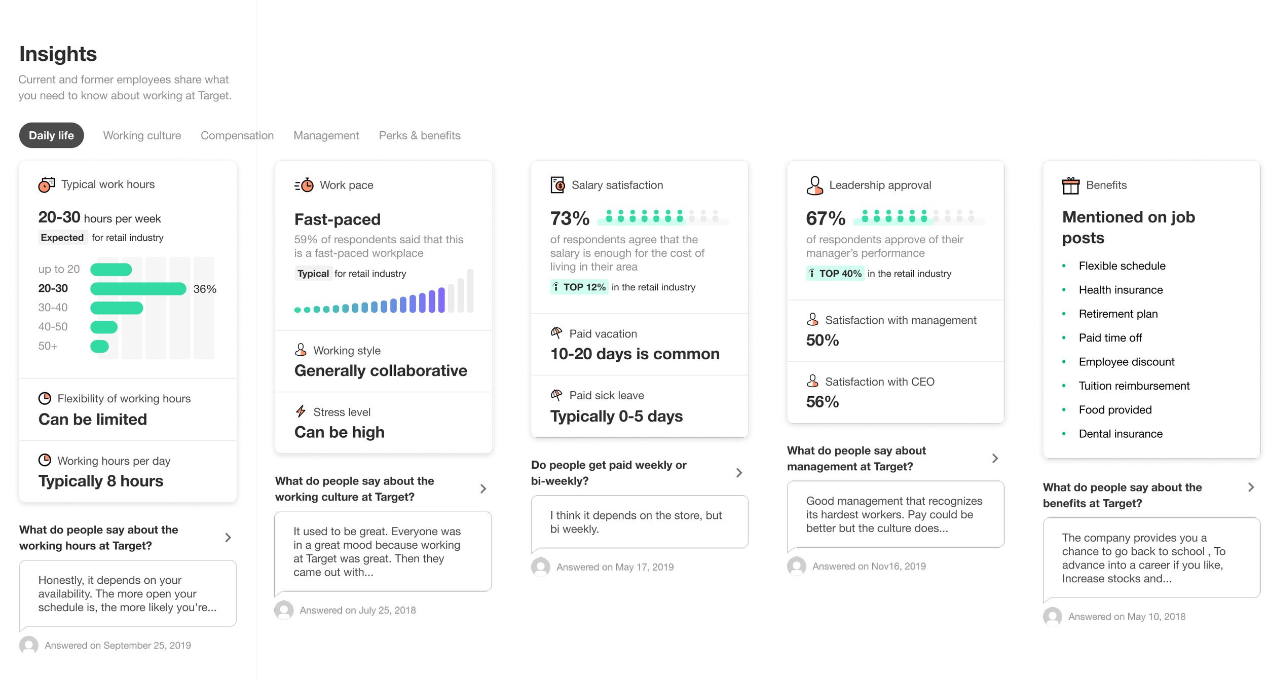
ACME holds a unique position in Indeed's product portfolio, as it represents what it's like to work at a specific company.
This involves a range of elements including data visualisation, employer branding, ratings, industry context, and the use of photos, imagery, illustrations, and icons.
Our challenge is to balance these diverse components while delivering a world-class user experience. This responsibility extends to our representation in various Indeed products and our contribution to the overall Job Seeker (JS) direction.

Step 1 — Process kickoff
Current state audit, map and analyse
We initiated a comprehensive audit of ACME, thoroughly examining the product overview of all pages and design patterns while identifying inconsistencies. Our analysis focused on user data to determine priority pages and understand where users are most engaged on ACME today. We will use this analysis as a reference to determine which pages should be prioritised for the integration of the new identity.ACME pages audit
Mood-boarding exercise to explore the look and feel based on the new set of brand expressions
Doing so helped us envision potential design directions for ACME. In addition, while doing that, we also conducted a comprehensive analysis of our competitors to understand their strategies and identify opportunities for differentiation.Competitor Analysis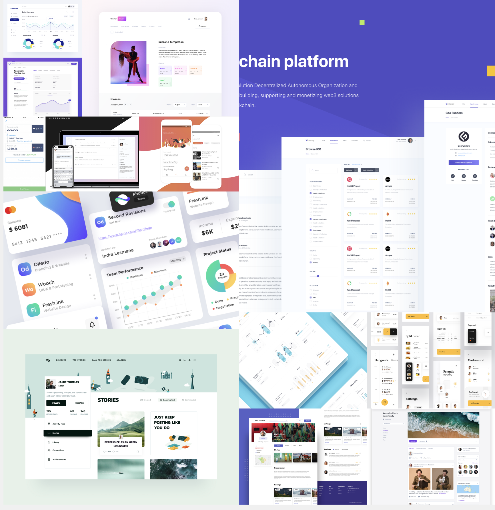

Step 2 — What we did
Refresh of the UI
Our journey began with an initial focus on the visual concept of the refreshed ACME, guided by the existing brand guidelines. We aimed to breathe new life into the product's appearance while staying true to its core identity. Our initial approach to the visual concept of the refreshed ACME was to rely on the functional set of colours provided in the brand guidelines. However, we quickly realised that this approach was not sufficient for our needs. ACME is a complex product that features a variety of elements such as data visualisations, ratings, and illustrations. Each of these elements requires a distinct colour treatment to ensure clarity, hierarchy, and visual appeal.
We saw an opportunity to build off of the original palette and create something fresh and inviting that still felt like Indeed.
We recognised that colour is more than just an aesthetic choice; it's the visual backbone that gives a brand system its personality. It's the element of design that users interact with most frequently in the product. With this in mind, we knew that our colour palette needed to be more than just functional—it needed to resonate with our users and reflect the essence of Indeed.Starting from piecemeal colours
Designing with purpose
Our original identity focused solely on bright blue and orange as our core colours. Realising that those two colours weren’t enough, we’d needed an extended palette of colours.In our pursuit to evolve the colour palette for ACME, our team conducted a thorough review of screenshots and design files. Working closely with the Brand Systems team, we identified three main goals for the next evolution of our colour palette:
Clarity
As a set, we wanted the colours in our palettes to fit together in a complementary way, rather than competing with each other. They would need a consistent look so that we could build one visually cohesive brand where users could easily identify the meaning and purpose of each colour. At the same time, our system also had to have a wide choice of colours covering a broad range of applications in product and marketing. Accessibility
Accessibility was a primary focus for our company. As we developed our new core palette, our executive leadership team emphasised the importance of meeting accessibility standards. This commitment to inclusivity was a key consideration in the development of our palette, ensuring that our digital experiences are usable and enjoyable for all users, regardless of their visual abilities.Flexibility
We had to understand how colours were built, so we could fully control the outcomes. This would let us avoid flaws like visual gaps or inconsistent contrast across the range, freeing us to predictably combine and effectively use colours across different elements and surfaces, from data visualisations to illustrations and ratings, without compromising quality.Colour construction
We created a new, refined core blue, then designed each of the other hues and grades with consideration for our users and accessibility standards
The result was a deep palette that reached all colour grades needed for ACME and product design teams to implement through our design system.
In addition, this extensibility of this new palette also opened up new possibilities for Design System to represent multiple skin tones through Indeed's illustrations style. This vast amount of colours allowed our artists and illustrators to reflect a variety of ethnicities in their character design, so that our illustrations were relatable and approachable to every worker.We took a product-driven approach to designing this new colour palette, using the core Indeed blue of our logo as our starting influence.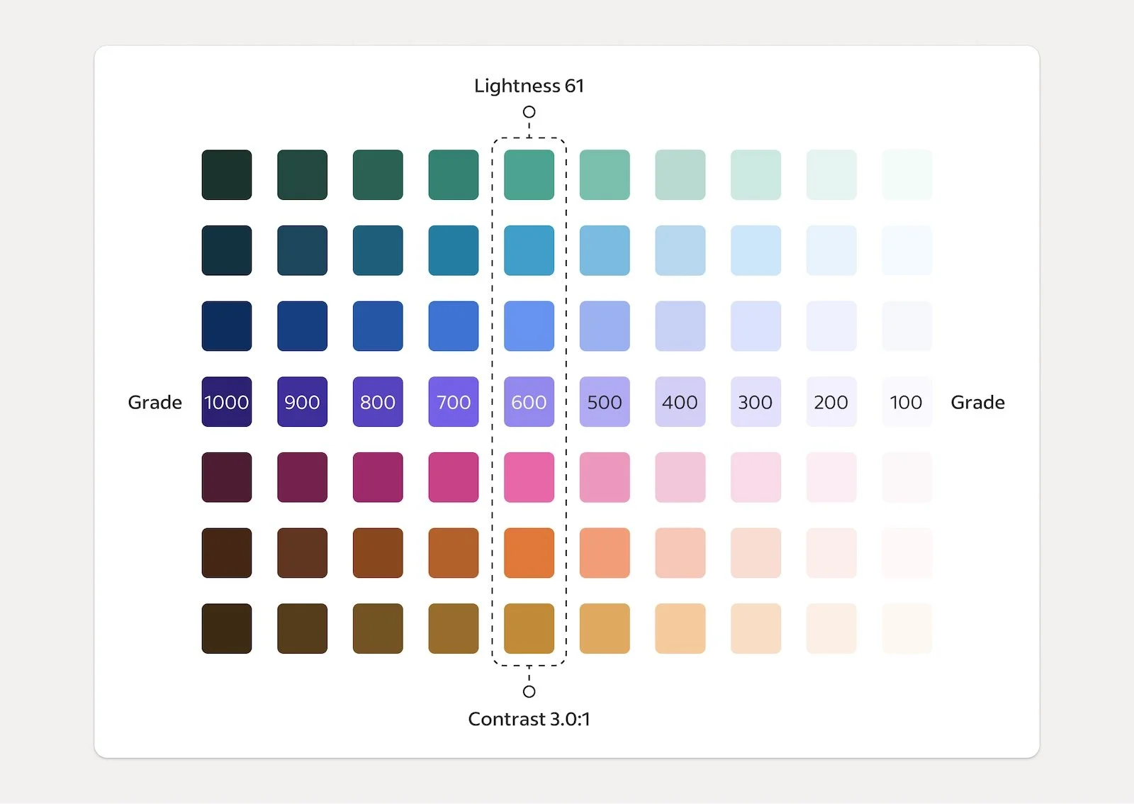
Colour system application across various surfaces, including the user interface and illustrations.
Developing a colour strategy
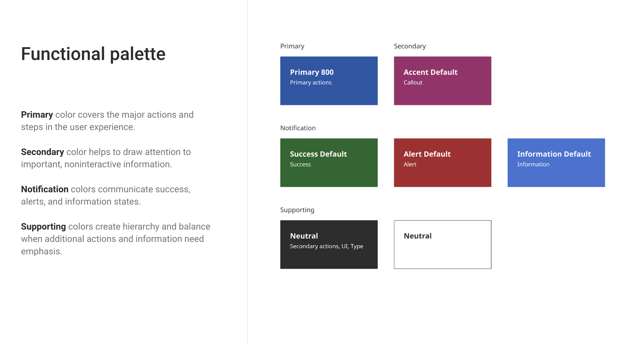
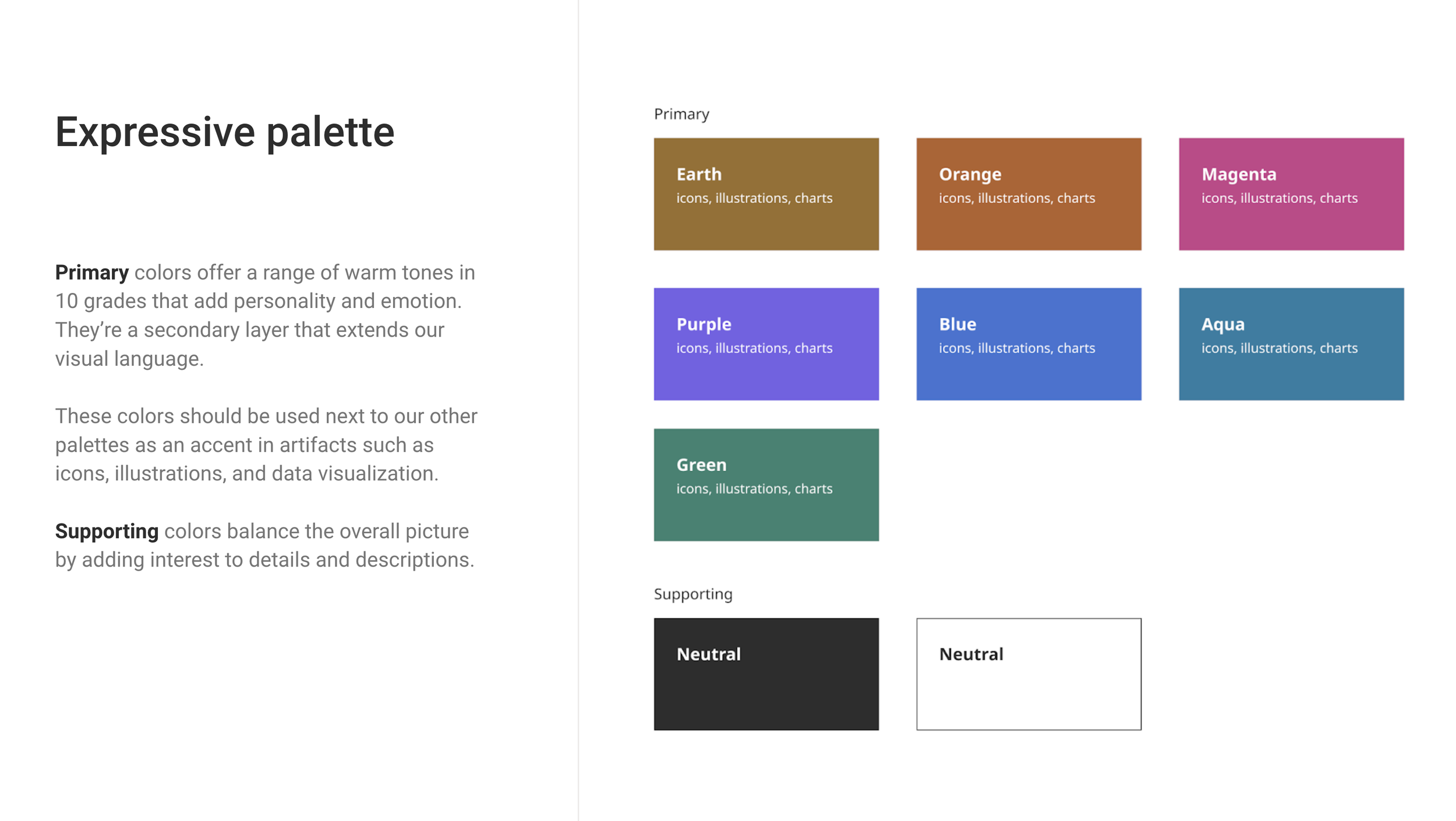
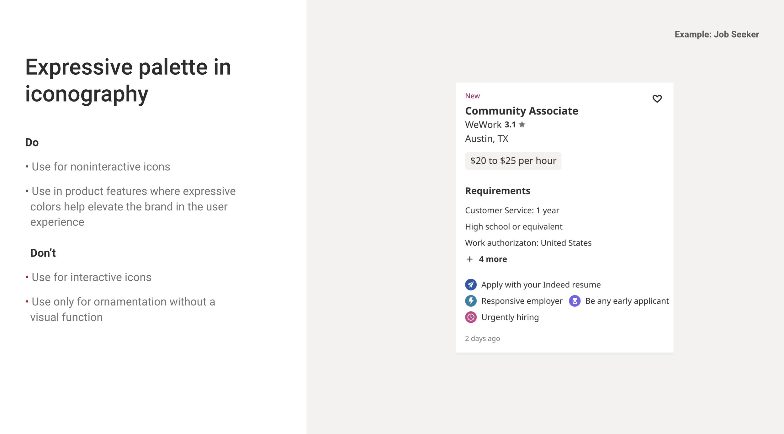
We started by splitting our palettes up based on application and strategically applied colour when contextually appropriate. The result was a three-part system: a core brand palette, a functional palette, and an expressive palette.


The names hint at this already, but breaking our use of colour into three distinct palettes helped us better distribute each color and its grade across the whole design system. We were able to create unified visual patterns that look and feel like one family and function that way, too.
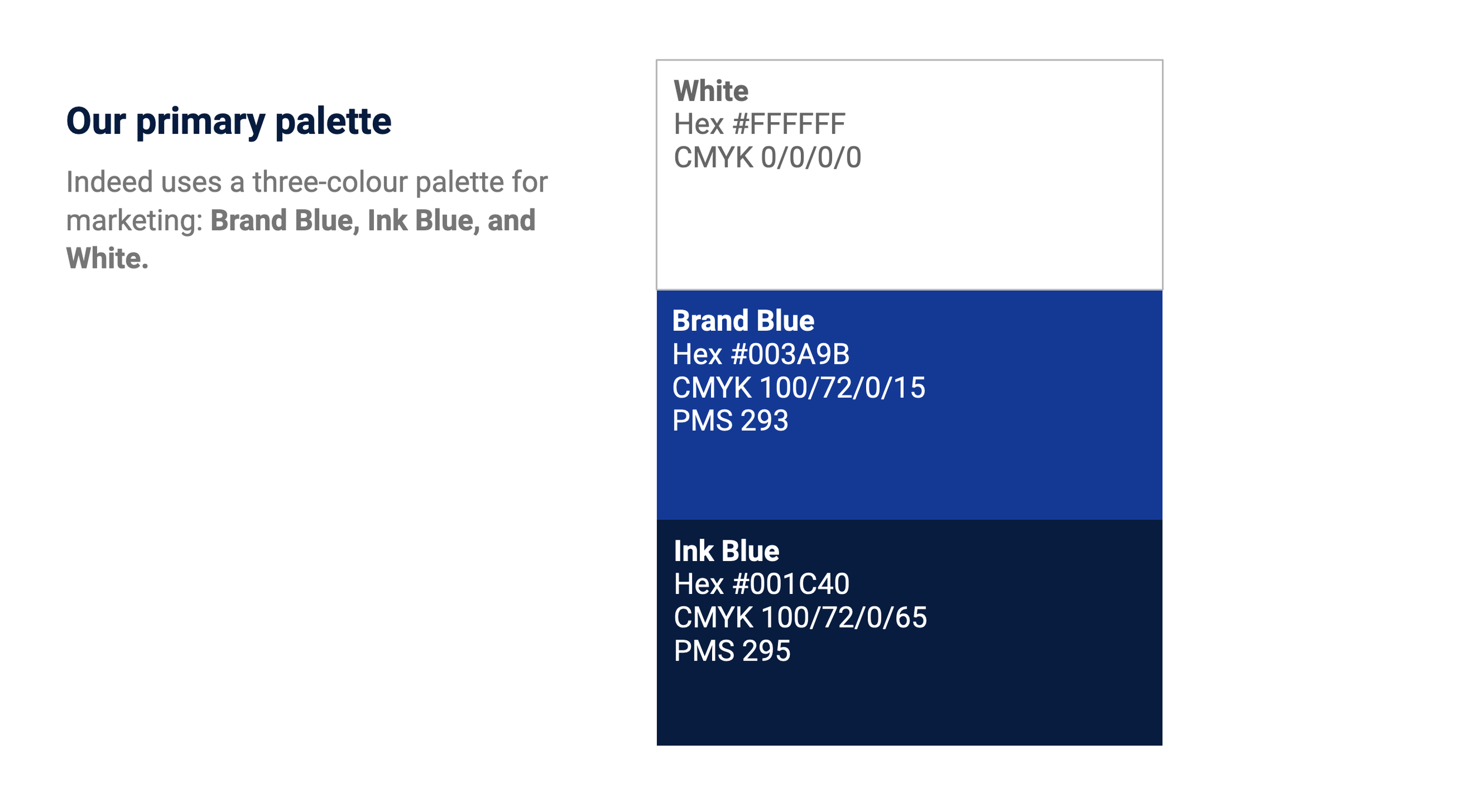
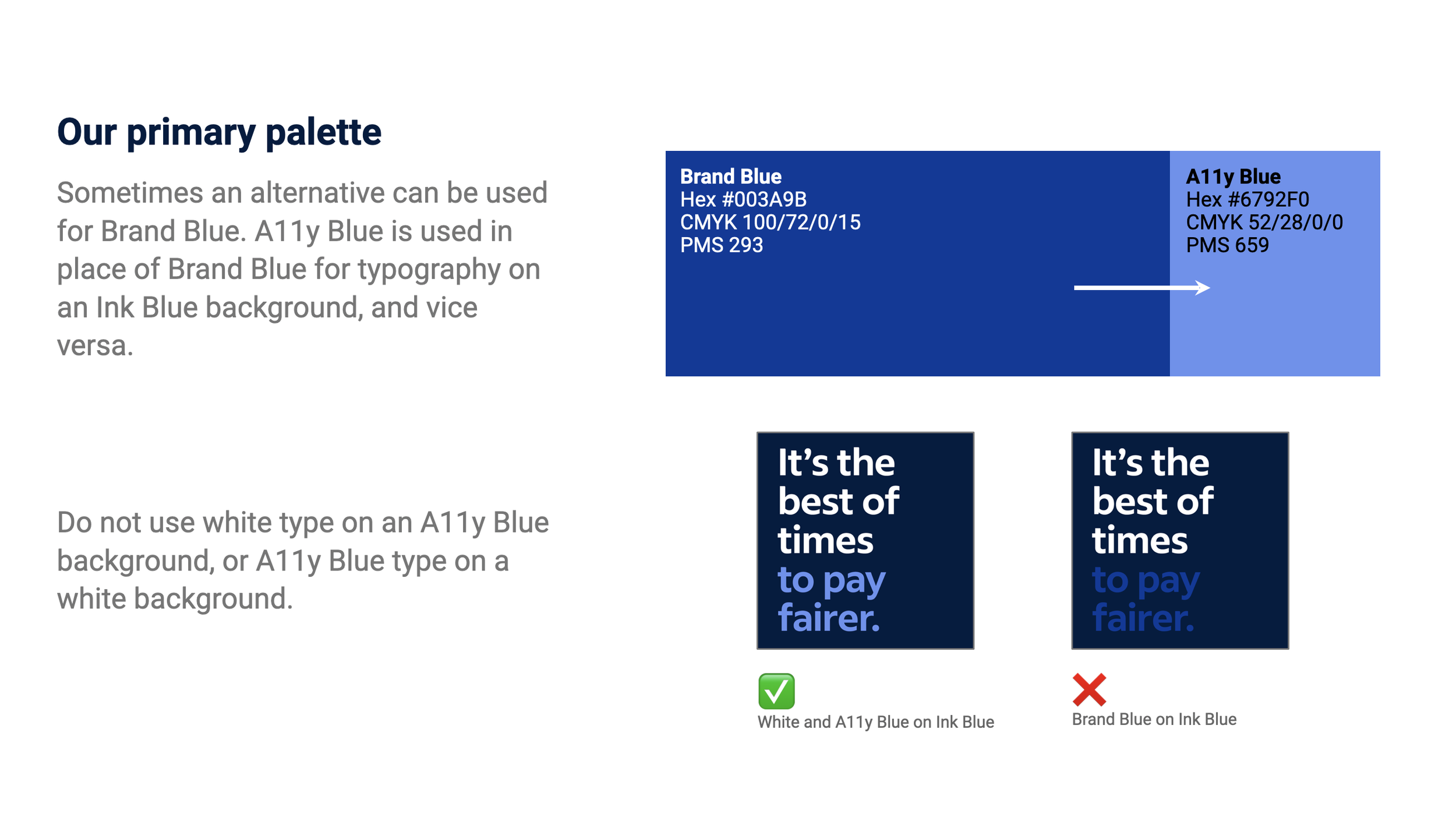
Our core brand palette is a mature evolution of the colors that helped Indeed succeed. We dialled in our two brand blues to be accessible hues that are distinct to high brand moments in the product and throughout marketing. Our functional palette is built for our product experience. The colors support each other to create seamless flows, highlighting what’s truly important and building clear visual patterns. Our expressive palette expands on the first two, creating a deep library of rich colors that could scale across digital and print. This same color range also allows our character designs within illustrations to have a library of inclusive skin tones for depicting people in an authentic way. Colour and its usages


Step 3 — Product applications
Product refresh with a comprehensive colour palette
As we embarked on refreshing our ACME product pages, we were mindful of integrating the new Aurora brand expressions while considering the insights from the current design approach.Figma product explorations (see below↓)
Key Insights from the Current ACME Design Approach: Balancing brands: We aim to strike a balance between the brand identity of the company featured on ACME and Indeed's overarching brand.
Visual anchors: Illustrations and icons are used to balance the information density and provide consistent visual anchors across the entire ACME experience.
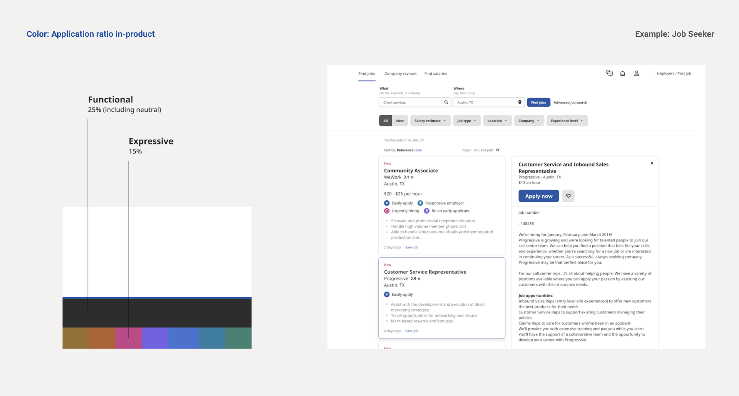
Sentiment colours: The use of red and green is primarily reserved for communicating trends. In data visualisations, we avoid assigning positive or negative colours to values (e.g., 25% CEO approval or 89% CEO approval is represented with the same colour).
Gold highlights: Gold colour, a current highlight in ACME, is used exclusively for rating-related information, such as stars and overall rating evolution charts.
Dynamic layout: The design must accommodate variations, such as missing assets or information. The layout should be dynamic enough to adjust to these situations, ensuring that the majority of company pages, which will be incomplete, still provide a coherent user experience.
Optimising engagement: We're optimising the page for dwell time, scroll rate, and engagement. The main purpose is to convey what it's like to work at a specific company.
Navigation experiments: Experiments with on-page navigation are in the pipeline to enhance user experience.
Flexible content structure: The order of sections is based on card sorting research but remains flexible for testing. We're also considering adding sections for company comparison, discovery, and career paths to enrich the content.
Step 4 — Learning , Testing & Findings
A colour palette that scaled across multiple use cases
While having a scalable colour palette was crucial, we also aimed to understand the global perception of our colours. We questioned whether our blue was interpreted similarly in the United States, Germany, and Japan. To address this, we conducted a study focused on semiotics, exploring how different cultures interpret symbols like colours and logos.Our study on the proposed new colour system revealed its cultural impact on our global audience. For example, we discovered that our new core Indeed Blue colour symbolised leadership and formal responsibility in Germany, while in Japan, it represented water, community, and care.

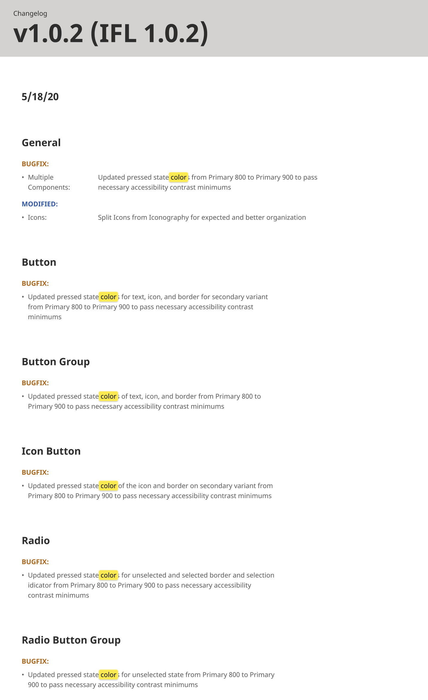
We updated the component change log with insights from tests and learnings, ensuring that our library reflects the latest improvements and best practices.
As we refresh the brand expressions on our product surfaces, we've also conducted extensive A/B testing
Through this testing, we compared the new components, featuring refreshed colors, typography, and icons, against their predecessors to ensure they met performance metrics. Interestingly, most components not only matched but also surpassed the existing ones. This success can be attributed to a more cohesive design language that enhanced user comprehension and engagement.
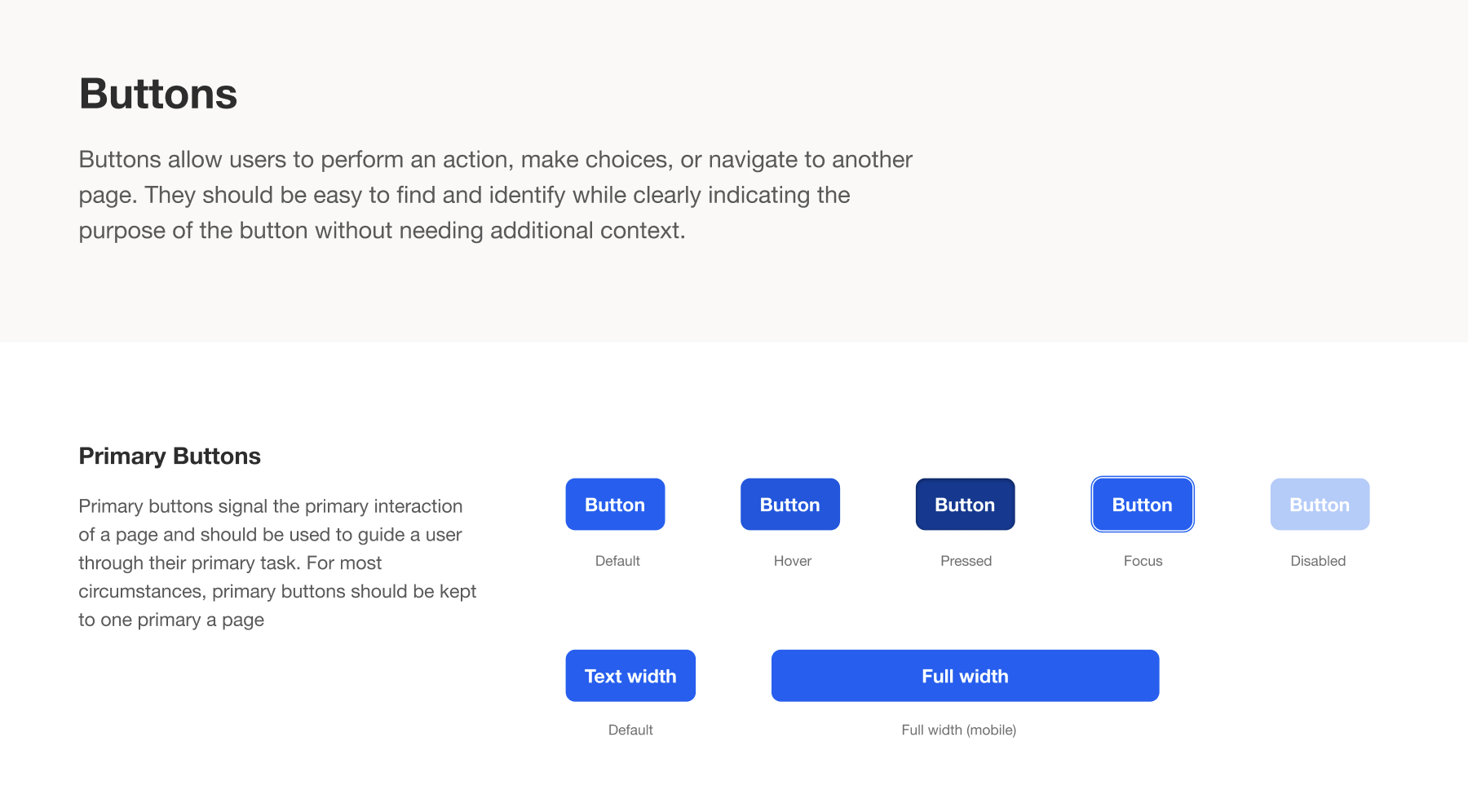
We applied the new colour palette to our component library, including buttons, cards, and text. This ensured a consistent and visually appealing application of colours across various UI elements.
Making accessibility a feature
Accessibility at the forefront for colour
Every color from the expressive and neutral palettes comes in 10 grades to cover various needs and uses. This includes a wide range of contrast levels, especially 3.0 and above, which is essential for building an accessible product.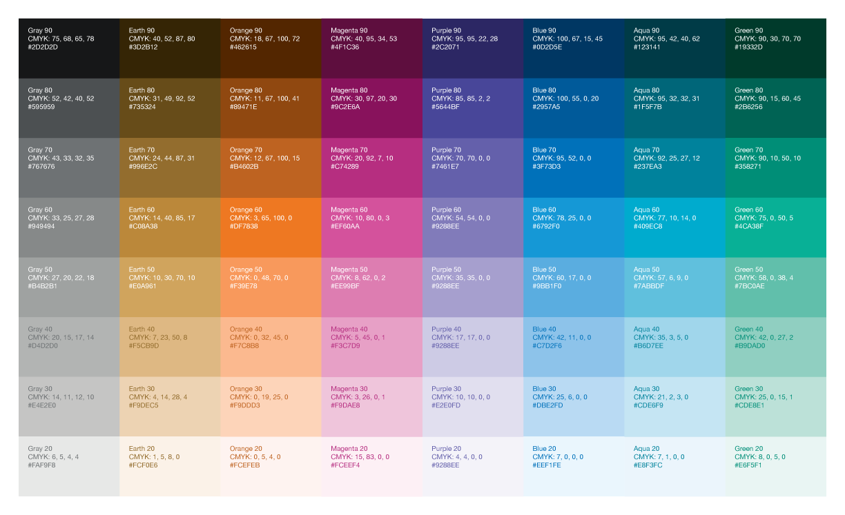
Accessibility library
The WCAG 2.1 AA standards mandate that designers ensure their work meets these accessibility requirements before passing them on to developers. As part of the Aurora initiative, Indeed has seamlessly integrated the accessibility library into Figma, enhancing our product designs to comply with WCAG 2.1 AA standards. This library equips designers with pre-filled components and a tagging system, streamlining the integration of accessibility considerations into the design and development process. This approach not only enhances project efficiency but also minimises the need for post-launch adjustments and promotes empathetic design practices.
More than just boosting efficiency, the accessibility library plays a pivotal role in making Indeed's platform more inclusive and accessible, especially for users with disabilities, by providing clear guidelines and tools for accessible design.

Accessibility Annotation Kit in Figma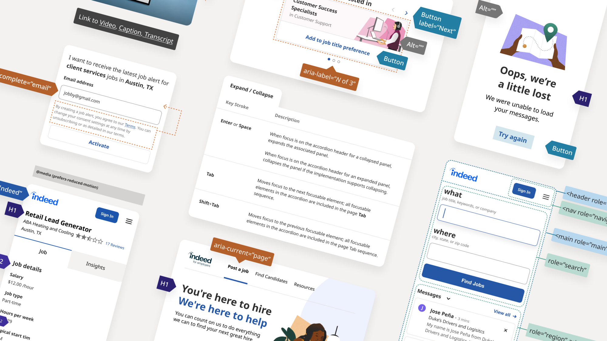

Impact
Positive feedback from unmoderated user testing and A/B tests, with a general preference for the refreshed design.All job seeker-facing products adopted the new design system/ Aurora by Dec 2021, ensuring greater consistency in the user experience.Established framework for adding new components and adapting existing ones to meet the unique needs of different teams.New visual identity positively received by users, aligning with the brand's evolution.Accessibility (WCAG 2.1) integrated into design components from the outset, ensuring a more inclusive user experience.
Project Showcase (with Aurora)